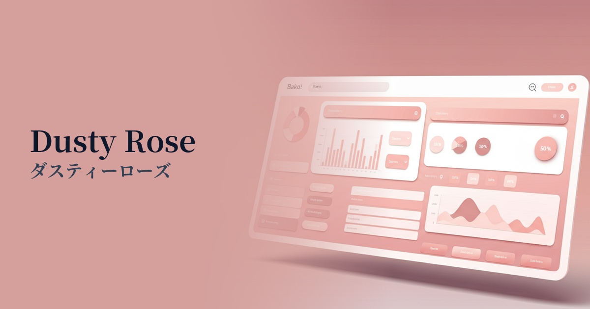
| English name | Dusty Rose |
|---|---|
| Katakana | Dusty Rose |
| HEX | #EADAD9 |
| RGB | 234, 218, 217 |
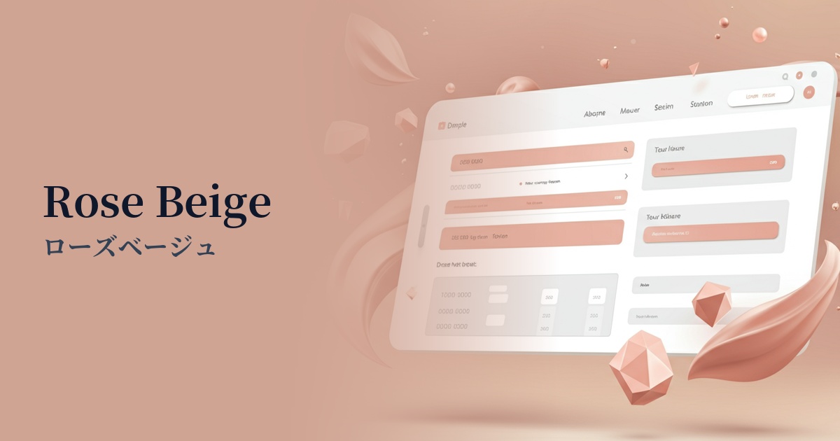
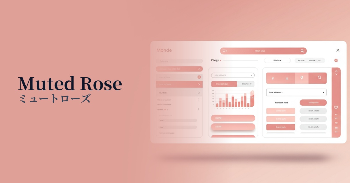
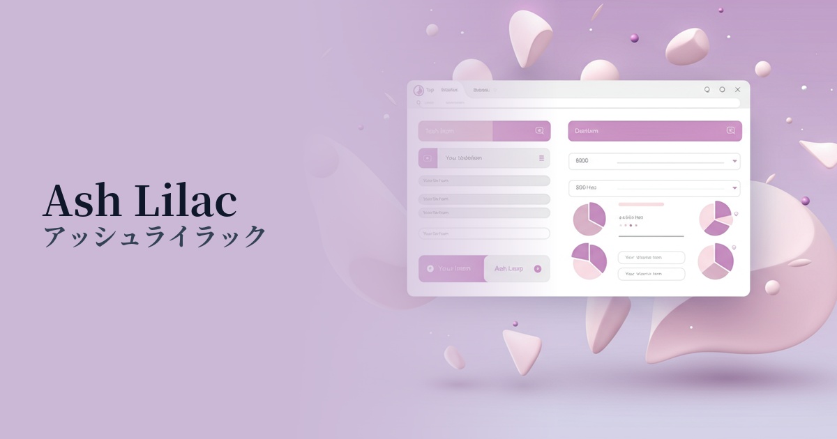
| Design Theme | Neutral & Minimal Background Colors |
Why is it a trend? (Background and reasons)
In recent years, minimalism and neutral colors have become major trends in web design. Beyond simple whites and grays, there's a demand for warmer, slightly colored neutrals, and dusty rose is gaining attention as a color that balances elegance and comfort.
Another contributing factor is the growing interest in gender-neutral expression. Dusty rose, with its subdued saturation, stands apart from the traditionally feminine image of pink and is being adopted in a wide range of designs as a sophisticated color that is easily accepted by people of all genders.
In today's information-saturated digital society, the concept of "digital wellness," which aims to reduce users' visual fatigue and provide a pleasant experience, is gaining importance. The organic and gentle tones of Dusty Rose give users a sense of security and create a calm space where they can easily concentrate on the content.
The psychological effects of design and UX
Dusty Rose gives an impression of elegance, sophistication, and tranquility. While retaining the romantic atmosphere of pink, the grayish, muted tone tones down the sweetness and adds a mature calmness.
This color evokes a nostalgic feeling, creating a sense of comfort and familiarity for the user. Its non-aggressive and gentle impression makes it useful in UI/UX design, helping to alleviate user tension and allow them to use the service in a relaxed state.
When used as a background color, it creates a warm and inviting base that doesn't detract from the content, yet avoids becoming too sterile. As a result, it adds depth to the brand's world and can lead to increased user engagement.
Visibility testing (UI component example)
Practical usage (best practices)
Its most effective use is as the background color for the entire website. Even when used extensively, it doesn't feel overwhelming and gently enhances key content such as text and images. It's particularly well-suited for minimalist portfolio sites and e-commerce sites for lifestyle brands.
It's recommended to use this color not only as the main background color, but also partially as the background for information cards and sections. It creates a soft boundary between other elements and generates a visual rhythm. This helps organize information and makes it easier for users to understand the content.
Using it as an accent color on interactive elements such as buttons and links can subtly encourage user action without being overly assertive. It particularly stands out beautifully and enhances the sophisticated impression when used in designs based on dark gray or navy.
Combining it with photographic content is also effective. In particular, pairing it with portraits of people, plants, or interiors creates an overall tone that is soft and emotional, resulting in a design that tells a story.
Recommended color scheme suggestions
Charcoal (#36454F)
The softness of dusty rose and the richness of charcoal complement each other beautifully. It achieves a balance of luxury and modernity, and its high readability makes it ideal for use as text. Recommended for sophisticated brand websites and similar applications.
Sage Green (#B2AC88)
The combination of earth tones creates a very natural and comforting impression. It's perfect for organic product and wellness-related websites. It provides users with a sense of security and relaxation, creating a natural and relaxed atmosphere.
Ivory (#FFFFF0)
By using soft tones together, a very gentle and elegant atmosphere is created. It is ideal for designs that require delicacy and cleanliness, such as bridal items, cosmetics, and baby products. It gives a refined and unified impression.