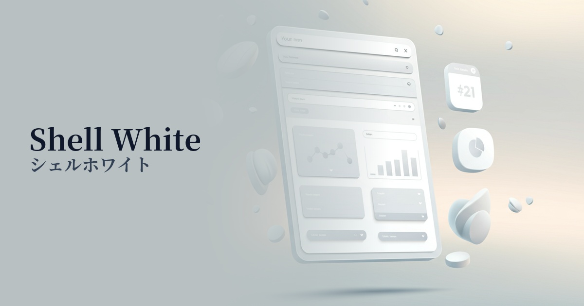
| English name | Shell White |
|---|---|
| Katakana | Shell White |
| HEX | #FFF5EE |
| RGB | 255, 245, 238 |
| Design Theme | Neutral & Minimal Background Colors |
Why is it a trend? (Background and reasons)
In recent years, web design has increasingly prioritized user visual comfort. Pure white (#FFFFFF) can strain the eyes, especially on large screens or during prolonged viewing, but off-white colors like shell white soften the glare and give a softer, more calming impression. This consideration for the user is fueling its popularity as a trend.
As quiet, sophisticated aesthetics such as "quiet luxury" and minimalism become mainstream in design, the demand for shell white is increasing. While not flashy, its subtle hue brings depth and refinement to a space. It functions as an ideal canvas, quietly highlighting the appeal of content and products.
As the name Shell White suggests, this color evokes elements of nature, such as seashells and eggshells. With the growing interest in themes like organic, sustainable, and wellness, this natural and calming color palette has become popular. It helps build a brand image that is authentic, genuine, and not artificial.
The psychological effects of design and UX
The subtle warmth of shell white gives users a sense of security and comfort. Unlike pure white, which can often give a cold and impersonal impression, it creates a friendly and welcoming atmosphere. As a result, users are more likely to form a positive first impression of the site.
This color conveys a subtle yet undeniable sense of quality and elegance. It creates a sophisticated impression reminiscent of luxury brand packaging or museum walls. By unifying the entire website with shell white, you can unconsciously communicate the high quality of your products and services to users.
Shell white as a background color is an excellent supporting player that enhances the main content. It reduces unnecessary visual noise and improves the readability of text and the vibrancy of photographs. This makes it easier for users to focus on the information, ultimately leading to an improved UI/UX.
Visibility testing (UI component example)
Practical usage (best practices)
This color is ideal as the main background color for websites that primarily consist of text and image content, such as blogs, news sites, and portfolios. It provides an environment where users can easily concentrate on the content, even during extended visits.
When used as a key color for minimalist landing pages or brand websites, it creates a spacious, airy, and clean impression. Its effect is maximized when combined with beautiful typography and high-quality photography.
For websites that allow switching between dark and light modes, using this color as the background color for light mode is a good approach. It provides a less jarring visual experience when switching from dark mode compared to pure white, offering a more seamless user experience.
In UI design, using this color as the background for components such as cards, modals, and dropdown menus can create a subtle contrast with the main background, adding depth and structural clarity. It helps to organize the UI softly without using strong borders.
Recommended color scheme suggestions
Slate Gray (#708090)
The soft warmth of shell white combined with the calm, intellectual impression of slate gray creates a highly sophisticated and modern atmosphere. When used as a highly readable text color or for important UI elements, it conveys both reliability and a sense of luxury.
Sage Green (#B2AC88)
The natural feel of shell white and the gentle, organic hue of sage green are a perfect match. Ideal for natural cosmetics and lifestyle brands that want to express a calming and soothing world. It provides users with a sense of security and relaxation.
Coral (#FF7F50)
By adding coral as an accent against an elegant shell white background, the design gains vitality and approachability. When used selectively in areas where you want to encourage user action, such as CTA buttons and links, it effectively attracts attention without detracting from the overall sophisticated impression.