
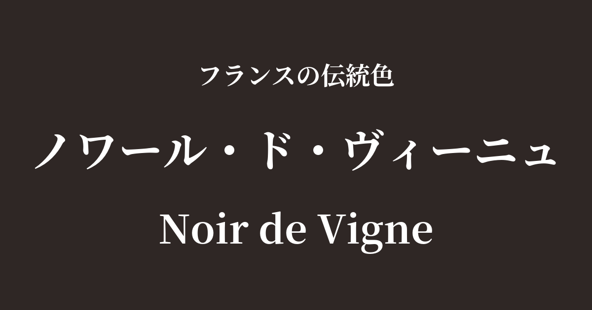
| French | Noir de Vigne |
|---|---|
| Katakana | Noir de Vigne |
| HEX | #2f2725 |
| RGB | 47, 39, 37 |
What is Noir de Vigne? Origin and Etymology
Noir de Vigne is a very poetic and profound color name in French, meaning "black of the vineyard."
As the name suggests, this color originates from the landscape of vineyards, symbolizing France's rich wine culture. The color of the skins of black grapes ripened under abundant sunlight, the color of pruned old grapevines, and the color of the fertile soil that nourishes life—all these elements combine to create a complex, warm, almost blackish-brown color, which is the origin of Noir de Vigne.
It's not just plain black; it's characterized by a subtle hint of red or purple, evoking a sense of life and the energy of the earth. It's a color that reflects the very terroir (the unique character of the land) of France, telling a story of nature's bounty and abundance.
Historical background of Noir de Vigne
Noir de Vignes is a color that has been deeply intertwined with the lifestyle and culture of regional France, rather than being favored by specific royalty or nobility. Its history is intertwined with the history of winemaking in France itself.
For centuries, vineyards have been an integral part of life for the French people, a place of work, and a symbolic location that brings abundant harvests. This color is thought to have quietly become a part of their lives, reflected in the simple work clothes worn by farmers and the tools they used daily.
Before the advent of modern chemical dyes, nuanced blacks like these, made from plant bark, roots, or soot, were common. While not flashy, they were durable, highly practical, and have a history of quietly enriching the lives of people rooted in the French landscape.
Noir de Vigne in the world of art and fashion
In the world of art, we can find color tones reminiscent of noir de vigne in the rural landscapes painted by 19th-century Barbizon School artists. The colors of the shadows on the land and the clothes of the peasants in Jean-François Millet's "The Gleaners" perfectly express the simplicity and strength of these colors. They revered the unadulterated beauty of nature and captured landscapes woven from light and shadow in these deep, earthy colors.
In fashion, it's a color that's softer than black and more chic than brown, and has been loved across generations. It pairs exceptionally well with natural materials like high-quality wool and leather, and incorporating it into coats, jackets, and leather accessories creates an air of refined intelligence and elegance. It's a color favored by those who appreciate essential beauty and are not influenced by trends.
Color scheme preview
This is to check the readability of the text when this color is used as the background.
Noir de Vigne color scheme proposal
Beige de Paris (#DABF99)
By combining it with natural beige, reminiscent of soil and sand, a sophisticated harmony of earth tones is created. This color scheme is recommended when you want to express a calm, comfortable, and urban natural feel.
Rouge Vif (#D21404)
The vibrant red accents create a dramatic and passionate impression. The combination, reminiscent of ripe grapes and wine itself, possesses a powerful charm that captivates the viewer.
Vert Olive (#808000)
The calming green color scheme, reminiscent of olive leaves, evokes a natural beauty, as if a vineyard landscape had been captured directly. It gives a profound impression, where vitality and maturity coexist.
Practical Scenes
In interior design, noir de vigne brings a sense of weight, warmth, and tranquility to a space. Incorporating it into a wall, bookshelves in a study, or a leather sofa creates an intellectual and comfortable atmosphere. Combining it with materials such as wood, linen, and brass enhances the texture of the materials, resulting in a more refined space.
In fashion, it's a key color for autumn and winter outfits. When incorporated into items like wool coats, cashmere sweaters, or leather boots, it creates a look that's less heavy than black and more modern than brown. Pairing it with colors like off-white, beige, or burgundy results in an elegant and sophisticated style.
In web and graphic design, using this color as a background can convey a sense of luxury and trustworthiness. It is especially ideal as the brand color for brands that emphasize quality and tradition, such as wine, food, and organic products.