
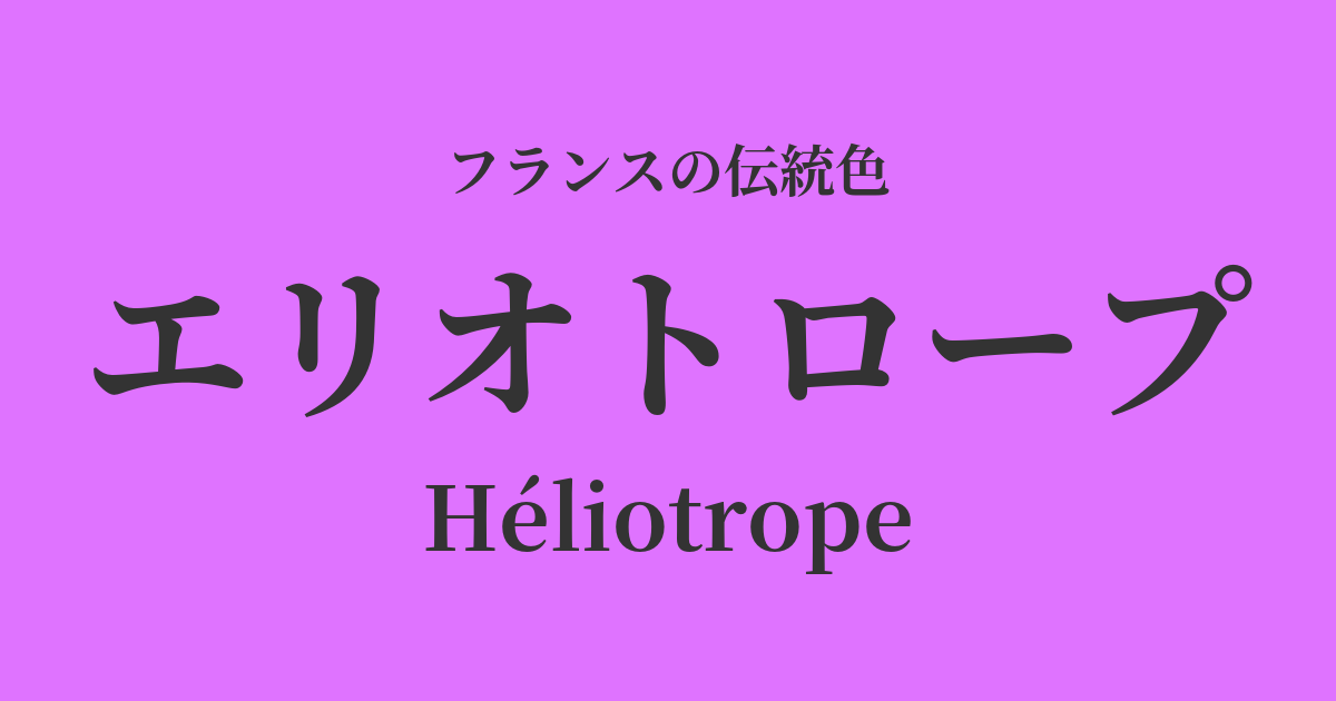
| French | Héliotrope |
|---|---|
| Katakana | Heliotope |
| HEX | #df73ff |
| RGB | 223, 115, 255 |
What is an heliotrope? Origin and etymology
Heliotrope is a bright, reddish, vibrant purple. Its name comes from the flower of the same name, "heliotrope."
The name of this plant originates from the Greek words "helios" (sun) and "tropos" (to face), meaning "that which faces the sun." As the name suggests, it was named for its characteristic of blooming in a way that seems to follow the movement of the sun.
Heliotrope flowers have long been cherished not only for their beautiful colors but also for their sweet, fragrant scent, often compared to vanilla or cherry pie. This color embodies both the flower's delicate beauty and the memory of its captivating fragrance.
In terms of color, it's more vibrant than lavender, with a purple nuance closer to magenta. When exposed to light, it shines brilliantly, leaving an elegant and romantic impression on the viewer—a truly captivating color.
Historical background of Heliotrope
Heliotrope became widely known in France in the late 19th century. This era was a revolution in color, with new colors being created one after another thanks to advances in science and technology.
Since chemist William Perkin invented the world's first synthetic dye, mauve, in 1856, vibrant aniline dyes became extremely popular in Europe. Heliotrope was one of the new purples that emerged during this trend, achieving vivid colors that had been difficult to achieve with natural dyes until then, and bringing new vibrancy to people's lives.
This color became immensely popular in the fashion world, especially during the late 19th and early 20th centuries, a period known as the "Belle Époque" (the beautiful era). It was used in the decoration of glamorous dresses, hats, and ribbons, elegantly and modernly adorning the streets of Paris at the time.
Heliotrope in the world of art and fashion
The emergence of new synthetic pigments had a significant impact on the art world. Impressionist painters actively incorporated new colors into their palettes to express the changing light and atmosphere. Bright purples like heliotrope were ideal for depicting the contrast between sunlight and shadow, and the delicate gradations of the twilight sky.
Furthermore, it has a deep affinity with the Art Nouveau style that swept across Europe at the end of the 19th century. In this artistic style, which uses organic forms from the natural world, such as plants and insects, as motifs, heliotrope was effectively used in works such as the glasswork of Émile Gallé and the jewelry of René Lalique as a color symbolizing the vitality and elegance of flowers.
...The heliotrope, that purple bouquet, intoxicated the air with the scent of vanilla.
Color scheme preview
This is to check the readability of the text when this color is used as the background.
Heliotrope color scheme proposal
Gris de Lignan (#DCD7D1)
The vibrant heliotrope is gently complemented by a muted, flaxen-like white, creating an elegant and sophisticated impression. This color scheme is perfect for creating a calm space that is both classic and modern.
Veil Opaline (#A2D2C8)
By combining it with a pale, bluish-green reminiscent of opal, the colors complement each other, creating a fresh and vibrant impression. The color scheme evokes a bright and light atmosphere, like a spring garden.
Blue Nuit (#0F2350)
By combining it with a deep navy blue, meaning "night blue," the mystical charm of heliotrope is highlighted. This color scheme gives a dramatic and elegant impression, like a starry night sky.
Practical Scenes
In the world of fashion, heliotrope is a color that can be both the main focus and an accent in an outfit. When incorporated into dresses and blouses made of glossy materials such as silk or satin, its elegance is further enhanced. When used as an accent color in accessories such as scarves, bags, and jewelry, it can add a sophisticated touch to the entire look.
In interior design, incorporating these elements through cushion covers, curtains, or art posters brings a romantic and elegant atmosphere to a space. Simply adding them to a simple room with a white or gray color scheme creates a pleasant accent and brings the space to life.
In website and graphic design, this color is particularly effective in enhancing the brand image of beauty, wellness, and lifestyle-related brands. By adding a touch of this color to a calm, trustworthy color palette, you can convey a sense of creativity and quality to users.