
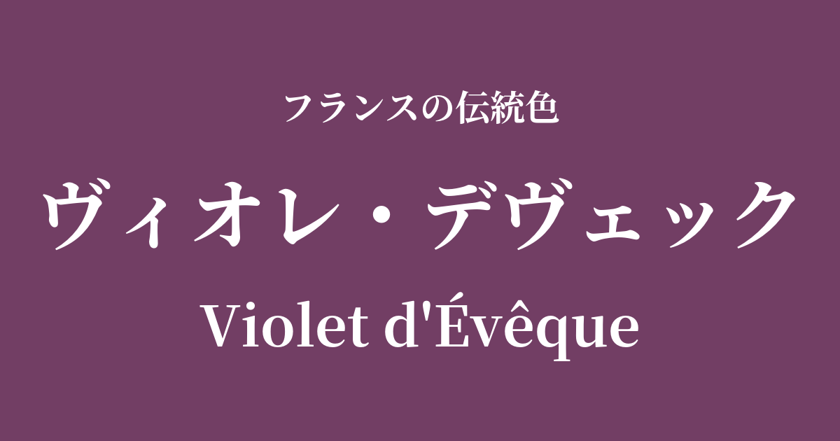
| French | Violet d'Évêque |
|---|---|
| Katakana | Violet Devec |
| HEX | #723e64 |
| RGB | 114, 62, 100 |
What is Violette de Vêque? Origin and etymology
Violet d'Évêque is a profound and noble color, meaning "bishop's purple" in French. "Évêque" means bishop, and "Violet" means purple; as the name suggests, it was created as a color to symbolize the authority and spirituality of bishops in the Catholic Church.
In Christianity, purple has traditionally been considered a color symbolizing repentance, humility, and the Passion of Christ. Bishops wearing vestments of this color were meant to signify their spiritual role and status.
Furthermore, in the ancient world, purple dye, especially "Tyrian purple" extracted from Mediterranean seashells, was extremely rare and expensive. Therefore, purple was considered a forbidden color, reserved only for the highest-ranking authorities, including Roman emperors, and became a symbol of wealth and power. This historical background further reinforces the dignified image associated with Viollet-Deveck.
The historical background of Viollet-devec
In France from the Middle Ages to the early modern period, the Catholic Church wielded immense influence over every aspect of society. Viollet-d'Évec was frequently used in religious ceremonies and festivals as an important color that visually represented the authority of the Church. The majestic purple vestments worn by bishops instilled a sense of awe in the faithful and enhanced the atmosphere of the sacred space.
The French royal family also adopted this noble color as a symbol of authority. Wearing purple attire during important state ceremonies such as coronations visually reinforced the "divine right of kings," the belief that royal power is bestowed by God. Especially within the opulent court culture of the Bourbon dynasty, purple was one of the highest-ranking colors, used lavishly in clothing, tapestries, and interior decorations.
The French Revolution shook the absolute authority of the monarchy and the Church, but Viollet-Dévec's mystical and noble image continued to be deeply etched in people's hearts.
Violet Devec in the world of art and fashion
In Western art, particularly religious paintings, violet-devec was an indispensable color for depicting clergy. The portraits of popes and cardinals painted by Renaissance artists such as Titian and Raphael beautifully capture the gravitas and dignity of clothing in this color.
Symbolist painters of the late 19th century were also strongly drawn to the mystical and introspective worldview associated with purple. In the works of artists such as Gustave Moreau, this sensual and enigmatic color was effectively used to depict mythological and dreamlike worlds.
In the world of fashion, early 20th-century couturier Paul Poiret made a striking use of this deep purple in his bold designs that incorporated Oriental influences. Even today, violet deveque continues to be a favorite color among many designers in haute couture collections, used to express dramatic and sophisticated elegance.
Color scheme preview
This is to check the readability of the text when this color is used as the background.
Violet Devec's color scheme proposal
Jaune d'Or (#E8B32A)
The resplendent gold further enhances the religious authority and nobility inherent in Viollet-devec. It gives a luxurious and dignified impression, reminiscent of church decorations or royal ceremonies.
Gris de Tourturelle (#B9B5A8)
The muted dove pink softens the deep hues of Violette de Vêque, creating a sophisticated, urban atmosphere. It gives a chic and intellectual impression, suitable for modern interiors and fashion.
Rose Pompadour (#ED86A3)
The deep purple and bright, elegant pink create a beautiful contrast, giving a mysterious yet feminine and glamorous impression. This color scheme is perfect for cosmetics and romantic designs.
Practical Scenes
In interior design, Violet Devec brings depth and a luxurious atmosphere to a space. Incorporating it into an accent wall in the living room, or into velvet sofas and cushions, instantly transforms the space into one of refined elegance. Combining it with gold or brass lighting and accessories completes a classic and elegant style.
In fashion, this color has a leading role presence. Incorporating it into dresses and coats made from high-quality materials such as silk and cashmere creates a very sophisticated impression. Furthermore, even using it as an accent color in accessories like bags, scarves, and pumps elevates the entire outfit, making it more intelligent and refined.
In the fields of web design and graphic design, it is ideal for luxury brand websites and pages dealing with cultural content. Using it as a background color or as an accent color for buttons and headings can convey a sense of trust and exclusivity to users.