
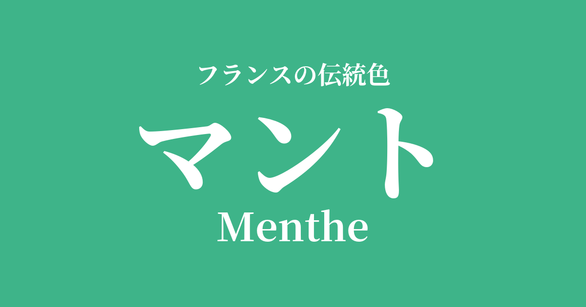
| French | Menthe |
|---|---|
| Katakana | Cloak |
| HEX | #3EB489 |
| RGB | 62, 180, 137 |
What is a cape? Origin and etymology
"Menthe" is a French word meaning "mint," the herb. As the name suggests, it refers to the bright, refreshing green color of spearmint or peppermint leaves.
Mint, which has been an integral part of people's lives since ancient times as a medicinal herb and spice, has been a symbol of refreshing coolness that revitalizes both mind and body. Its vibrant colors give those who see them a sense of peace and a new beginning. The color name "Mantle" encompasses not only the color itself, but also the cultural background and the memories of the pleasant scent associated with mint.
Historical background of cloaks
The widespread use of bright, cape-like green in the world of fashion and art is a relatively recent development, occurring in the late 19th century. The Industrial Revolution brought about a dramatic advancement in synthetic dye technology, making it possible to express vivid and diverse colors that were previously difficult to achieve with natural dyes.
In particular, during the optimistic atmosphere of the Belle Époque (the beautiful era) that swept across Europe from the late 19th to the early 20th century, bright, cape-like colors were popular. Unlike the heavy colors that symbolized the authority of traditional royalty, these colors embodied the lightness and free spirit of the bourgeois culture that heralded the arrival of a new era.
Capes in the world of art and fashion
Mantle is a color that has a particularly deep connection to the Art Nouveau style. In this artistic style, which drew inspiration from the organic forms of nature, such as plants and insects, green, reminiscent of leaves, was an essential element.
Alphonse Mucha's posters depicting vines and the floral motifs found in Emile Gallé's glass art effectively utilize a vibrant, cape-like green. In the world of fashion, it has been cherished as a color that heralds the arrival of spring and summer, adding freshness and elegance to outfits as an accent on dresses, blouses, and hats. To this day, it remains a popular color in textile design and interior design, creating a natural yet sophisticated atmosphere.
When my daughter came into the kitchen and asked if I wanted some mint water, I replied, "Yes, please," because I've always been fascinated by the drink's artificial and out-of-place color.
Color scheme preview
This is to check the readability of the text when this color is used as the background.
Cape color scheme suggestions
Blanc Cassé (#EFEBDC)
This color scheme maximizes the refreshing feel of a cape, creating a clean and light impression. It's recommended for minimalist and modern spaces, as well as clean fashion styles.
Rose Pompadour (#ED82A2)
It creates a sweet and romantic atmosphere reminiscent of a spring flower garden or macarons. This combination is perfect when you want to express the elegance of Art Nouveau or Rococo style.
Gris de Parle (#D4D4D4)
The vibrant colors of the cape are gently complemented by the elegant, pearly gray, creating an intelligent and calm impression. It helps create a natural, comfortable, and relaxing space.
Practical Scenes
In interior design, mantles serve as a refreshing accent color that brings a breath of fresh air to a space. Simply incorporating them into cushions and curtains in the living room, or bed linens in the bedroom, will give the entire room a brighter and more refreshed feel. They pair particularly well with white or natural wood-grain furniture.
In fashion, incorporating this color into spring and summer blouses, dresses, and accessories like scarves can brighten your complexion and create a youthful, lively image. Pairing it with basic colors like navy and beige results in an elegant and sophisticated look.
In website and graphic design, this color is a perfect match for themes related to organic products, healthcare, and the environment. It conveys a fresh and positive message while instilling a sense of security and trust in the user.