
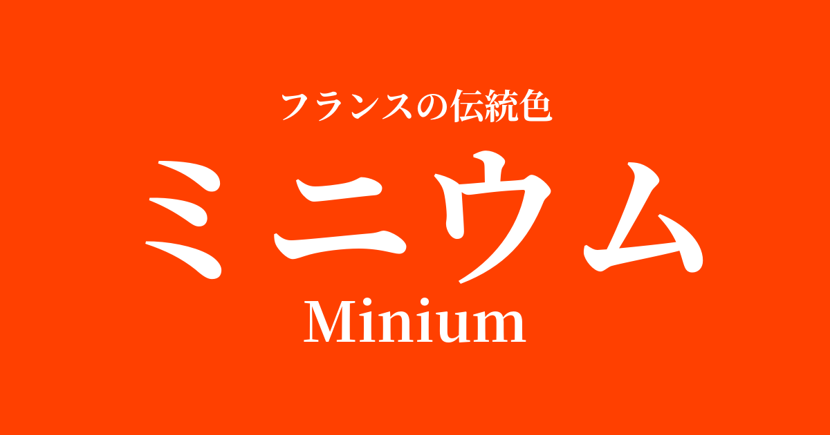
| French | Minium |
|---|---|
| Katakana | Minium |
| HEX | #ff4000 |
| RGB | 255, 64, 0 |
What is Minium? Origin and Etymology
Minium is a Latin-derived word referring to red lead, an artificial pigment made from lead. Its vibrant, powerful orange-red color has captivated people since ancient times.
The most widely accepted etymology is that it originates from the Minho River (Minius in Latin), in northwestern Spain, where high-quality red lead raw materials were said to have been extracted during the ancient Roman era. It is said that the soil along this river had a reddish tint, and therefore the pigment produced there came to be called by the same name.
Historical background of Minium
Minium has a long history, having been used in ancient Roman times for coloring murals and cosmetics. Its vibrant colors can also be seen in the murals discovered at the ruins of Pompeii.
Its value particularly increased during the Middle Ages in Europe. At the time, this pigment was extremely expensive and was mainly used in the production of illuminated manuscripts. Decorating the initials and illustrations of Bibles and Books of Hours with minium was an important process that increased the value of the manuscripts. It is said that the phrase "to color with minium" later became the origin of the word "miniature," meaning a miniature painting.
Although it was favored by many painters from the Renaissance onward, it also had a weakness: it was prone to discoloration and turning black when it reacted with sulfur. In modern times, its excellent rust-preventive properties attracted attention, and it is famous for being used as the first rust-preventive undercoat during the construction of the Eiffel Tower. Its role transformed from an artistic pigment to a paint that supported industry.
Minium in the world of art and fashion
Perhaps the art form in which the color of minium shone brightest was the illuminated manuscripts of the Middle Ages. Numerous manuscripts, including the Très Riches Heures du Duc de Berry, are magnificently adorned with the fiery red of minium. The vermilion initial letters marking the beginning of each passage attracted the reader's eye and drew them into the world of sacred words.
In the world of painting, its vibrant colors were effectively used to highlight the clothing of saints and important motifs. However, due to the risk of blackening over time, it was often mixed with other, more stable pigments.
While titanium itself was rarely used as a dye in the world of fashion and textiles, the imagery associated with this color—authority, celebration, and vitality—has continued to inspire the designs of ceremonial garments and tapestries for royalty and nobility.
Color scheme preview
This is to check the readability of the text when this color is used as the background.
Minium's color scheme proposal
Blue Roi (#0053a0)
The vibrant Minium and deep Blue Roi create a powerful contrast that highlights each other's colors, giving off a dignified and dramatic impression reminiscent of a royal coat of arms.
Gris de l'Ain (#d2c6b3)
The vibrant colors of Minium are complemented by the gentle, natural hues of Gris de l'Ain. This sophisticated combination is both modern and warm.
Jaune d'Or (#ffd700)
Combining fiery titanium with shimmering gold creates a very vibrant and festive atmosphere. This color scheme is recommended for occasions where you want to convey a sense of abundance and energy.
Practical Scenes
In interior design, we recommend incorporating Minium as an accent color. Using it in small areas, such as cushions, art panels, or a single chair, will bring vibrancy and sophistication to the space. Its vibrancy will stand out even more when paired with white, gray, or dark wood-grain furniture.
In fashion, incorporating this color into dresses, scarves, or bags instantly brightens up the entire outfit. In particular, pairing it with basic colors such as black, navy, and beige highlights the powerful beauty of micron, resulting in an elegant and striking style.
In web and graphic design, it's highly effective when used for buttons (CTAs) or headlines that you want to attract attention. It's perfect for conveying energy, passion, or importance, but using it too much can be overwhelming, so the key to success is using it strategically and in a balanced way.