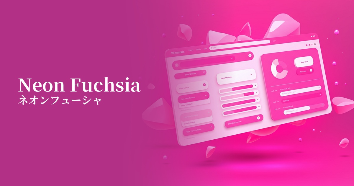
| English name | Neon Fuchsia |
|---|---|
| Katakana | Neon Fuchsia |
| HEX | #FD00A3 |
| RGB | 253, 0, 163 |
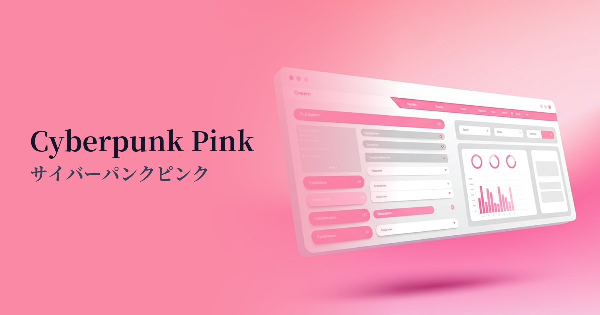
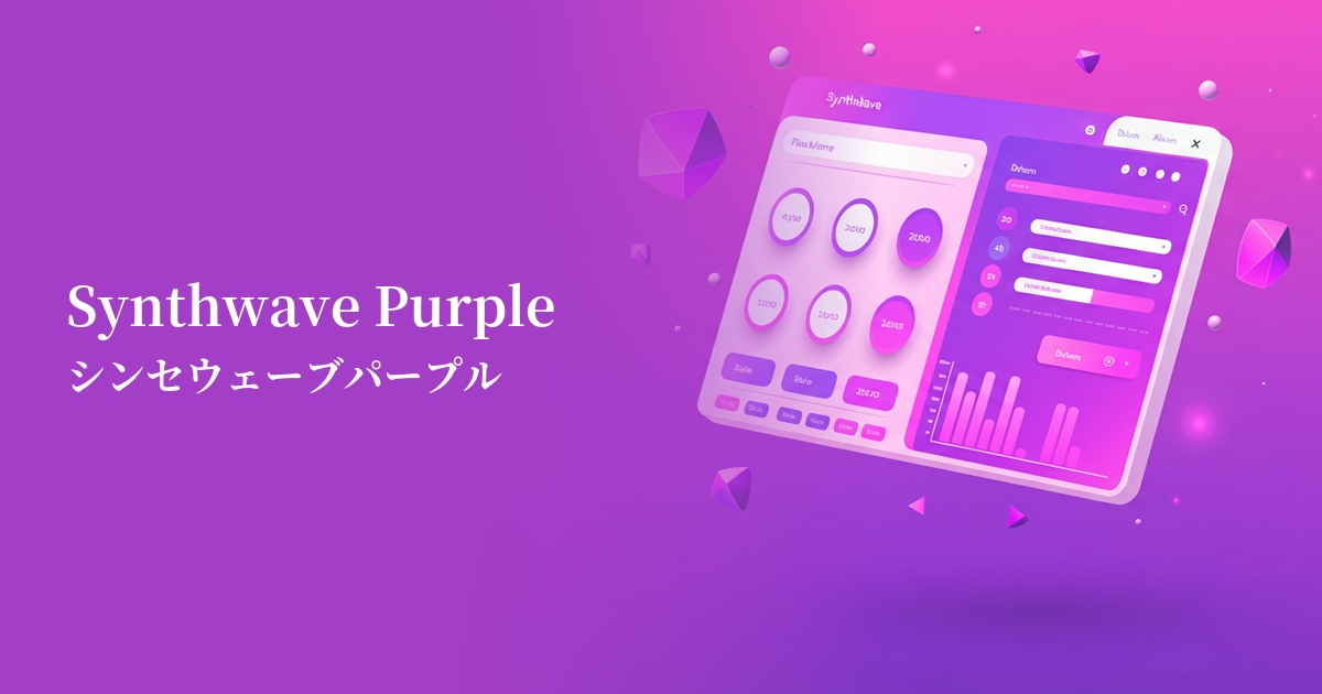
| Design Theme | Neon & Cyberpunk Colors |
Why is it a trend? (Background and reasons)
The neon fuchsia trend is deeply intertwined with Y2K fashion and the revival of cyberpunk culture. The vibrant colors, reminiscent of the early digital dawn of the 2000s, evoke a retro-futuristic feel and provide fresh inspiration to contemporary creators.
In the information-saturated digital world, the ability to instantly capture a user's attention is crucial. High-saturation colors like neon fuchsia exude an overwhelming presence on screen, enabling bold and energetic expression that sets it apart from minimalism and neutral color trends.
The psychological effects of design and UX
Neon fuchsia is a color that symbolizes energy, excitement, boldness, and youthfulness. Incorporating it into UI/UX design can intuitively convey the innovativeness and creativity of a service or brand. It is expected to evoke positive emotions in users such as "new," "fun," and "exciting."
Because it is a color that provides a strong psychological stimulus, it has the power to powerfully guide the user's gaze to specific elements. When used for CTA buttons or important notifications, it makes it easier to encourage user action. However, overuse can cause visual fatigue and a feeling of pressure, so it is most effective when used as an accent.
Visibility testing (UI component example)
Practical usage (best practices)
One of its most effective uses is as a Call to Action (CTA) button. Neon fuchsia buttons stand out, especially when placed on a dark mode interface or a dark background, clearly indicating the user's next action.
Rather than using it across the entire design, it's recommended to use it as an accent color on interactive elements such as icons, link hover effects, active navigation items, and form focus indicators. This adds vibrancy and dynamism to the design without compromising the user experience.
This color can be used as a key color for websites aiming for a futuristic and edgy branding, such as technology startups, music events, and creative agencies. Even partially incorporating it into the typography and graphic elements of the hero section can create a powerful first impression.
From a readability standpoint, this color should be avoided in long texts such as body text. It is difficult to meet WCAG contrast standards and can be stressful for users. Use it only for large, short texts such as headings.
Recommended color scheme suggestions
Midnight Blue (#191970)
Against a deep midnight blue background, the neon fuchsia stands out vividly, creating a cyberpunk or synthwave aesthetic. The high contrast maximizes visibility, making this a classic combination that gives a futuristic impression.
Gainsboro (#DCDCDC)
When combined with a light gray, the intensity of neon fuchsia is softened, resulting in a clean and modern impression. Using it as an accent in a minimalist layout expresses a sophisticated playfulness.
Dodger Blue (#1E90FF)
When paired with vibrant blue tones, the colors complement each other, creating a very energetic and dynamic color scheme. This combination is ideal for game and entertainment-related designs, as it's perfect for stimulating user excitement.