| English name | VJ Blue |
|---|---|
| Katakana | VJ Blue |
| HEX | #005FFF |
| RGB | 0, 95, 255 |
| Design Theme | Neon & Cyberpunk Colors |
Why is it a trend? (Background and reasons)
The rise of VJ blue is rooted in the revival of retro-futuristic aesthetics, such as 1980s cyberpunk culture and vaporwave. The immersion in the digital world and the rise of new technologies like VR/AR are rekindling the allure of this surreal and striking blue.
Furthermore, in modern web design, it's essential to capture the user's attention and provide a memorable experience. High-saturation colors like VJ Blue are a powerful tool for making brands and products stand out in the digital space overflowing with countless pieces of information. In particular, their brilliance is amplified in dark mode UIs, easily creating a cutting-edge and energetic impression.
The psychological effects of design and UX
VJ Blue strongly evokes keywords such as technology, the future, and innovation. Its vibrancy energizes and excites users, and it is expected to enhance immersion in entertainment, gaming, and creative services.
From a UI/UX perspective, this color has extremely high visibility. It is very effective in guiding the user's gaze to specific elements (such as CTA buttons or important notifications). However, because of its intensity, overuse can potentially tire the user, so using it as an accent is key to maintaining psychological comfort.
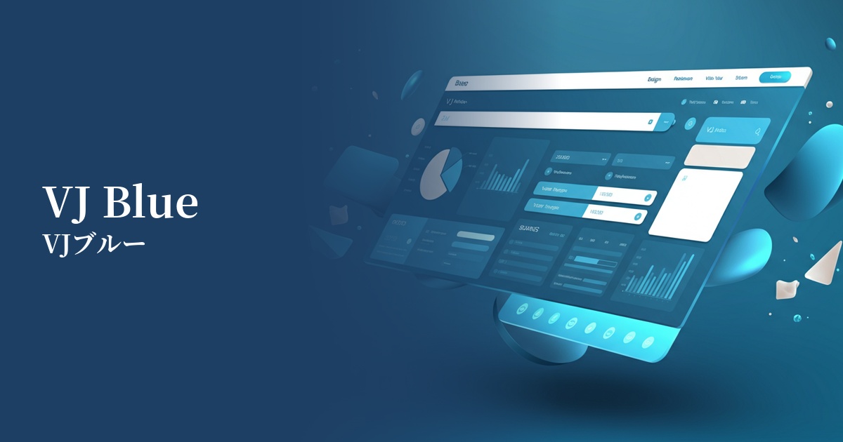
Visibility testing (UI component example)
Practical usage (best practices)
The most effective use is in CTA (Call To Action) buttons on landing pages and websites. Against a dark background or achromatic layout, VJ Blue buttons powerfully encourage user action.
When used in SaaS dashboards and data visualization tools for active menu items, graph highlights, and notification icons, it intuitively conveys the importance of information and improves usability.
It's also recommended to apply it to the typography in the hero section or to the hover effects of interactive elements. This can provide users with a sense of "touch and enjoyment" and increase overall site engagement.
Rather than using it extensively as a main color, the general rule is to use it as an accent color, typically in the range of 5 to 10%. Combining it with neutral colors such as black, dark gray, and white maximizes its cutting-edge appeal.
Recommended color scheme suggestions
Hot Pink (#FF69B4)
This is a classic combination for cyberpunk and synthwave. The vibrant colors complement each other, creating a futuristic, energetic, playful, and bold design.
Charcoal (#36454F)
By placing VJ Blue against a dark charcoal gray background, the blue's brilliance stands out, creating a sophisticated and futuristic feel. It's perfect for modern, understated, adult-oriented tech designs.
Alice Blue (#F0F8FF)
By combining it with a very pale, bluish-white, it creates a clean and cutting-edge impression. It softens the intensity of VJ Blue while resulting in a refreshing, high-tech design.