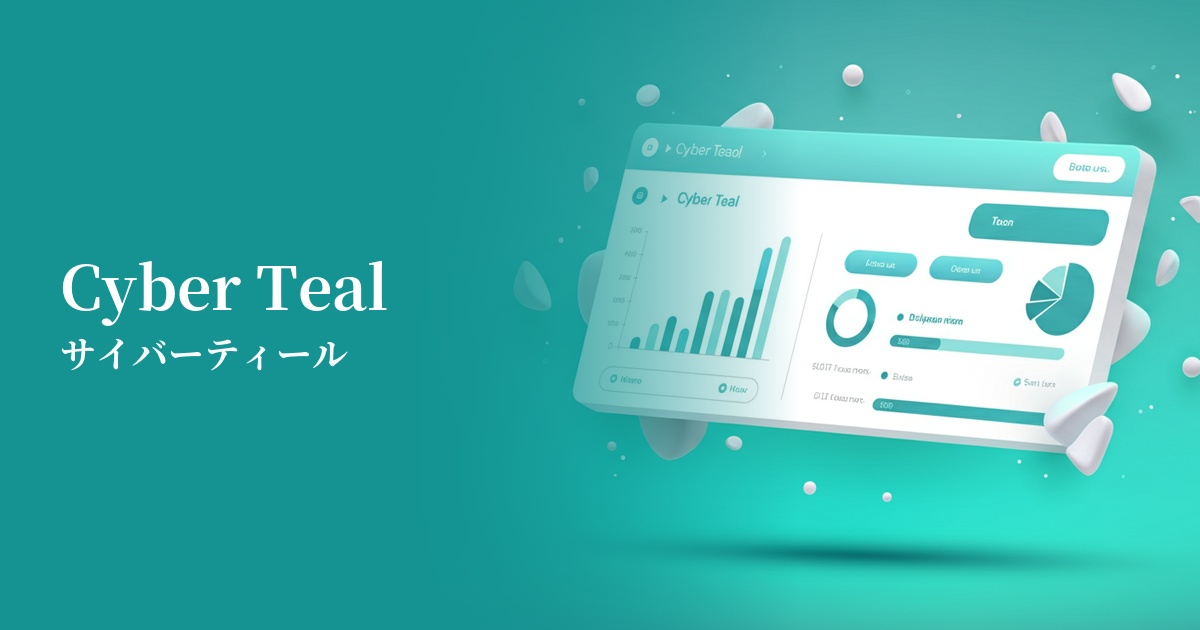
| English name | Cybermail |
|---|---|
| Katakana | Cyber Teal |
| HEX | #00E5B8 |
| RGB | 0, 229, 184 |
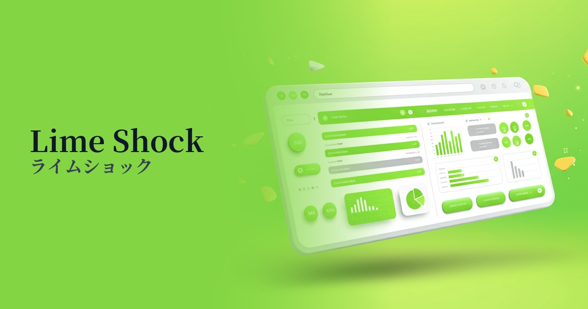
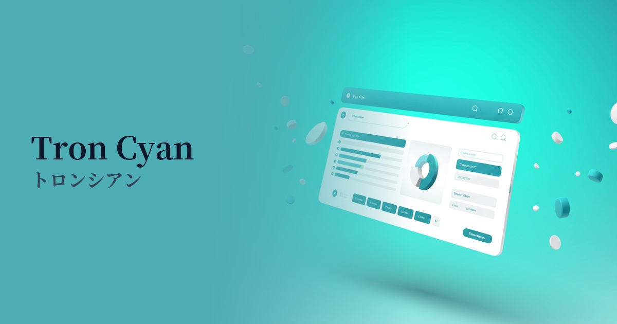
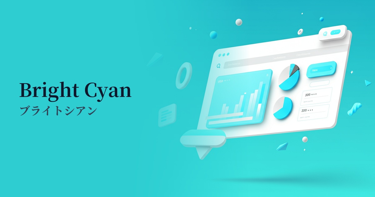
| Design Theme | Neon & Cyberpunk Colors |
Why is it a trend? (Background and reasons)
The rise of Cyber Teal stems from the rapid evolution of technology and its increasing integration into our lives. As futuristic concepts like AI, the metaverse, and Web3 become more commonplace, the design world has also seen a growing demand for colors that symbolize "advancement" and "digital sensibility." This color perfectly meets those expectations, exuding a futuristic and energetic presence.
The widespread adoption of dark mode is also a major contributing factor. High-saturation colors like cyber teal shine vividly against a dark background, maximizing their visual impact. The shift from minimalist and understated designs to more expressive and emotionally resonant designs has also fueled this color trend.
The psychological effects of design and UX
Cyber Teal gives viewers an impression of "advancement," "technology," "the future," and "innovation." Combining the intellectual image of blue with the vitality and growth of green, it is the perfect color to express the energetic dynamism of the digital world.
In UI/UX design, its high visibility effectively attracts user attention. Using it for CTA buttons, active status indicators, and important notifications guides users intuitively and facilitates smooth operation. However, because it's such a powerful color, overuse can lead to visual fatigue. It's most effective when used as an accent.
Visibility testing (UI component example)
Practical usage (best practices)
It is most effective when used for CTA (Call to Action) buttons and links. Especially in dark mode UIs, cyber teal buttons have a striking presence and strongly encourage user action. You can expect an improvement in conversion rates.
It's also recommended to use it as an accent color throughout your website or app. By using it selectively on active menu items, icons, highlighted sections of graphs, and loading animations, you can naturally guide the user's eye and instill a forward-thinking image of your brand.
In landing pages and key visuals, incorporating it as part of a gradient can create an immersive, cyberpunk world. Combining it with black or dark blue allows for a dramatic effect, as if light is shining through.
Recommended color scheme suggestions
Charcoal (#36454F)
The dark charcoal gray background maximizes the vibrancy of Cyber Teal. It creates a futuristic and sophisticated impression, making it an ideal combination for UIs of technology services and cool brand websites.
Deep Pink (#FF1493)
The intense contrast, reminiscent of neon signs, strongly reflects the synthwave and cyberpunk aesthetic of the 80s. It's recommended for highly entertaining designs that express playfulness and energy.
Alice Blue (#F0F8FF)
When combined with a very light, bluish-white, it creates a clean and light impression that is both cutting-edge and sophisticated. It brings a sense of cleanliness and futurism to modern interfaces where you want to organize and display information, such as SaaS dashboards.