| English name | Light Danger |
|---|---|
| Katakana | Light Danger |
| HEX | #FEE2E2 |
| RGB | 254, 226, 226 |
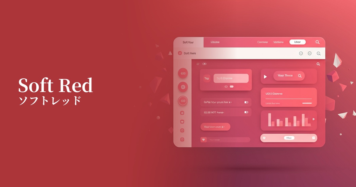
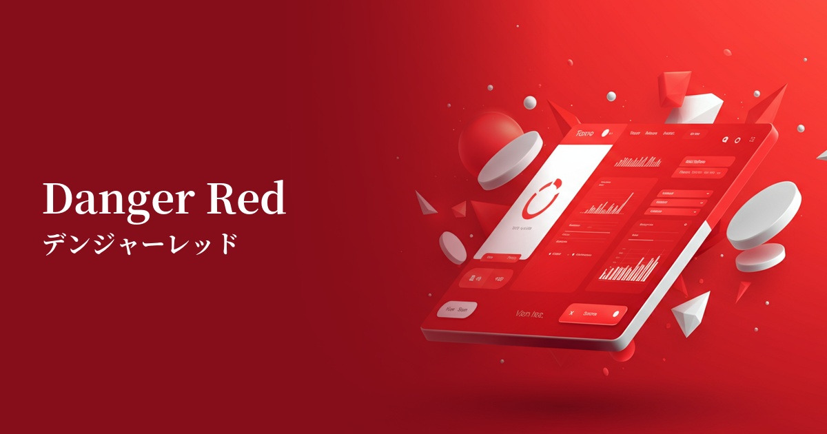
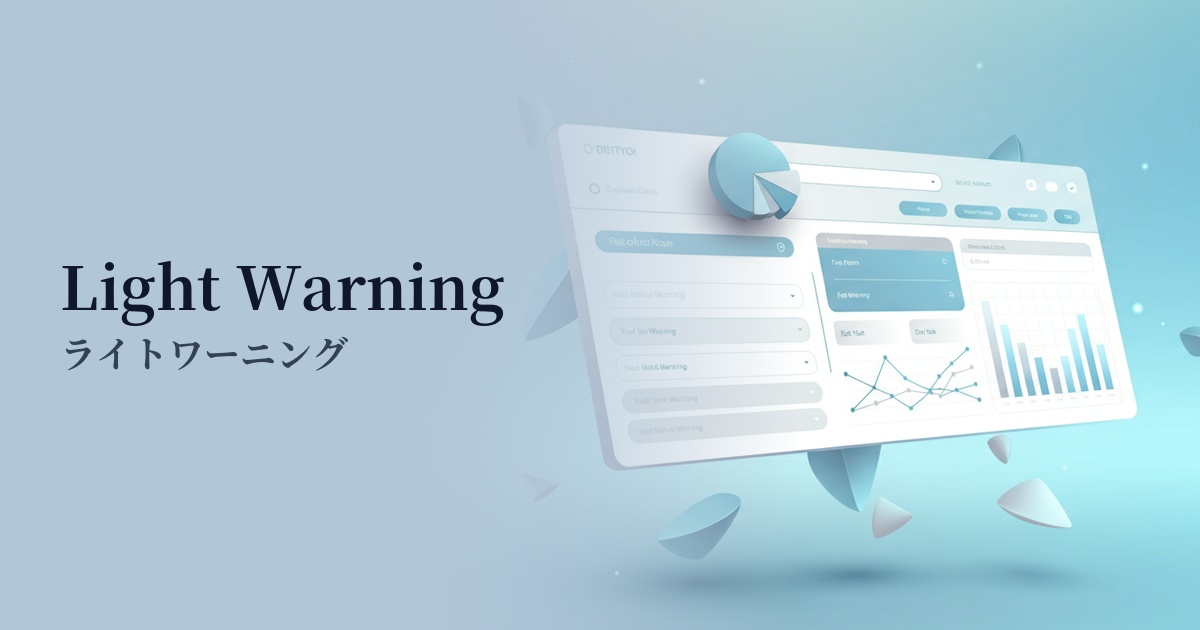
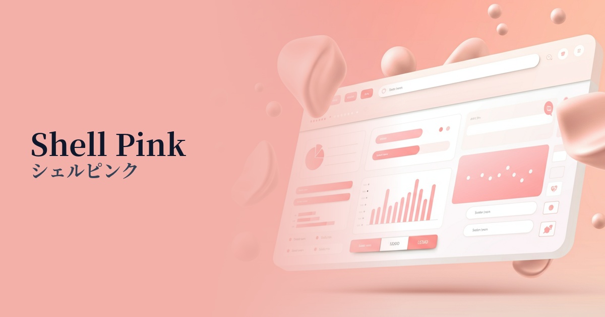
| Design Theme | UI System & Alert Colors |
Why is it a trend? (Background and reasons)
In recent years, web design and app UI have increasingly emphasized "user-friendly interfaces" that do not cause excessive stress to users. Traditional bright red warning colors could sometimes cause excessive anxiety or intimidation in users. Light Danger is used to convey the intention of a warning while reducing the psychological burden.
The popularity of design trends such as minimalism and soft UI is one reason why light danger is gaining attention. In an overall soft and clean design, strong primary warning colors tend to stand out. Light danger, with its muted tones, blends naturally into these modern designs and fulfills its functional role without disrupting the overall harmony.
Another contributing factor is increased awareness of accessibility. It has become standard practice to convey information not just through color, but by combining it with icons and text to communicate intent to a diverse range of users. Light Danger is highly effective as a "background color" to make warning icons and text messages stand out, and it plays a role in creating hierarchical information.
The psychological effects of design and UX
Light Danger inherits the inherent meanings of red, such as "danger," "caution," and "error," while also having a psychological effect that softens that impression. Because of its high brightness and low saturation, it is less intimidating to the user and encourages a calm response.
From a UI/UX perspective, it's suitable for conveying the nuance that "something has happened, but it can be resolved." Rather than causing panic in the user, it calmly informs them of the existence of a problem and smoothly guides them to the next action.
This color also conveys a sense of friendliness and softness. Therefore, it helps prevent error messages from standing out negatively and maintain the brand image, especially in the UI of services aimed at women or brands with a clean and gentle aesthetic.
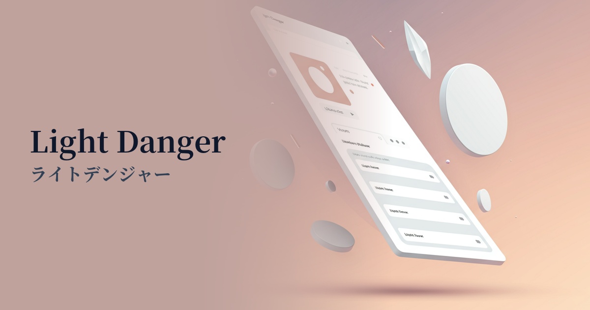
Visibility testing (UI component example)
Practical usage (best practices)
The most common use case is highlighting the background color of error fields in form input. By highlighting the areas where input errors have occurred, users can intuitively understand where they need to make corrections.
It's also effective as the background color for confirmation modal windows asking "Are you sure you want to delete?", and for the delete button. It functions as a gentle reminder to encourage users to pause and think.
It's also suitable for alert banners on dashboards and admin panels. It's ideal for notifying users of issues that aren't at the highest level of urgency but should still be noticed, such as "Backup failed" or "API connection is unstable."
The key is not to use Light Danger on its own. The general rule is to use this color as a background and then place dark red text, such as "Danger Red," or warning icons on top of it to ensure sufficient contrast and improve visibility.
Recommended color scheme suggestions
Davy's Gray (#555555)
Placing text in this color against a light danger background maximizes the readability of the warning. It easily meets WCAG contrast ratio standards, making it a reliable and accessible combination.
Firebrick (#B22222)
By using Light Danger as a background color and displaying icons and key keywords in this color, the intention to draw attention is clearly conveyed. Using similar colors maintains a sense of unity while intuitively expressing the seriousness of the warning.
Alice Blue (#F0F8FF)
This is effective not only for error notifications but also when considering the overall UI color scheme. By combining it with the clean and calming Alice Blue, the warning color doesn't stand out too much and blends naturally into a sophisticated design.