| English name | Soft Red |
|---|---|
| Katakana | Soft Red |
| HEX | #FCA5A5 |
| RGB | 252, 165, 165 |
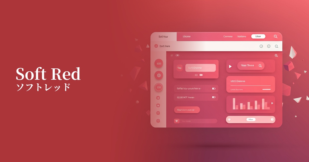
| Design Theme | UI System & Alert Colors |
Why is it a trend? (Background and reasons)
Traditional bright red warning colors (such as #FF0000) could cause significant anxiety and stress to users. Therefore, in the trend towards more user-friendly UIs, "soft red," which effectively conveys attention without being intimidating, has gained attention. This can be seen as a way to communicate information without compromising the user experience.
With minimalism and clean design becoming mainstream, there is a growing preference for soft, muted colors. Soft red is not too vibrant and harmonizes well with other neutral colors, making it easy to integrate into modern and sophisticated design systems.
One of the contributing factors is that the role of design is shifting from simply conveying information to "dialogue with the user." Soft Red is gaining value as a color that enables communication that gently guides the user, rather than the system unilaterally pointing out a "mistake," saying, "Please check this."
The psychological effects of design and UX
Soft red retains the inherent "warning" function of red, but its softness mitigates negative impressions such as "danger" or "failure." Users can recognize the warning but deal with it calmly without feeling excessive pressure.
Warm, gentle colors convey a sense of friendliness and reassurance. Using these colors when pointing out form input errors can help avoid giving the impression of blaming the user and convey a supportive nuance such as, "It's okay, we just need to fix this."
From a UI/UX perspective, it can be expected to reduce the psychological burden on users. For example, using it to display "low stock remaining" on an e-commerce site can attract attention without creating excessive anxiety, potentially leading to a more positive purchasing experience.
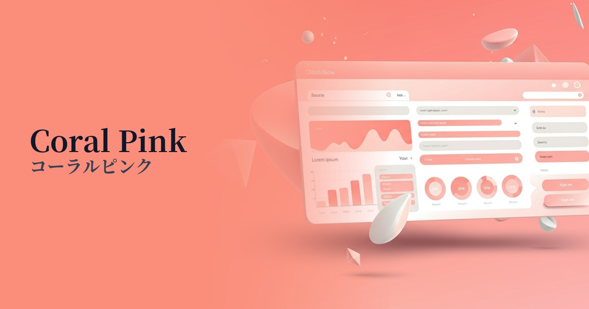
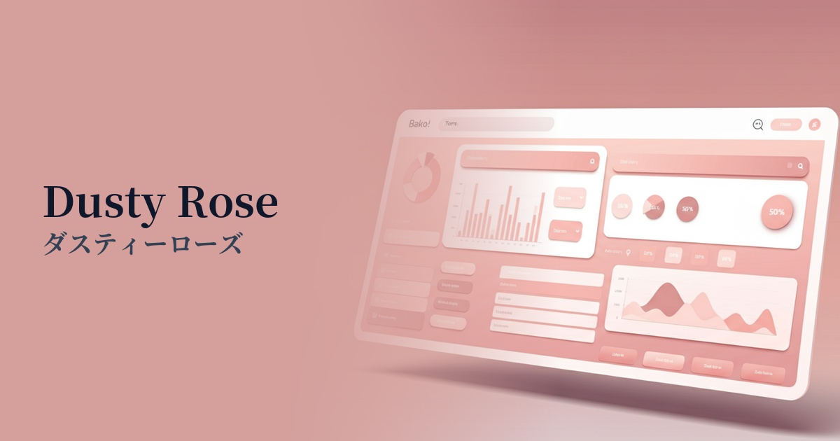
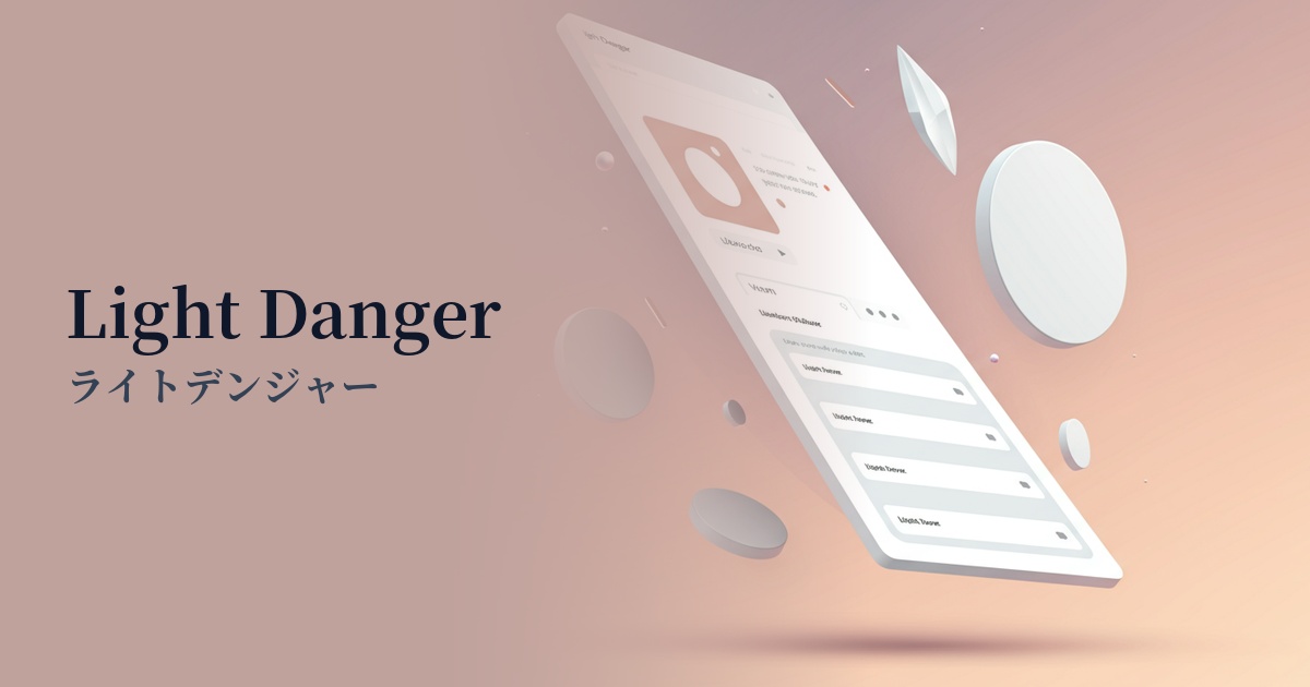
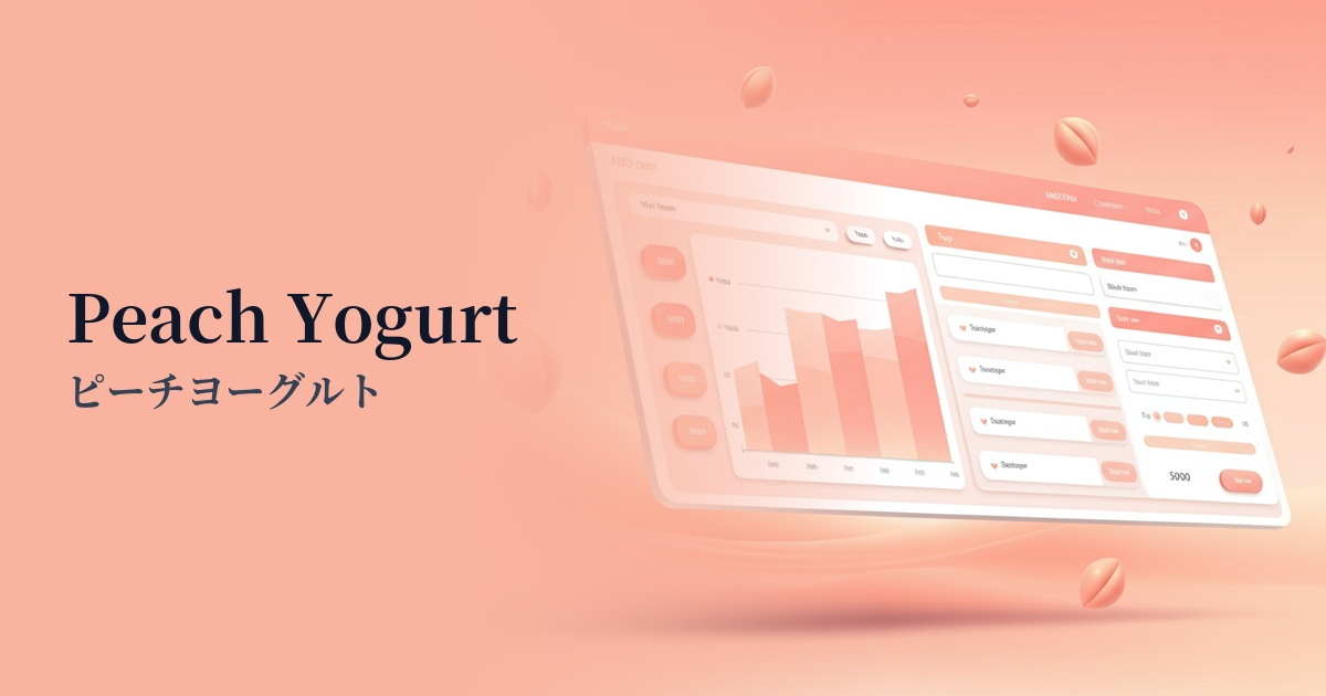
Visibility testing (UI component example)
Practical usage (best practices)
It's ideal for pointing out form input errors and validation issues. By using soft red for field borders and as the text color for error messages, you can gently yet clearly communicate which items have problems.
It can be used as the background color for notification banners and toasts that are not urgent but still want to inform users, such as "Your session is about to expire" or "Your draft has been automatically saved." It allows you to draw attention to important information without interrupting user interaction.
This is useful for highlighting data that requires attention (e.g., metrics that are not meeting targets, graphs showing a downward trend) in the management screen or dashboard. It is suitable for expressing a level of detail that is not a serious alert, but one that you want to prompt attention to.
When using this color for "delete" or "cancel" buttons, it's best to limit its use to situations where the operation is undone. For destructive operations that cannot be undone, it's advisable to use a stronger warning color, such as "danger red," and differentiate colors according to the level of danger.
Recommended color scheme suggestions
Dove Gray (#BDBDBD)
When combined with the gentle, neutral Dove Gray, it highlights the attention-grabbing role of soft red while creating an overall sophisticated and calm impression. It's perfect for a clean and modern UI.
Juniper (#4E6965)
Adding a deep Juniper accent gives the design depth and a sense of stability. The warmth of the soft red and the calmness of the Juniper complement each other, creating an impression of reliability.
Alice Blue (#F0F8FF)
Using Alice Blue, a very pale bluish color, as the background color enhances the warmth of the soft red, creating a very clean and light atmosphere. It's recommended for friendly designs that give users a sense of security.