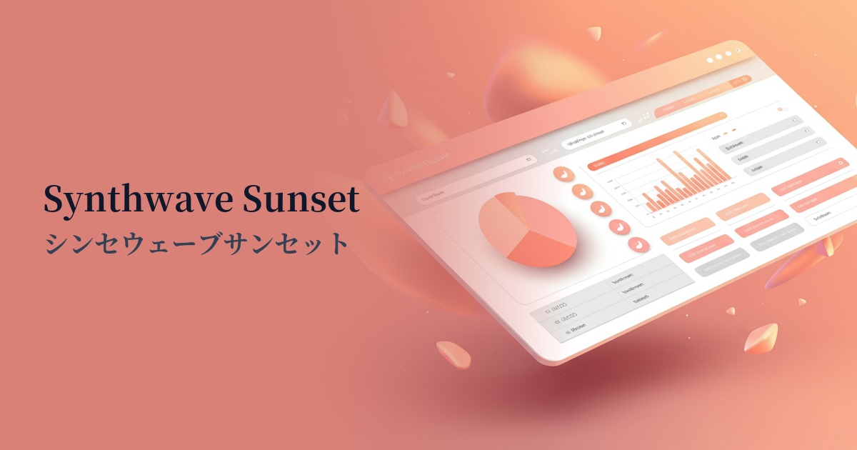
| English name | Synthwave Sunset |
|---|---|
| Katakana | Synthwave Sunset |
| HEX | #FF577F |
| RGB | 255, 87, 127 |
| Design Theme | Neon & Cyberpunk Colors |
Why is it a trend? (Background and reasons)
The popularity of synthwave sunsets is largely rooted in a return to 80s synthwave culture and retro-futurism. The nostalgic atmosphere reminiscent of neon signs and early video games blends with modern digital expression, and is being embraced as a new appeal, especially by Generation Z.
Furthermore, the rise of visually-oriented social media platforms like TikTok and Instagram is also driving this trend. Highly saturated colors instantly grab users' attention on their feeds and pique their interest in content, making them highly effective in increasing engagement. As a result, many brands and creators are actively adopting these colors.
It is also attracting attention as a color that expresses technological advancement and expectations for the future. In particular, in services and products that deal with cutting-edge themes such as the metaverse, AI, and blockchain, its futuristic and energetic image contributes to building a worldview and visually conveys innovation.
The psychological effects of design and UX
Synthwave Sunset, with its vibrant blend of pink and orange hues, strongly evokes positive emotions such as energy, passion, and joy. It has a psychological effect of uplifting and exciting users, enhancing their immersion in the content.
In UI/UX design, its high saturation gives it a powerful attention-grabbing ability. By using it on elements that you want to encourage specific user actions, such as CTA (Call To Action) buttons, important notifications, and sales information, you can improve visibility and expect to see an increase in click-through rates and conversion rates.
However, because it is such a striking color, overuse carries the risk of causing visual fatigue in users or making the entire interface feel cluttered. The key to maximizing its effectiveness is to use it sparingly as an accent to highlight important elements, rather than making it the main focus of the design.
Visibility testing (UI component example)
Practical usage (best practices)
One of the most effective uses is on landing pages (LPs) and campaign websites for call-to-action (CTA) buttons. Especially when combined with a dark background, the button stands out, naturally guiding the user's gaze and encouraging clicks.
Using this color as a gradient in the background of the hero area, along with other cyberpunk colors such as electric blue and synthwave purple, instantly conveys the site's futuristic worldview. In this case, it is important to choose white or light gray for the text and ensure a sufficient contrast ratio for readability.
In SaaS dashboards and app UIs, accent colors are effective for highlighting areas you want users to focus on, such as icons indicating an active status or badges notifying new notifications. This allows for an interface that maintains a calm overall tone while ensuring important information isn't overlooked.
It also works well as a key color in illustrations and infographics. Using this color in futuristic themes or entertainment-related content can create dynamic and memorable visuals.
Recommended color scheme suggestions
Midnight Blue (#191970)
The deep midnight blue background maximizes the vibrancy of the synthwave sunset. This combination is perfect for expressing a cyberpunk or 80s retro-futuristic aesthetic and is effective for drawing attention to CTA buttons and other elements.
Teal (#008080)
By combining it with teal, which is close to its complementary color, the two colors stand out, creating a dynamic and vibrant impression. This impactful color scheme is recommended for energetic brand images and creative portfolio websites.
Cream (#FFFDD0)
Using a soft cream color for the background and white space softens the strong presence of the Synthwave Sunset theme, creating a sophisticated and pop aesthetic. It's perfect for fashion and cosmetics websites that want to create a modern yet approachable atmosphere.