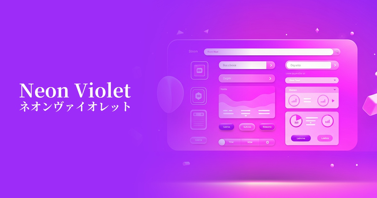
| English name | Neon Violet |
|---|---|
| Katakana | Neon Violet |
| HEX | #BF00FF |
| RGB | 191, 0, 255 |
| Design Theme | Neon & Cyberpunk Colors |
Why is it a trend? (Background and reasons)
The reason neon violet is gaining attention is that the aesthetic sensibilities of cyberpunk and retro-futurism have permeated the mainstream of web design. As themes such as virtual reality (VR), metaverse, and AI become more commonplace, there has been a growing demand for colors that have an unrealistic and futuristic feel.
The widespread adoption of dark mode is also a major contributing factor. Neon colors, which stand out vividly against a dark background, are highly effective as accents that enhance UI visibility and attract user attention. In today's information-saturated world, impactful colors that instantly catch the user's eye are key to increasing engagement.
The psychological effects of design and UX
Neon violet strongly conveys an impression of innovation, technology, and the future. Therefore, it is a very good match for cutting-edge SaaS products, games, and entertainment services. It effectively evokes feelings of "newness" and "excitement" in users, increasing their anticipation for the product.
At the same time, purple also possesses aspects of mystery and creativity inherent in the color. When used in creative portfolio websites or when you want to create a mysterious worldview, it can emphasize originality and an artistic atmosphere.
However, because it is a highly saturated and stimulating color, overuse can cause visual stress to users. From a UI/UX perspective, the key to maximizing its positive psychological effect is to use it sparingly as a "spice" to highlight important information or actions.
Visibility testing (UI component example)
Practical usage (best practices)
Its most effective use is as an accent color. In particular, in dark mode UIs, using it on active menu items, notification icons, and progress bars can naturally guide the user's gaze and improve usability.
Using this color for call-to-action (CTA) buttons on landing pages and special campaign sites can improve click-through rates. However, it's important to consider the balance with surrounding elements and ensure the button doesn't stand out too much.
Gradients created by combining neon colors, such as cyber yellow or electric blue, are also a popular technique. Using them in the background of the hero area or to decorate card-type UIs can create immersive and dynamic visuals.
It's also ideal for creating engaging interactions. The effect of buttons that are normally achromatic or muted in color changing to neon violet when hovered over clearly communicates feedback to the user and provides a pleasant experience.
Recommended color scheme suggestions
Jet (#343434)
This combination uses a deep, almost black Jet background with neon violet as an accent. The contrast between light and shadow is striking, emphasizing a cyberpunk or science fiction aesthetic. It's ideal for the UI of cutting-edge technology services.
Daffodil (#FFFF31)
The combination with vibrant Daffodil evokes a lively impression reminiscent of 80s retro-futurism and arcade games. The colors intensely complement each other, making it ideal for entertainment websites seeking a bold and playful design.
Gainsboro (#DCDCDC)
Using Gainsboro, a light gray, as a base and adding neon violet as an accent color creates a modern and sophisticated impression without being overly flashy. This is effective when you want to smartly highlight a specific action within a clean layout.