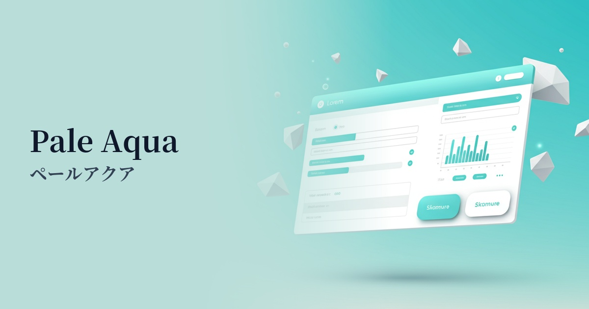
| English name | Pale Aqua |
|---|---|
| Katakana | Pale Aqua |
| HEX | #E0F7F6 |
| RGB | 224, 247, 246 |
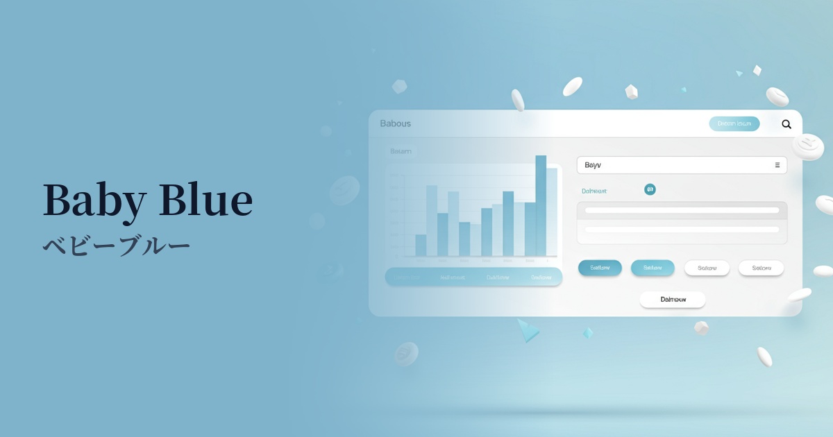
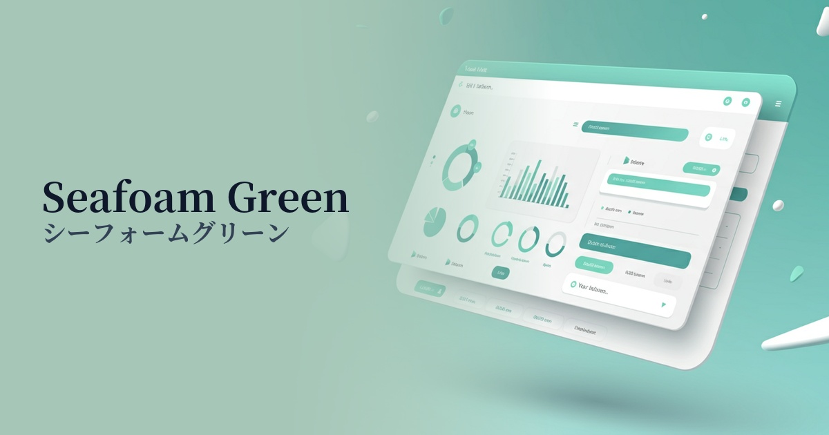
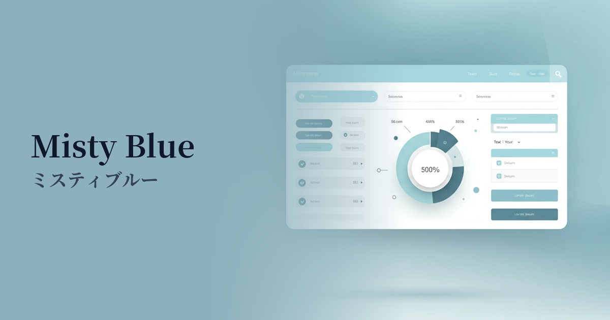
| Design Theme | Neutral & Minimal Background Colors |
Why is it a trend? (Background and reasons)
The popularity of pale aqua stems from a return to minimalism and clean design. In today's information-saturated world, users seek interfaces that are visually uncluttered and comfortable. This color, which gives a sense of spaciousness with its near-white feel, while adding warmth and individuality with its subtle hue, is a popular choice among many designers.
The growing interest in modern values such as wellness and sustainability is also driving this trend. Pale aqua, reminiscent of water, sky, and clean air, is strongly associated with images of physical and mental health and environmental consideration. Therefore, it is particularly effective in branding healthcare, clean beauty, and eco-related services and products.
Furthermore, it's attracting attention in the context of the fusion of technology and humanity. By incorporating soft colors like pale aqua into technology-based services, which tend to give off an impersonal and cold impression, a sense of familiarity and humanity can be created. This is expected to reduce the psychological burden on users in SaaS UIs and encourage a positive experience.
The psychological effects of design and UX
Pale Aqua evokes images of water and sky, giving users positive impressions such as "cleanliness," "transparency," and "trustworthiness." This psychological effect can help enhance brand image in clinics, financial services, and e-commerce sites that prioritize a clean image.
Pale blue-green is said to have a calming and relaxing effect. In UI/UX design, it reduces user stress and provides a sense of security. By using it as the background color for dashboards that are expected to be used for long periods of time, or for applications that handle complex information, it becomes easier to maintain user concentration.
It also has the effect of making a space appear larger and lighter. When combined with a minimalist layout that makes good use of white space, it can create a design that is not oppressive and has good airflow. It gives users a sense of openness and does not hinder their immersion in the content.
This color not only conveys freshness but also a sophisticated sense of "advancement." By using it in cutting-edge fields such as IT, AI, and fintech, you can build a clean and futuristic brand image while simultaneously shortening the psychological distance with users.
Visibility testing (UI component example)
Practical usage (best practices)
One of the most effective uses is as the main background color for a page. Using pale aqua instead of white adds softness and depth to the overall content, and offers the UX benefit of reducing eye strain even during prolonged viewing.
It's also effective as a background color to visually separate multiple information sections on landing pages and other similar pages. Alternating sections with a white background creates a pleasing rhythm on the page, making it easier for users to intuitively understand the structure of the information.
It's also recommended to set this color as the background color for card-style UI elements such as SaaS dashboards and pricing plan comparison tables. By grouping information into meaningful chunks and clearly defining the boundaries between them, it improves the overall visibility and readability of the interface.
It also plays a supporting role, enhancing vibrant accent colors. For example, when placing coral pink or bright yellow CTA buttons, using pale aqua as the background makes those colors stand out more, effectively guiding user action.
By using it as a hover effect for buttons and navigation menus, or as a background color to indicate an active state, it provides subtle yet clear feedback to user interactions, resulting in a highly usable UI.
Recommended color scheme suggestions
Slate Gray (#708090)
The lightness of pale aqua, combined with the calmness of slate gray, creates a color scheme that conveys reliability and stability. It's ideal for business websites and SaaS UIs, giving a professional impression while avoiding a stiff or formal feel.
Coral (#FF7F50)
The refreshing pale aqua and the warm, energetic coral are a perfect match. Using coral for CTA buttons and icons will attract the user's attention and create a positive and fun atmosphere.
Sandy Brown (#F4A460)
By combining pale aqua, reminiscent of a waterside, with sandy brown, like a beach, a natural and organic worldview is created. It brings warmth and approachability to lifestyle brands and wellness-related services.