| English name | Neutral Red |
|---|---|
| Katakana | Neutral Red |
| HEX | #FECACA |
| RGB | 254, 202, 202 |
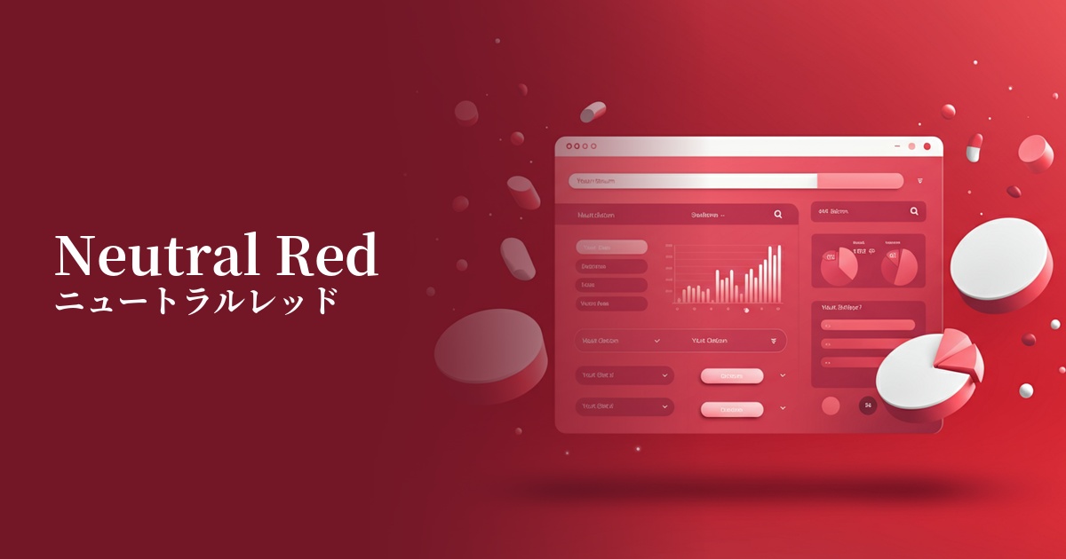
| Design Theme | UI System & Alert Colors |
Why is it a trend? (Background and reasons)
In recent years, web design has emphasized creating a more empathetic and comfortable experience for users, minimizing stress. This trend has led to a shift from traditional aggressive and strong warning colors to softer, less psychologically burdensome colors.
Neutral red perfectly embodies this trend. While fulfilling the attention-grabbing role of red, its muted, gentle hue prevents unnecessarily startling or unsettling users. This allows for sophisticated UI design that calmly communicates "something to be careful about" rather than "a major error."
The psychological effects of design and UX
Neutral red softens the negative connotations of strong red, such as "danger," "urgency," and "failure," and conveys a gentler, more constructive message, such as "caution," "check," and "needs correction."
This color lowers the psychological barrier for users, making them more likely to correct form input errors or minor configuration errors. Because it's not intimidating, users can calmly address the problem, which can ultimately help prevent a decrease in conversion rates and user drop-off.
From a UI/UX perspective, it helps to express a user-friendly approach and the brand's thoughtful attitude. Messages from the system will be received as gentle "notifications" rather than cold "warnings."
Visibility testing (UI component example)
Practical usage (best practices)
It's ideal for real-time validation messages in form input fields. It can communicate minor errors, such as "This field is required," without startling the user.
This is also effective when you want to convey that an action is destructive, such as delete or cancel, in a confirmation dialog, while maintaining a non-intimidating tone.
When used as badges or tags to indicate statuses such as "unread" or "needs attention" on dashboards or admin screens, they gently draw attention without interfering with other elements.
It can also be used as the background color for notification banners containing information that isn't urgent but that you want users to see, such as "Maintenance Notices" or "Terms of Service Updates."
Recommended color scheme suggestions
Davy's Gray (#555555)
Using this dark gray as the text color against a neutral red background ensures sufficient contrast. This is a classic combination for creating alert displays that meet WCAG standards and are easy for anyone to read.
Alice Blue (#F0F8FF)
This color scheme features a clean and spacious background accented with neutral red. Within a modern and minimalist UI, it gently yet clearly conveys only the essential information to the user.
Dove Gray (#6D6F6E)
By combining neutral red and muted gray, you can create a design system that gives an overall soft and sophisticated impression. It's ideal when you want to create a professional yet somehow warm atmosphere.