| English name | Sax Blue |
|---|---|
| Katakana | Saxophone Blue |
| HEX | #C9E2F8 |
| RGB | 201, 226, 248 |
| Design Theme | Pastel & Macaron Colors |
Why is it a trend? (Background and reasons)
In recent years, there has been a growing trend in web design to reduce visual fatigue caused by prolonged contact with digital devices and to provide users with a comfortable experience. Gentle and soft pastel colors like sax blue are compatible with minimalism and clean design philosophies, and are gaining attention as colors that give users a sense of security and calmness.
In particular, there is a growing need to intuitively convey reliability and cleanliness in SaaS management screens, healthcare services, and financial services. Saxophone blue inherits the image of "trust" and "integrity" associated with blue, but the addition of white gives it a lighter and more approachable impression, making it ideal for interfaces that handle complex information.
Furthermore, the fusion of technology with nature and humanity is a major trend. Even websites and services dealing with cutting-edge themes such as AI and DX are actively adopting soft, human colors like sax blue to avoid a cold, impersonal impression and to show a user-friendly attitude.
The psychological effects of design and UX
Saxophone blue evokes images of clear skies and pure water, giving users positive impressions such as "freshness," "cleanliness," and "openness." This psychological effect is particularly effective on wellness-related, environmental, and travel service websites.
Blue hues possess psychological effects such as "trust," "calmness," and "intelligence." However, because they are softer and less oppressive than strong blues, they give users a sense of security and make it easier for them to receive information in a relaxed state. They are ideal for B2B SaaS and financial service UIs where you want to create a friendly atmosphere without compromising trustworthiness.
The calming, muted colors can help soothe the user's mind and support their concentration on the content. Using them in dashboards or online learning platforms where prolonged use is expected can reduce cognitive load and lead to a more comfortable user experience.
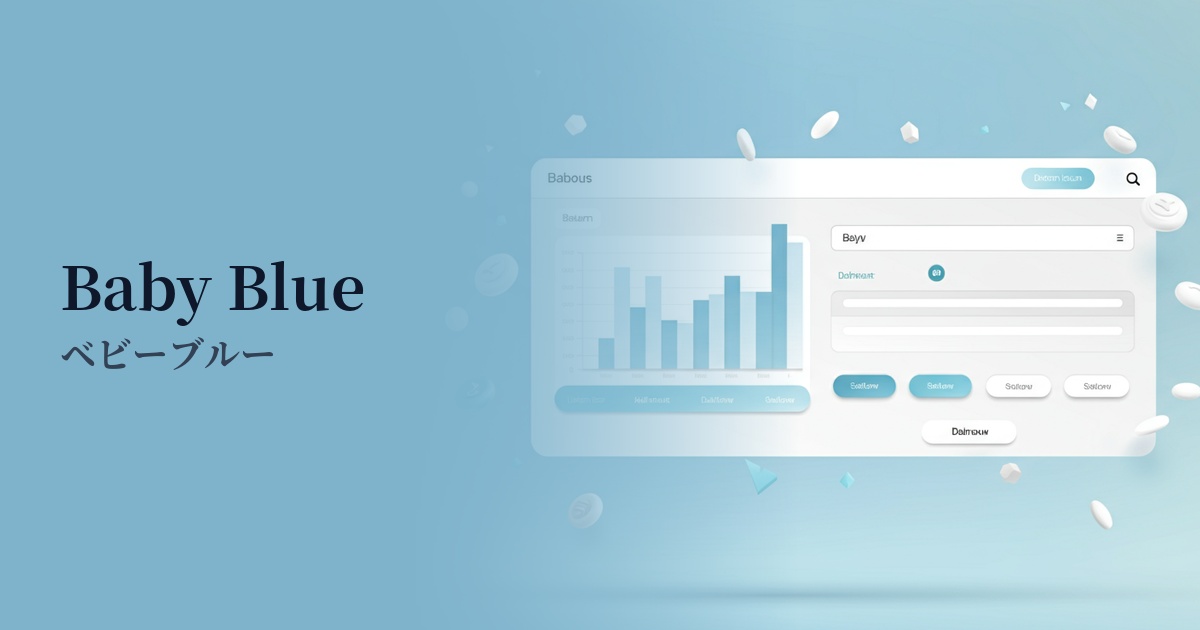
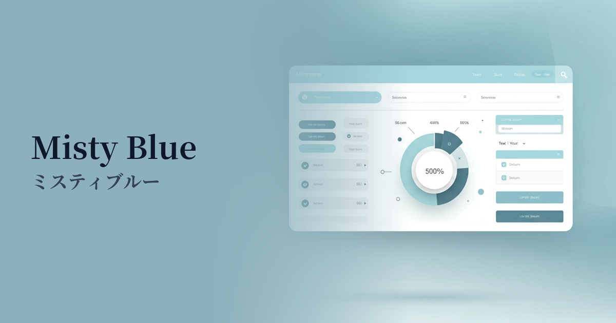
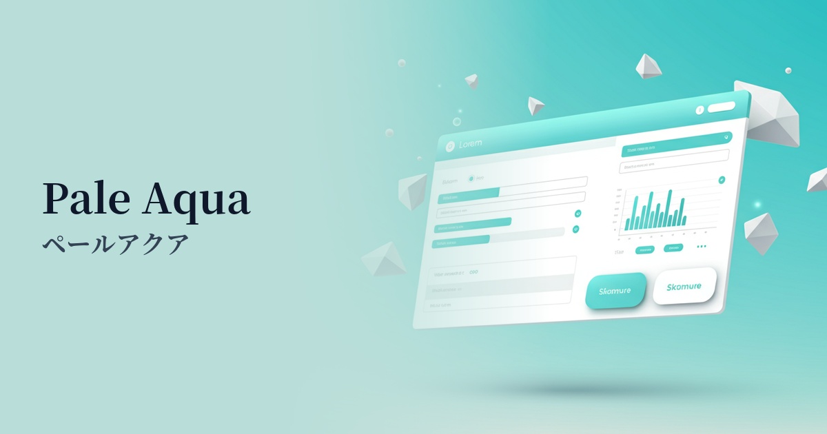
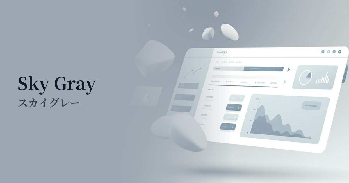
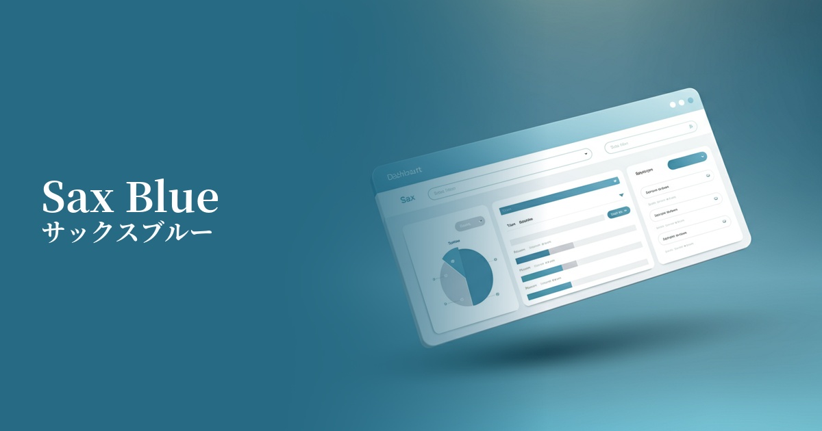
Visibility testing (UI component example)
Practical usage (best practices)
Using it as the background color for the entire site easily creates a clean and spacious impression. By making the content area white or light gray and using light blue as the outer background, a visual depth and a pleasant rhythm are created.
Using this color as the background color for headers and sidebars of information cards in SaaS application dashboards and settings screens helps organize information and reduces visual burden. It is also effective when used for UI elements that indicate an active state.
In minimalist designs based on white and gray, using accent colors on interactive elements such as CTA buttons, links, and icons can gently yet clearly guide user actions.
On landing pages for services where trustworthiness and a clean image are crucial, using this image boldly as the main visual or background in the first view can instantly convey the service's values. It also works well with photographs, particularly highlighting people and natural landscapes.
Recommended color scheme suggestions
Navy (#000080)
The lightness of the sax blue, combined with the gravitas of navy, creates a sense of stability and high reliability in the overall design. Using it in the header, footer, or important text of a business website will create a professional impression.
Sandy Brown (#F4A460)
The refreshing combination of light blue and warm sandy brown creates a friendly and comfortable atmosphere. It's recommended for lifestyle media and children's service websites where you want to balance a sense of security and fun.
Dove Gray (#6D6D6D)
Combining sax blue with neutral dove gray creates a modern and sophisticated impression. It's ideal for minimalist portfolio websites and technology-related services, conveying a clean and intelligent atmosphere.