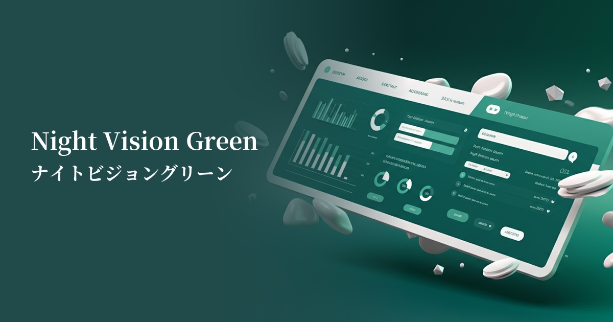
| English name | Night Vision Green |
|---|---|
| Katakana | Night Vision Green |
| HEX | #39FF14 |
| RGB | 57, 255, 20 |
| Design Theme | Neon & Cyberpunk Colors |
Why is it a trend? (Background and reasons)
In recent years, with the advancement of technology, particularly the increasing prevalence of concepts like AI and the metaverse, colors that express a digital, surreal worldview are gaining attention. Night Vision Green is a prime example of this trend. Its intense light, as if glowing in the dark, intuitively conveys a sense of the future and cutting edge.
Furthermore, the global boom in gaming culture, including esports and game streaming, is also boosting the popularity of this color. Neon colors, frequently used in the LED lighting and UI of gaming devices, give users a sense of excitement and immersion, and night vision green is widely accepted in this context.
It also pairs perfectly with "dark mode," a current UI design trend. Placing night vision green against a black or dark blue background maximizes its brilliance, ensuring extremely high visibility. This allows for a balance between a modern, sophisticated look and functionality.
The psychological effects of design and UX
Night Vision Green, as its name suggests, evokes the image of night vision scopes, strongly impressing users with advanced images such as "technology," "future," and "cyber." It also possesses an otherworldly and mysterious atmosphere, stimulating the viewer's curiosity.
From a UI/UX perspective, its high saturation and brightness make it extremely effective as an "accent color" that powerfully attracts user attention. When used for CTA buttons, important notifications, or indicators showing active status, it can accurately guide user actions.
However, its intense light can strain users' eyes if used over a wide area. For services where prolonged use is expected, it's crucial to limit its use to specific areas. While appropriate use can create a positive impression of energy and innovation, excessive use can give a cheap impression, so a sense of balance is required.
Visibility testing (UI component example)
Practical usage (best practices)
The most effective use is on call-to-action (CTA) buttons on landing pages (LPs) and service websites. Placing a button of this color against a dark background allows users to easily recognize where to click, which can lead to improved conversion rates.
In SaaS dashboards and analytics tools, it's recommended to use them as accents for elements such as active menu items, specific data points in graphs, and notification icons. They visually convey the importance of the information and help users intuitively navigate the interface.
When used in loading animations and hover effects, it can give the entire site a dynamic and futuristic feel. It can transform the time users spend waiting into an immersive experience that draws them into the brand's world.
You should avoid using it as the entire background color. It creates a strong visual pressure and significantly impairs readability. The key to a sophisticated design is to use it sparingly, as a "highlight," to create a striking effect.
Recommended color scheme suggestions
Charcoal (#36454F)
The deep charcoal gray background maximizes the brilliance of the night vision green. It most directly expresses a cyberpunk aesthetic while offering excellent visibility. This combination is perfect for creating a modern and cool impression.
Deep Pink (#FF1493)
When combined with a vibrant deep pink, it creates a retro-futuristic atmosphere reminiscent of 80s synthwave. The result is an energetic, playful, and highly impactful color scheme.
Dove Grey (#6D6968)
By pairing it with the soft impression of Dove Grey, the intensity of Night Vision Green is slightly softened, resulting in a more refined, tech-inspired design. It's recommended when you want to maintain a clean and intellectual atmosphere without being too assertive.