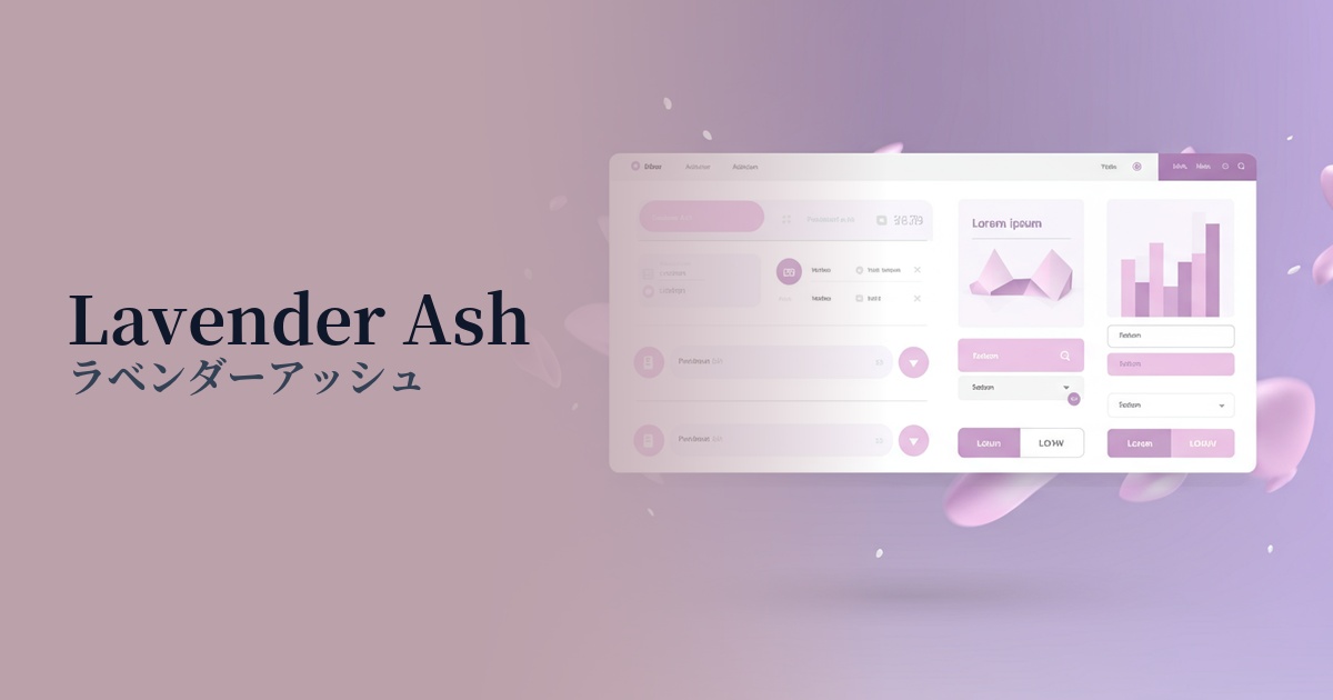
| English name | Lavender Ash |
|---|---|
| Katakana | Lavender Ash |
| HEX | #EAE4F2 |
| RGB | 234, 228, 242 |
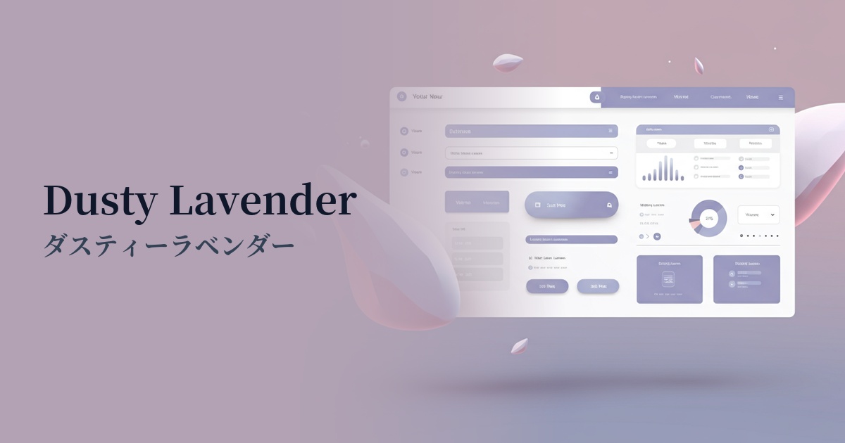
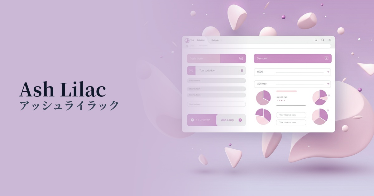
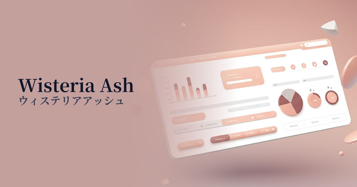
| Design Theme | Pastel & Macaron Colors |
Why is it a trend? (Background and reasons)
In recent years, web design has emphasized the concept of "digital well-being," which considers the mental and physical health of users. There is a growing tendency to avoid extremely bright colors and stimulating color schemes, preferring calm and eye-friendly color palettes, and subdued tones such as lavender ash are gaining attention.
This color falls under the trend of "dusty colors" or "muted colors," setting it apart from mere pastels. Its subdued saturation and subtle hint of gray create a sophisticated, mature feel without appearing childish. Therefore, it's an ideal choice for brands seeking to balance luxury with approachability.
Lavender ash offers excellent UX advantages, including high reproducibility on digital screens and reduced eye strain even during prolonged viewing. It functions as a highly effective background color when you want to break away from the monotony of white or light gray and add a subtle touch of individuality and softness to your website.
The psychological effects of design and UX
Lavender traditionally symbolizes relaxation, healing, and tranquility. Lavender ash, in addition to these effects, combines the neutrality and stability inherent in "ash" to provide users with a calm and reassuring psychological effect.
The subdued, elegant color palette conveys sophistication, grace, and a modern sensibility. Combined with a minimalist design, it subtly suggests the high quality of the product or service, enhancing the brand image.
Purple tones are said to stimulate creativity and intuition. The soft tones of lavender ash can appeal to both intellect and emotion in creative portfolio sites and blogs that share new ideas.
The bright and light color scheme gives users an open and honest impression. When used as a UI background, it helps create a clean and reliable interface without hindering content readability.
Visibility testing (UI component example)
Practical usage (best practices)
The most effective way to use it is as the background color for the entire website or for specific sections. This brings a consistent, soft, and calming atmosphere to the entire page, gently highlighting the content.
In UI design, it can be used as a background color for cards, modal windows, sidebars, and active menu items. It helps to visually group elements and clarify the information hierarchy.
It's also effective to use it as an accent color, rather than as the main color. In particular, in minimalist designs based on white or gray, using it for secondary buttons, tags, or icons can add subtle color and depth to the design.
Its calming characteristics make it ideal for services where users spend extended periods of time or where a sophisticated aesthetic is required, such as SaaS dashboards, wellness and meditation apps, beauty-related e-commerce sites, and personal portfolios.
Recommended color scheme suggestions
Slate Gray (#708090)
The soft impression of lavender ash is given definition by the intelligent and modern slate gray. This combination, when used for text and important UI elements, creates a highly readable and sophisticated professional atmosphere.
Pistachio (#93C572)
The tranquility of lavender ash is complemented by the natural, fresh vitality of pistachio green. This color scheme is effective when you want to convey a calm yet positive impression on organic product or wellness-related websites.
Rosy Brown (#BC8F8F)
By combining it with the adjacent rosy brown hue, it creates a unified, gentle, and feminine impression. This color scheme is ideal for lifestyle and beauty-related designs where you want to achieve both warmth and calmness.