
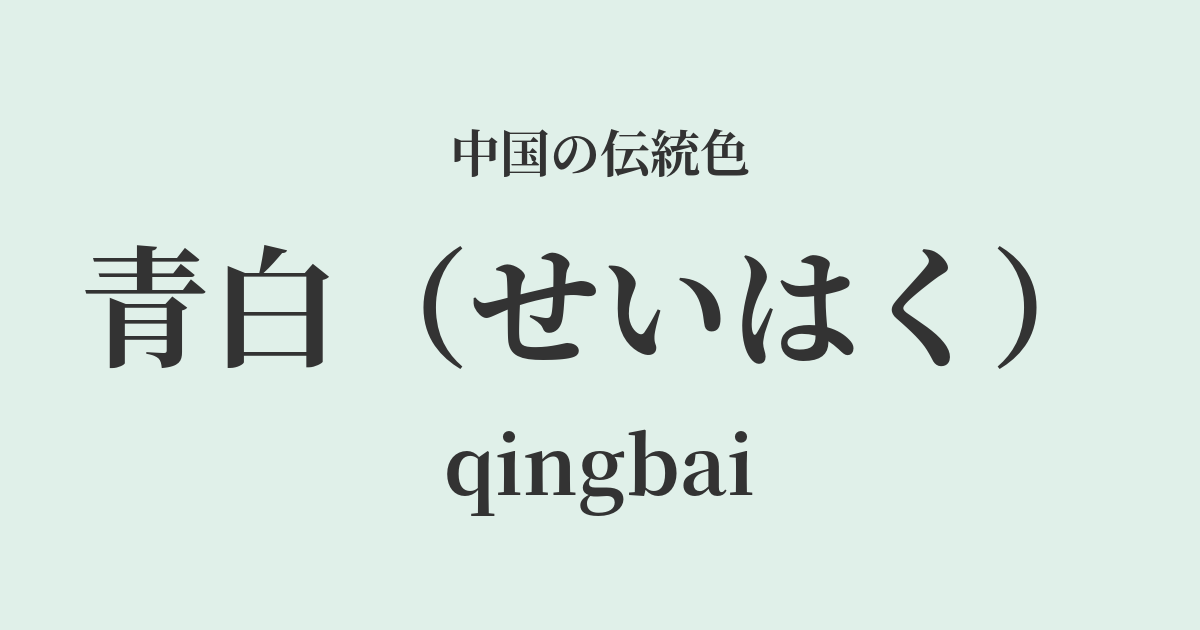
| Color name | blue white |
|---|---|
| reading | seihaku |
| pinyin | qingbai |
| HEX | #E0F0E9 |
| RGB | 224, 240, 233 |
What does "pale blue" mean? Origin and etymology
Seihaku, as its name suggests, refers to a very pale and delicate bluish-green color, a "white with a bluish tint." The origin of this color lies in the hue of "jade," which has long been considered the most precious treasure in Chinese culture, and especially in the color of white jade, which is considered the highest quality.
Among them, the jade known as "yōshōgyoku" (羊脂玉), which has a smooth and moist texture like sheep's fat, has a slight bluish or greenish tint within its pure white color. This understated and dignified hue is considered the origin of "bluish-white." This color, which is not simply white but conveys depth and purity, has become deeply rooted in people's aesthetic sensibilities as a symbol of purity and integrity.
The historical background of blue and white
The color pale blue gained particular prominence in Chinese history during the Song Dynasty (960-1279). During this period, a refined aesthetic sense developed among literati, and simple, introspective beauty was valued more than extravagant ornamentation.
This aesthetic sensibility was embodied in "Celadon Porcelain," produced primarily in the Jingdezhen kilns of Jiangxi Province. Celadon porcelain exhibits a pale bluish-white color, reminiscent of clear water, ice, or jade, as the white clay body containing trace amounts of iron is visible beneath the translucent glaze. Due to its mystical hue, it was also called "Yingqing" or "Raoyu," and was loved by people of all social classes, from emperors to commoners. It can be said to be the culmination of the high skill and aesthetic sense of Song dynasty potters who sought to express the ideal color of jade in ceramics.
Blue and white in Chinese art and crafts
The pale blue hue is most beautifully expressed in Song Dynasty celadon porcelain. The delicate carved floral patterns on the surface of the vessel emerge like shadows through the thin layer of glaze, creating a serene and poetic atmosphere. When held up to the light, its transparency and the subtle shades of blue become even more striking, leaving a deep impression on the viewer.
In fashion culture, pale, elegant colors like bluish-white were favored for the attire of nobles and literary figures. When expressed in lustrous silk fabrics, this color subtly changes in hue depending on the light, creating a very elegant impression. Understated yet dignified, bluish-white also symbolized the wearer's intelligence and inner richness.
Color scheme preview
This is to check the readability of the text when this color is used as the background.
Blue and white color scheme proposal
Moon White (#D9E4E8)
By combining it with an even paler blue than moonlight, it creates a quiet and clear atmosphere. It's a very elegant and calming color scheme that evokes the moonlight in the night sky or the scene of a winter morning.
Anzu (#FBC870)
Adding a warm, soft apricot yellow gives the coolness of the pale blue a more approachable feel. This color scheme evokes the gentleness of spring sunshine and gives a youthful, bright impression.
Silver mouse (#AFAFAF)
By combining it with a neutral gray like silver-gray, the sophisticated atmosphere of the pale blue is further enhanced. It's a stylish color scheme that gives an intelligent, modern, and urban impression.
Practical Scenes
In interior design, blue and white bring a sense of cleanliness and tranquility to a space. Using them on large areas such as wallpaper, curtains, and sofas creates a bright and calming atmosphere throughout the room. Adding blue and white porcelain vases or tableware as accents is also a lovely idea. It harmonizes well with minimalist and sophisticated spaces, regardless of whether they are Japanese or Western in style.
In fashion, blue and white convey an elegant and intellectual impression. Incorporating them into blouses and dresses made from natural materials such as silk, linen, and high-quality cotton creates a cool and refined look. Because it's not a color that stands out too much, it's easy to match with other colors, expanding your styling options.
In web and graphic design, using it as a background color can create a clean and trustworthy image. It is particularly well-suited for high-end brand websites and content with wellness or spiritual themes.