
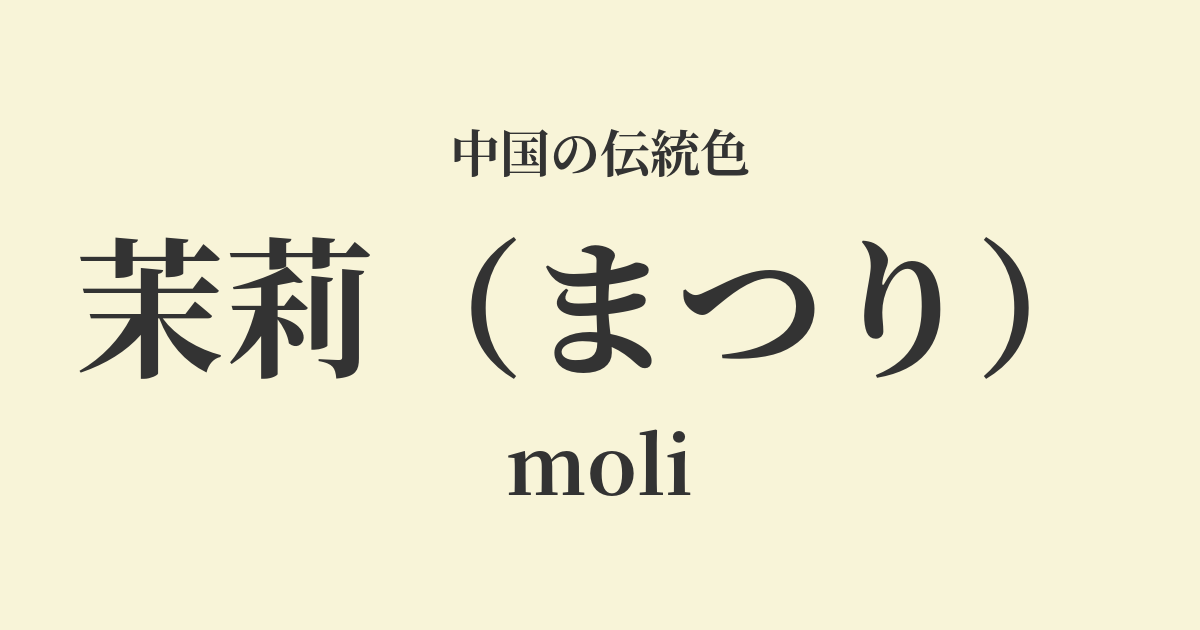
| Color name | Mari |
|---|---|
| reading | festival |
| pinyin | moli |
| HEX | #F8F4D8 |
| RGB | 248, 244, 216 |
What is Jasmine? Origin and Etymology
Matsuri, as its name suggests, is a warm, slightly yellowish white color derived from the jasmine flower. It is characterized by a soft and gentle hue, different from pure white.
This color symbolizes the purity, elegance, and delicate beauty of the jasmine flower. The Chinese name for jasmine, "茉莉花 (mòlìhuā)," is said to have originated from the ancient Persian word "yasmin," which was transmitted via the Silk Road, reflecting its deep history.
The historical background of jasmine
It is said that jasmine flowers were introduced to China from the Western Regions during the Han Dynasty. Their fragrant scent and delicate appearance quickly attracted people, and they became especially popular among the ladies of the court during the Tang Dynasty. They enjoyed the pure fragrance of jasmine by using it as a hair ornament or wearing it as a perfume.
During the Song Dynasty, "Jasmine Tea," flavored with jasmine flowers, spread among the common people and became deeply ingrained in their lives. It is thought that from this time onward, the color "Jasmine" came to be recognized not only as something noble, but also as a familiar color that was close to people's daily lives.
During the Ming and Qing dynasties, many writers and painters used jasmine as a subject for their poetry and paintings. Its understated yet elegant whiteness was seen as a symbol of the spirituality and aesthetic sensibilities they aspired to.
Jasmine in Chinese Art and Crafts
In fashion culture, jasmine yellow was a color that expressed elegance and purity, and was particularly favored in women's clothing. Pale cream-colored silk fabrics and Hanfu with delicate embroidery gave the wearer an elegant and refined impression. Especially as summer clothing, it created a cool and refreshing atmosphere.
In the world of ceramics, the warm, ivory-like white color found in the white porcelain of the Ding ware kilns produced during the Song dynasty is similar to the hue of jasmine. Furthermore, the white background of blue and white porcelain produced in places like Jingdezhen also played a role in highlighting the pure beauty of jasmine.
In painting, especially in the art of Gofuku (a type of Japanese painting technique), when depicting white flowers, a very small amount of yellow or green is sometimes mixed with gofun, a white pigment. This creates a natural, soft white color that is not too cold, like that of a jasmine flower.
A group of surprises in a silent state, Yukiyuki Kiyoka Ikushu
Color scheme preview
This is to check the readability of the text when this color is used as the background.
Jasmine's color scheme proposal
Lotus root color (#EEDAD3)
The combination of the pure cream color of jasmine and the gentle pink of lotus root creates a very soft, feminine, and elegant impression. It's a calm and soothing color scheme that evokes the feeling of spring's arrival.
Tensei (#80A4CD)
The warm white of jasmine and the clear blue of sky blue complement each other, creating a refreshing and intellectual atmosphere. Its clean and sophisticated impression makes it suitable for design work as well.
Matsuka (#E0D8A7)
Jasmine and pine blossom, both plant-derived colors, create a natural and calming harmony. They possess the warmth and comfort of earth tones, making them ideal for creating a natural and relaxing space.
Practical Scenes
In interior design, using jasmine yellow as a base color for wallpaper, curtains, and sofa covers brightens the entire space and creates a calm and warm atmosphere. It also pairs well with wooden furniture and houseplants, making it suitable for creating a natural and comfortable space.
In the world of fashion, jasmine-colored dresses and blouses give the wearer a pure and elegant impression. When paired with natural materials such as silk and linen, the softness of the color is further enhanced, allowing for a graceful style.
In web and graphic design, using this color as a background enhances content readability while giving the entire site a clean and calming feel. It is a particularly good match for minimalist designs, natural brands, and wellness-related themes.