| English name | Ghost White |
|---|---|
| Katakana | Ghost White |
| HEX | #F8F8FF |
| RGB | 248, 248, 255 |
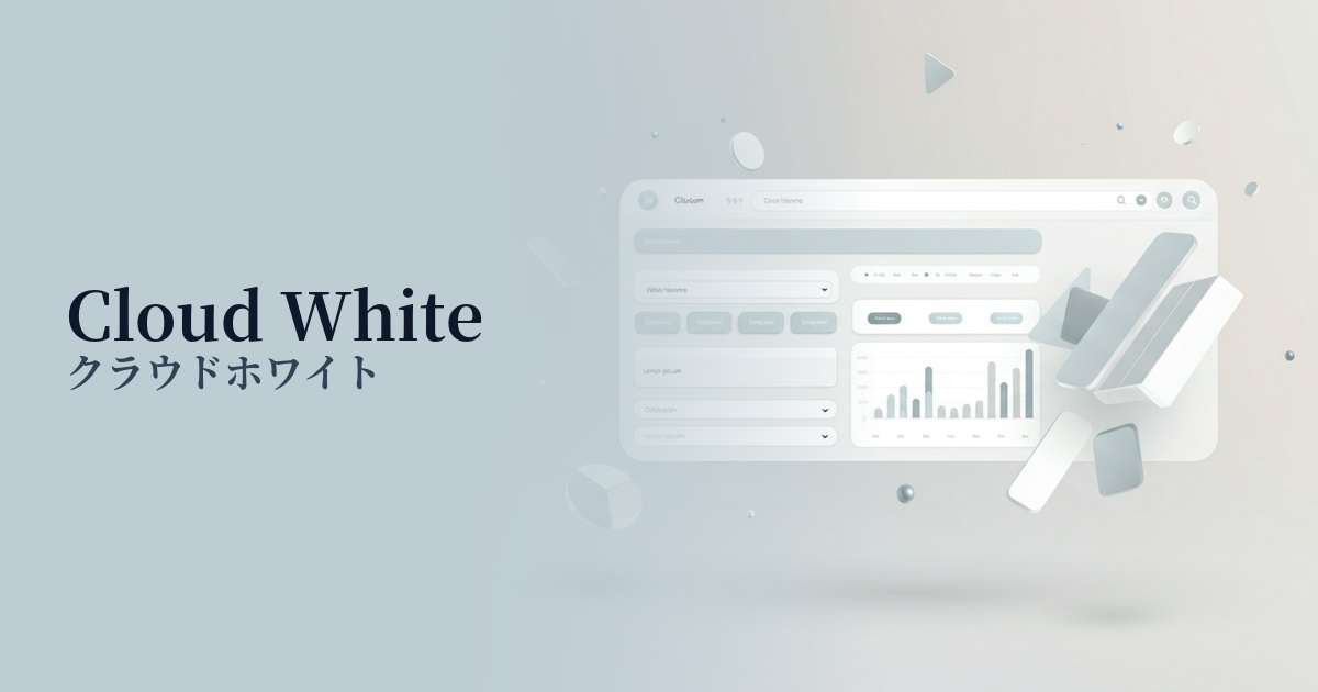
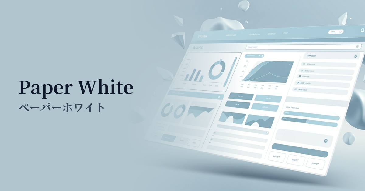
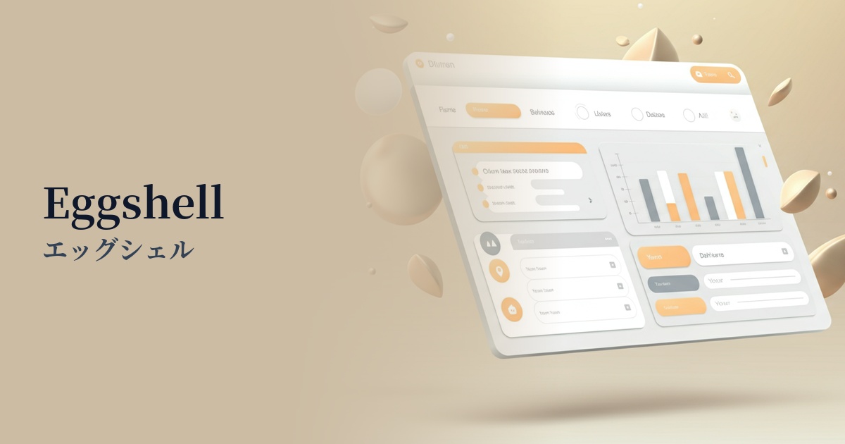
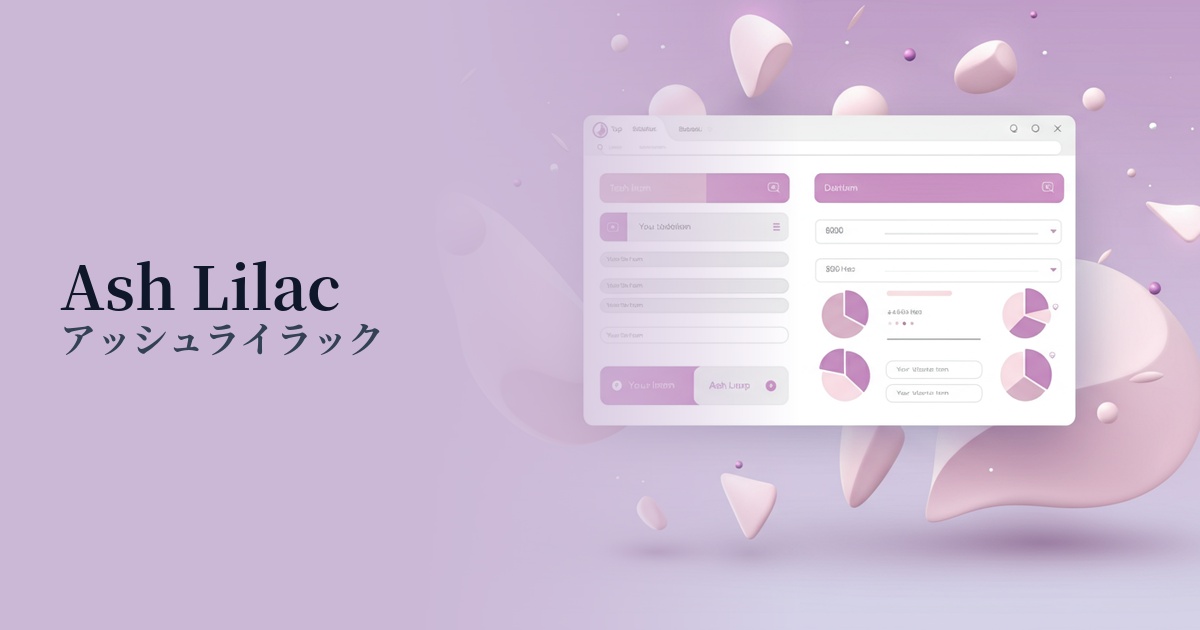
| Design Theme | Neutral & Minimal Background Colors |
Why is it a trend? (Background and reasons)
The recent trend towards minimalism and clean aesthetics in web design is behind the popularity of Ghost White. This slightly bluish color softens the sharpness and coldness of pure white (#FFFFFF), creating a softer, more eye-friendly impression. In today's world, where prolonged screen time is commonplace, it's gaining attention as an option to reduce user visual strain.
Furthermore, the widespread adoption of dark mode is another reason for the popularity of Ghost White. Dark mode against a pure white background can sometimes have too much contrast, making it difficult to read. Ghost White maintains a moderate brightness while suppressing light stimulation, providing a seamless user experience with minimal discomfort when switching to dark mode.
This color excels at making whitespace look beautiful and intentional. Using ghost white in the spaces between content creates an open layout that doesn't feel cramped. As a result, it is increasingly being adopted by many websites that prioritize a sophisticated aesthetic, such as technology companies, fashion brands, and architectural designs.
The psychological effects of design and UX
Ghost White conveys a sense of cleanliness, sophistication, and tranquility to users. While maintaining the clean image of pure white, the addition of a subtle bluish tint creates a more modern and intellectual atmosphere. This calming color is expected to soothe the user's mind and encourage concentration on the content.
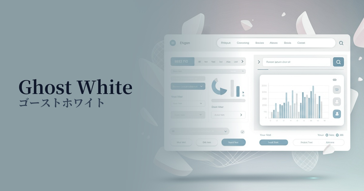
From a UI/UX perspective, this color functions as a "quiet protagonist." Because it's not overly assertive, it's ideal for highlighting other visual elements, typography, and photographs. Even on information-heavy dashboards and article pages, using ghost white as a background reduces visual noise and helps users process information smoothly.
This color is also characterized by its ability to evoke a sense of spatial expanse and lightness. It brings a feeling of openness to websites and provides users with a stress-free browsing experience. When combined with a minimalist design, its effect is further enhanced, indirectly conveying the brand's transparency and integrity.
Visibility testing (UI component example)
Practical usage (best practices)
The most common use is as the main background color for an entire website. It is particularly effective in creating a clean and consistent aesthetic, especially in portfolio sites where you want to highlight the visuals of products or works, or in minimalist e-commerce sites.
It's also useful for card-style UIs that arrange multiple information blocks, and for dividing content into sections. For example, placing ghost white cards on a light gray background creates natural depth and boundaries without using shadows, resulting in an elegant and organized layout.
It is also effective as a background color for interactive elements such as buttons and forms. However, from an accessibility standpoint, careful consideration must be given to the contrast ratio with the text color on top. To meet WCAG standards, it is safe to combine it with text in colors such as black, dark gray, or dark blue.
It also excels as a "supporting" color to enhance accent colors. It acts as a canvas, making vibrant primary colors appear more appealing without overpowering them. It provides a quiet, calming foundation for the overall design, supporting the flow of the eye to key elements.
Recommended color scheme suggestions
Slate Gray (#708090)
The clean impression of Ghost White is complemented by the calmness and trustworthiness of Slate Gray. It's ideal for business websites and SaaS UIs where you want to project an intelligent and sincere image. It also offers high readability as a text color, resulting in a stable and reliable design.
Rosy Brown (#BC8F8F)
Adding a touch of reddish rosy brown as an accent brings warmth and gentleness to the cool impression of ghost white. This color is recommended for lifestyle media, cosmetics brands, and other designs that want to balance approachability and sophistication.
Cornflower Blue (#6495ED)
The subtle bluish tint of Ghost White and the refreshing hue of Cornflower Blue harmonize beautifully. This combination is perfect for conveying a sense of cleanliness and innovation in technology services and healthcare-related websites.