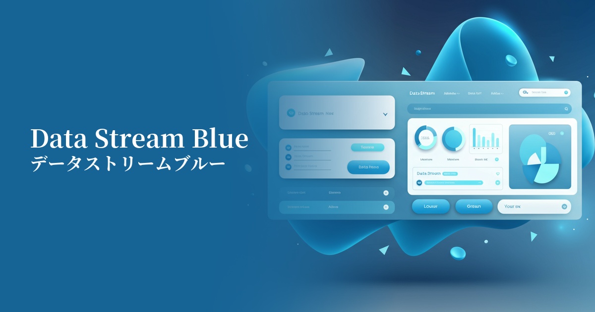
| English name | Data Stream Blue |
|---|---|
| Katakana | DataStream Blue |
| HEX | #007CF8 |
| RGB | 0, 124, 248 |
| Design Theme | Neon & Cyberpunk Colors |
Why is it a trend? (Background and reasons)
The rise of Data Stream Blue is driven by the rapid evolution of technologies such as AI, the metaverse, and Web3. This color is being adopted by many designers as an ideal color for visually representing the flow of digital information and the expansion of virtual spaces.
Another major factor is the modern reinterpretation and resurgence of 1980s cyberpunk and retrofuturistic aesthetics. Coupled with the widespread adoption of dark mode, this color, which stands out vividly against a dark background, has become indispensable for creating futuristic and sophisticated interfaces.
The psychological effects of design and UX
DataStream Blue is based on the psychological effects inherent in the color blue, such as "trust," "stability," and "integrity." This allows it to instill a sense of security in users, even in financial and security-related services.
At the same time, its high saturation and brightness strongly evoke a future-oriented image of "advanced technology," "speed," and "innovation." This makes it extremely effective for startups and technology companies to showcase their vision and technological capabilities.
From a UI/UX perspective, this color offers extremely high visibility. It instantly captures the user's attention and has the power to highlight important buttons, links, and notifications. When used appropriately, it can naturally guide the user to the desired action.
Visibility testing (UI component example)
Practical usage (best practices)
Using graphs, charts, and key KPIs in SaaS dashboards and data analysis tools significantly improves information readability. It allows for intuitive communication of data flows and changes.
Using this color for CTA buttons on landing pages (LPs) can improve conversion rates. Placing buttons of this color in a minimalist design naturally draws the user's attention.
One of the most effective ways to use it in dark mode designs is as an accent color. Against a black or dark blue background, Data Stream Blue appears as if it's glowing, creating a cyberpunk and immersive world.
When using it as the brand color throughout a website, combining it with white or light gray will maintain a clean and modern impression. The result is a design that is advanced yet light and unobtrusive.
Recommended color scheme suggestions
Gainsboro (#DCDCDC)
It gives a clean and modern impression. The vibrant Data Stream Blue stands out, allowing you to build a clear and highly readable UI. It's ideal for SaaS admin panels and corporate websites.
Deep Pink (#FF1493)
This combination evokes the synthwave and cyberpunk aesthetic of the 80s. The striking contrast is eye-catching and creates a unique impression on event websites and creative portfolios.
Midnight Blue (#191970)
By placing Data Stream Blue against a dark background, it creates an effect that makes the color appear to glow. This is ideal when you want to maintain visibility while simultaneously achieving a sense of luxury and the mysterious atmosphere of technology.