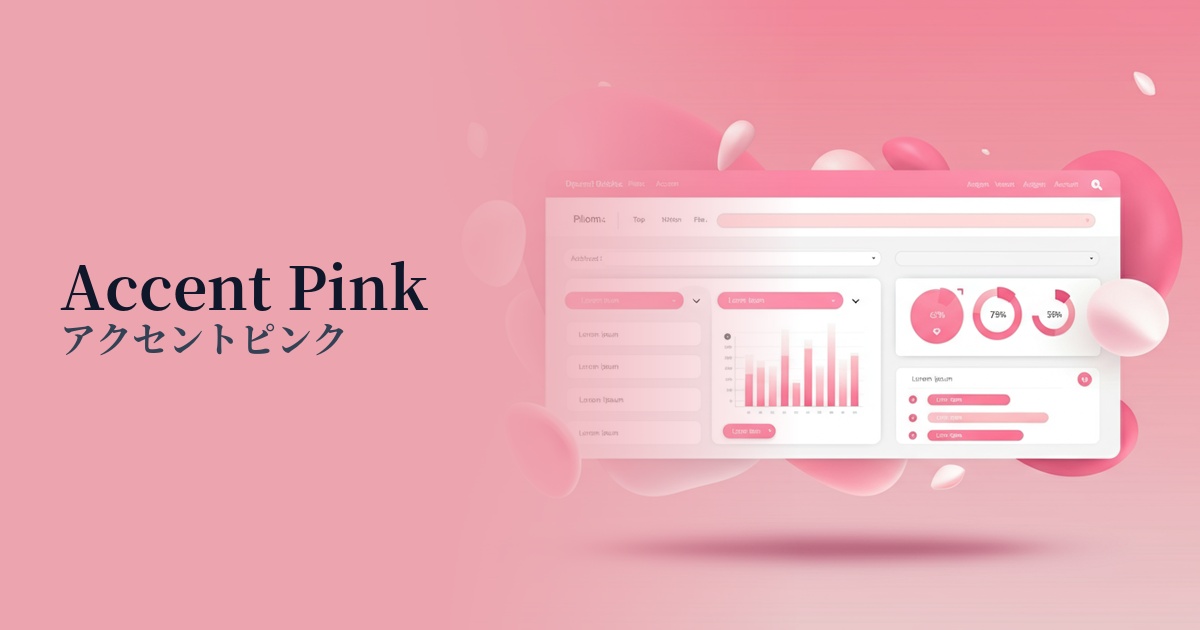
| English name | Accent Pink |
|---|---|
| Katakana | Accent Pink |
| HEX | #EC4899 |
| RGB | 236, 72, 153 |
| Design Theme | UI System & Alert Colors |
Why is it a trend? (Background and reasons)
Recent web design trends have shifted from the long-dominated minimalism towards a more expressive and emotionally resonant style. As users and designers, accustomed to simple UIs, seek vibrancy and individuality, bright and energetic colors like accent pink are gaining attention as elements that breathe life into designs.
In today's world, where social media and online services are an integral part of daily life, positive communication in the digital space is extremely important. This color has the power to intuitively convey emotions such as "fun," "friendliness," and "creativity," and is increasingly being adopted by brands and services targeting younger generations in order to build emotional connections with users.
Even in seemingly mundane SaaS dashboards and fintech services, where a solid, reliable image is expected, accent pink proves effective. Adding this color as an accent to a UI that tends to be functional and impersonal brings a human touch and approachability to the interface, playing a strategic role in increasing user engagement.
The psychological effects of design and UX
Accent pink, with its vibrant color, conveys positive and energetic impressions such as "liveliness," "passion," and "fun." It is expected to uplift users' spirits and foster a positive attitude towards the service.
Because it is a highly saturated and very eye-catching color, it has a powerful attention-grabbing effect on the UI. It naturally guides the user's gaze to a specific element, clearly communicating the designer's intention of "I want you to look here" or "I want you to click this."
It expresses not just "cuteness," but also modern values such as "boldness," "confidence," and "creativity." It can be a powerful tool for highlighting a brand's individuality and differentiating it from others.
However, because this color has such a strong energy, using it excessively can cause visual fatigue in users or detract from the overall quality of the design. The key to maximizing its effect is to use it only as an "accent," limiting the area it covers.
Visibility testing (UI component example)
Practical usage (best practices)
One of the most effective uses is in CTA (Call To Action) buttons. By using them for buttons that encourage actions that directly lead to conversions, such as "Buy Now" or "Try for Free," you can dramatically increase visibility and contribute to a higher click-through rate.
Using a small area of the logo on elements that indicate information you don't want users to miss, such as important notifications, new message badges, or sales information labels, can effectively draw attention.
While maintaining a calm overall tone to the UI, the use of accent pink on certain icons and illustrations subtly highlights functions and information, intuitively supporting user interaction.
Incorporating keywords in the headline or background graphics in the first view of a landing page (LP) can create a strong first impression on visitors and instantly convey the energy and creativity of your brand.
In graphs and charts used in SaaS dashboards and similar applications, using this color to highlight specific data series visually conveys the importance of the information and improves data readability.
Recommended color scheme suggestions
Navy Blue (#000080)
When combined with a deep, sophisticated navy blue, the vibrancy of the accent pink is further enhanced, creating a professional yet modern and refined impression. It is ideal for SaaS UIs and corporate websites where reliability is paramount.
Antique White (#FAEBD7)
The warm antique white background softens the energetic impression of the accent pink, creating a harmonious and approachable atmosphere. This is recommended for lifestyle media and other similar platforms that want to project a friendly, organic, and creative vibe.
Charcoal (#36454F)
A dark background, such as charcoal gray, has the effect of making accent pink appear futuristic and powerful. This combination is highly effective when you want to combine cutting-edge technology with a playful spirit in technology or entertainment services.