| English name | Grayish Purple |
|---|---|
| Katakana | Grayish purple |
| HEX | #A59AAD |
| RGB | 165, 154, 173 |
| Design Theme | Muted colors & earth tones |
Why is it a trend? (Background and reasons)
In recent years, web design has seen a growing interest in digital wellness and mindfulness, leading to a preference for calming tones that do not stress users. Muted, muted colors like grayish purple are at the heart of this trend because they are easy on the eyes and create an environment where users can easily concentrate on the content.
This color retains the mystique and sophistication of traditional vibrant purple, while the addition of gray gives it a neutral and refined impression. In today's world, where inclusive expression that transcends gender is valued, its broad appeal to a wide range of users has made it popular.
Another major reason is its excellent compatibility with other muted colors, earth tones, and neutral colors. While based on a minimalist design, it expresses a unique individuality and depth that sets it apart, making it a popular choice for many brands and creators.
The psychological effects of design and UX
Grayish purple conveys an impression of calmness, intelligence, sophistication, and elegance. The mystical image of purple combined with the gentle and neutral image of gray creates a psychological effect that brings a sense of security and trust to the user.
From a UI/UX perspective, using this color as a background reduces the user's mental burden and encourages prolonged service use and content viewing. It is particularly helpful in maintaining user concentration on information-heavy dashboards and article pages.
However, due to its low saturation, caution is needed when using it for call-to-action (CTA) buttons. It is necessary to ensure sufficient contrast with the surrounding colors and to design it in a way that intuitively conveys that it is a clickable element (e.g., color change on mouseover, addition of shadows, etc.).
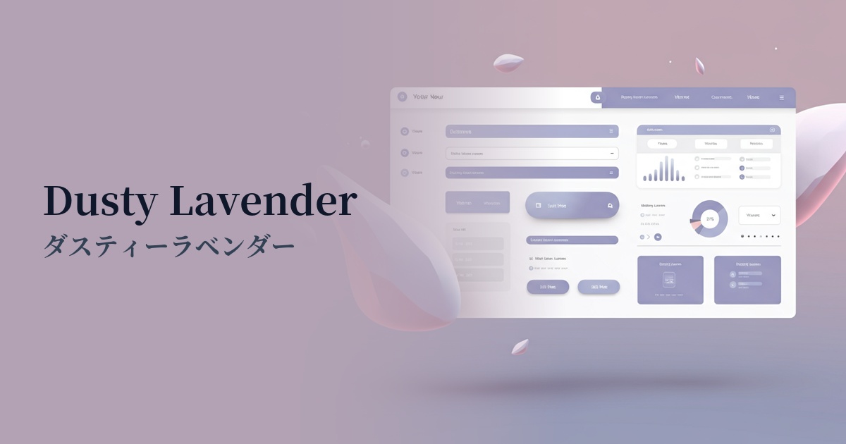
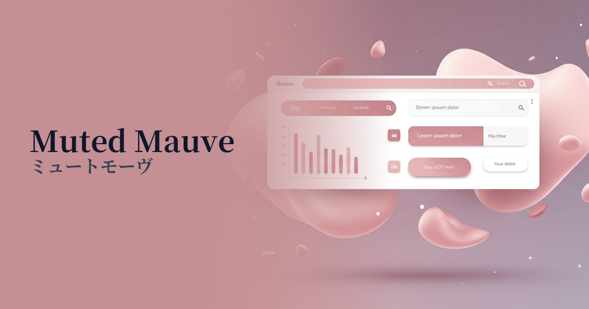
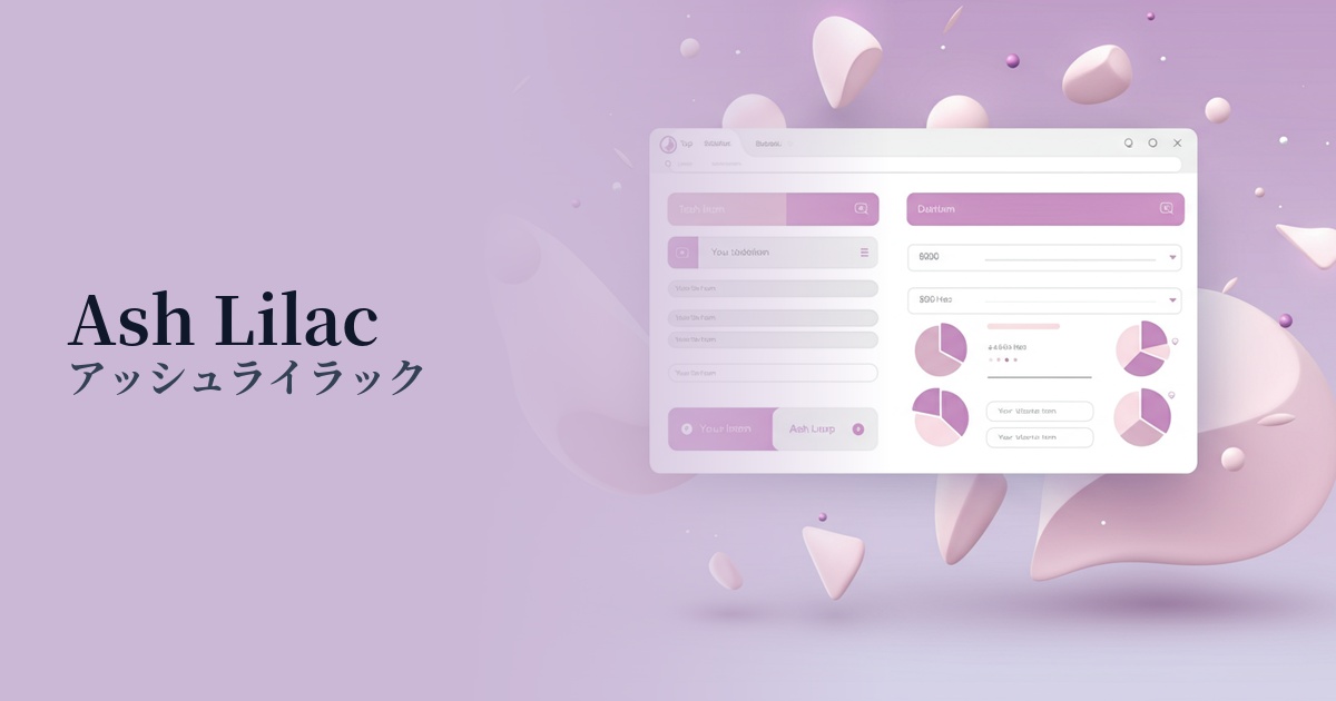
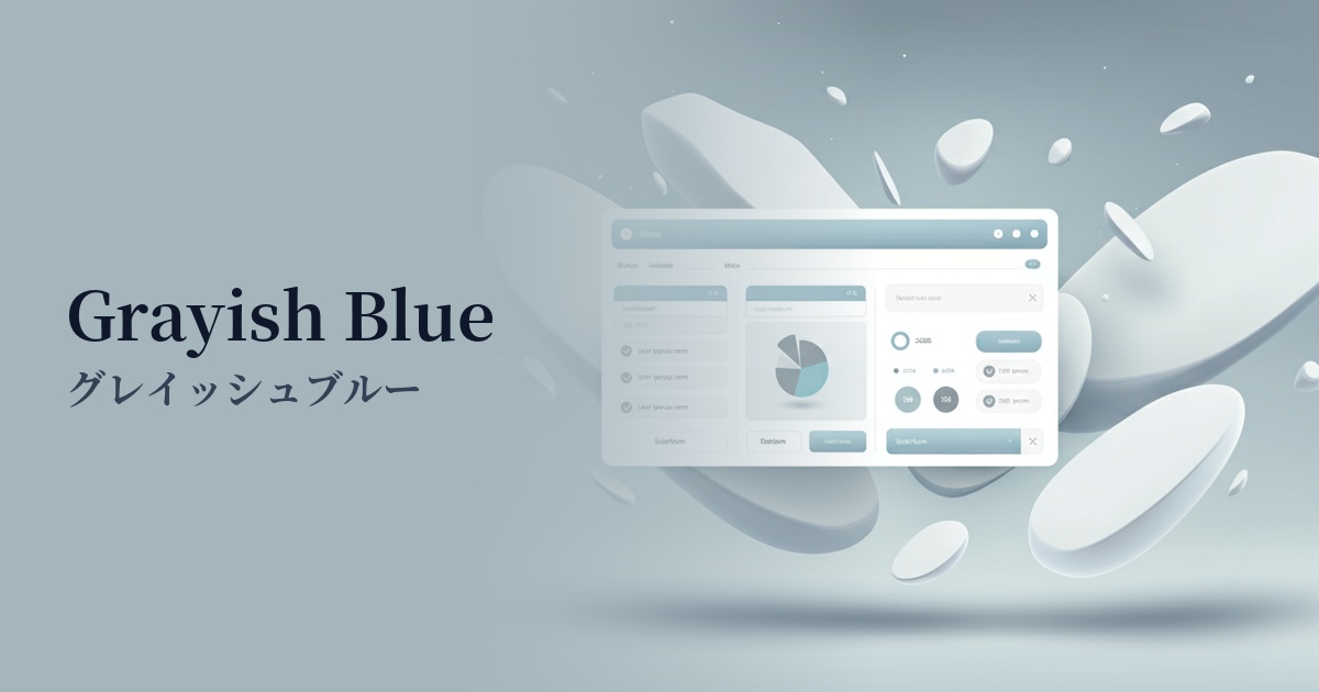
Visibility testing (UI component example)
Practical usage (best practices)
It's ideal for use as the main color across an entire website, creating a sophisticated and refined aesthetic. It's particularly effective when you want to convey a minimalist and modern brand image.
It's also recommended for use as a background color to enhance content. Combining it with white or off-white text creates an elegant atmosphere while maintaining readability. It's ideal for portfolio websites where photos and illustrations are the main focus.
By incorporating accent colors into buttons, icons, and link text in a design based on white or gray, you can naturally guide the user's eye without being overly flashy. This creates rhythm and depth in the overall design.
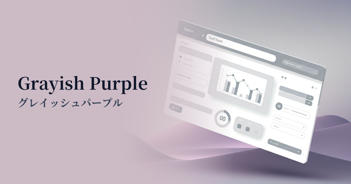
It is also suitable for designing the UI and management screens of SaaS products. By using it for the background of data display areas, sidebars, headers, etc., you can create a professional interface that allows users to work calmly.
Recommended color scheme suggestions
Navajo White (#FFDEAD)
The calming atmosphere of grayish purple is complemented by the warmth of Navajo White. This color scheme creates a natural and comfortable space, making it ideal for lifestyle and wellness-related websites.
Slate Gray (#708090)
Combining grayish purple with dark gray creates an intelligent and modern impression. This color scheme is recommended for SaaS UIs where reliability is essential, and for websites of technology companies.
Rosy Brown (#BC8F8F)
Adding a touch of Rosy Brown to a grayish-purple creates a sophisticated yet subtly glamorous look. It adds depth and individuality to cosmetic brands, fashion sites, and websites offering high-quality services.