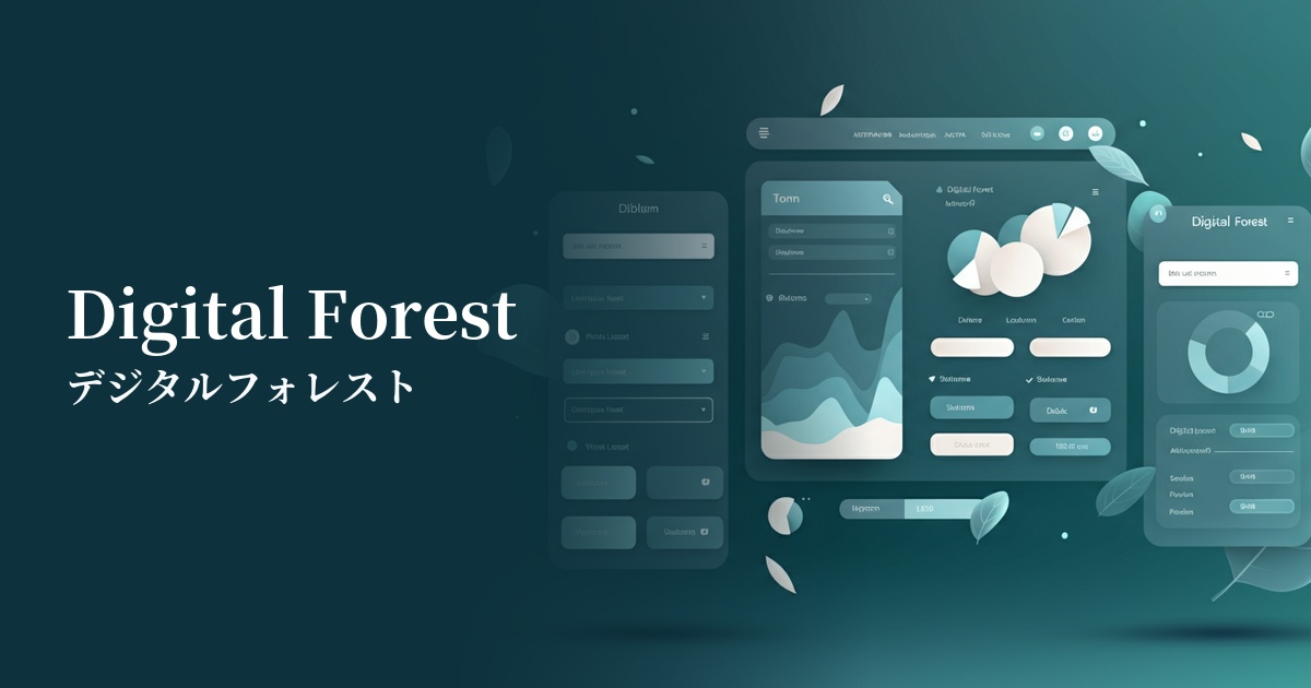
| English name | Digital Forest |
|---|---|
| Katakana | Digital Forest |
| HEX | #00FA9A |
| RGB | 0, 250, 154 |
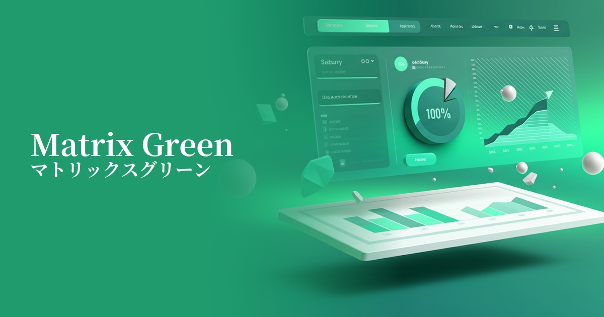
| Design Theme | Neon & Cyberpunk Colors |
Why is it a trend? (Background and reasons)
The rise of digital forests is driven by the rapid evolution of technologies such as AI and the metaverse. This vibrant neon green is being adopted by many designers as a color symbolizing virtual spaces and futuristic interfaces. The combination of "forest," meaning nature, and "digital" is ideal for expressing the contemporary theme of the fusion of technology and nature.
Another major factor is the revival of Y2K culture and cyberpunk aesthetics from the late 1990s and early 2000s. The "slightly retro futuristic feel" envisioned by people at that time is being reinterpreted by contemporary creators, and highly saturated colors like those in Digital Forest are being embraced with a fresh appeal.
From a UI/UX perspective, the widespread adoption of dark mode has also boosted the popularity of this color. Digital Forest stands out remarkably against a dark background, acting as a highly visible accent. It is effectively used in digital advertising and social media content where the goal is to instantly capture the user's attention.
The psychological effects of design and UX
As its name suggests, Digital Forest strongly evokes keywords such as "digital," "technology," and "future." By incorporating it into websites and apps, you can intuitively convey a cutting-edge and innovative brand image to users.
High-saturation green is a color that evokes vitality, energy, and dynamism. It gives users a positive and dynamic impression, visually supporting the product's image of "growth" and "evolution."
Because it is a very conspicuous color, it has a powerful attention-grabbing effect in UI design. It is effective for guiding the user's gaze to a specific action or highlighting important notifications. However, due to its intensity, overuse can cause visual stress to the user, so care should be taken with the area in which it is used.
Visibility testing (UI component example)
Practical usage (best practices)
The most effective use is as an accent color. In dark mode or achromatic designs, using it exclusively for CTA (Call To Action) buttons, important links, and indicators showing active status can guide users towards conversion without confusing them.
It's effective to use this color to highlight specific key metrics in SaaS dashboards and data visualization graphs. By clearly contrasting it with other colors, users can instantly understand the priority of the information.
Incorporating it partially into the hero section of a landing page or interactive elements (such as hover effects and loading animations) creates a cutting-edge and memorable first impression for the entire site. When using it extensively as a background, it's necessary to reduce the saturation slightly or add gradients and textures to soften the visual impact.
Recommended color scheme suggestions
Charcoal (#36454F)
By placing a digital forest against a dark charcoal gray background, you can strongly evoke a cyberpunk or futuristic world. The resulting contrast of light and shadow greatly enhances visibility, making it an ideal combination for tech-related services and event websites.
Gainsboro (#DCDCDC)
By combining it with Gainsboro, a light gray, the Digital Forest maintains its vibrancy while creating a clean and sophisticated impression. Adding it as an accent to a minimalist layout achieves a balance between cutting-edge design and approachability.
Deep Pink (#FF1493)
By combining it with a deep pink that is close to its complementary color, the two colors enhance each other even more, creating a very energetic and bold impression. This color scheme is effective when you want to make a strong impact on users, such as in games and entertainment content.