
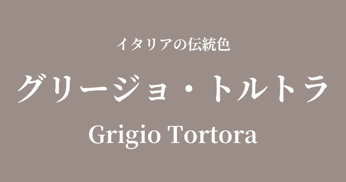
| Italian original name | Grigio Tortora |
|---|---|
| Japanese notation | Grigio Tortola |
| HEX | #9B8E88 |
| RGB | 155, 142, 136 |
What is Grigio Tortola? Origin and Etymology
Grigio Tortora, meaning "dove gray" in Italian, is a calm and sophisticated color. "Grigio" means gray, and "Tortora" refers to the turtle dove. As the name suggests, it is characterized by a warm, slightly reddish gray, reminiscent of a turtle dove's feathers.
Inspired by colors found in nature, it expresses a quiet and serene beauty that sets it apart from ostentatious decoration. Rather than being simply achromatic, the inclusion of beige nuances brings depth and softness to the space and materials.
Historical background of Grigio Tortola
Grigio Tortola is not a color directly associated with any specific historical event or royal family, but it is a color that has long been deeply ingrained in the landscape and lifestyle of Italy.
Since the time of ancient Rome, many natural intermediate colors like these have been found in the stone and plaster walls used in architecture. Furthermore, in Renaissance frescoes, it is believed that these muted colors were used as a base coat to enhance the vibrant colors, or to express the shading of the figures' clothing.
This color gained particular attention in the Italian modern design movement of the 20th century. As excessive ornamentation was eliminated and essential beauty was pursued, the universal appeal of neutral colors like Grigio Tortola was re-evaluated, and it became established as a symbol of sophistication in the worlds of fashion and interior design.
Grigio Tortola in Italian Culture and Art
Grigio tortola has long been recognized in Italian art and culture as a crucial supporting element that enhances the main subject. For example, in early Renaissance frescoes, exemplified by Giotto di Bondone, these subdued colors are effectively used against the backdrops of the saints' simple clothing and buildings.
In modern times, this color is indispensable, especially in the Italian fashion world. Giorgio Armani is known as the designer who popularized this color, along with the concept of "greige," to the world. The exquisite nuanced colors seen in the suits and dresses he creates truly embody the sophisticated worldview of Grigio Tortola.
Furthermore, this color is extremely popular in Italian interior design. It harmonizes with a wide range of styles, from modern and minimalist spaces to warm and classic ones, and is widely used as a base color to create a sophisticated atmosphere.
Color scheme preview
This is to check the readability of the text when this color is used as the background.
Grigio Tortola's color scheme proposal
Rosso Pompeiano (#D04A3C)
The tranquility of Grigio Tortola, combined with the red reminiscent of the frescoes of the ancient city of Pompeii, creates an intellectual and dignified impression. It's a classic color scheme that evokes a sense of historical depth.
Giallo Napoli (#FADA5E)
The warm gray combined with the bright yellow reminiscent of the Neapolitan sun creates a friendly and calming atmosphere. It's recommended for those who want to create a natural and comfortable space.
Verde Marina (#3C8A91)
The urban Grigio Tortola and the Mediterranean-inspired blue-green harmonize to create a modern and sophisticated impression. It's a color scheme that is cool yet evokes a sense of natural tranquility.
Practical Scenes
Grigio Tortola is a versatile color that can be used in a variety of situations.
In interior design, using it on large areas such as walls, sofas, and curtains can fill the entire room with a calm and elegant atmosphere. It harmonizes beautifully with different materials such as wood, stone, and metal, and serves as a perfect background color that enhances other colors.
In fashion, this color is perfect for classic items you want to cherish for a long time, such as coats, jackets, and high-quality knitwear. A monochrome outfit, where the entire look is in the same color family, brings out the elegance of this color to the fullest. You can also add a sophisticated accent by pairing it with a brightly colored scarf or bag.
In the world of web design, using it as a background color enhances content readability and instills a sense of trust and security in users. It is particularly effective for luxury brand and lifestyle websites.