
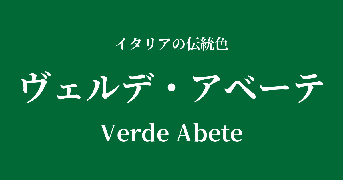
| Italian original name | Verde Abete |
|---|---|
| Japanese notation | Verde Abete |
| HEX | #016936 |
| RGB | 1, 105, 54 |
What is Verde Abete? Origin and Etymology
Verde Abete is a deep, calming green color that means "fir tree green" in Italian. "Verde" means green, and "Abete" means fir tree.
As the name suggests, this color is inspired by the deep, vibrant hues of coniferous trees in the mountainous regions of Italy, particularly the fir forests of the Alps and Apennine Mountains. It evokes not the bright colors of leaves bathed in sunlight, but rather the colors of the shades of trees deep within the forest, enveloped in silence.
As an evergreen tree that retains its leaves even in winter, the fir tree has long been considered a symbol of eternal life and permanence. Therefore, the Verde Abete color embodies not only the beauty of nature, but also meanings of strength, stability, and quiet hope.
Historical background of Verde Abete
In ancient Rome, evergreen trees like fir trees were used as symbols of rebirth and fertility during the Saturnalia festival, which celebrated the winter solstice. This deep green color is thought to have been deeply ingrained in people's lives as a color of hope, representing overcoming the harsh winter and awaiting the arrival of spring.
From the Middle Ages to the Renaissance, stable green pigments were scarce. Verdigris, made from copper, was used, but it was chemically unstable and prone to discoloration, making the depiction of a deep, beautiful green in painting a test of the artist's skill.
Venetian painters, in particular, made effective use of this deep green in their landscape depictions. The forests seen in the backgrounds of mythological and religious paintings by masters such as Titian convey a sense of grandeur and mystery inherent in Verde Abete. This color was recognized not only as a symbol of reverence for nature, but also as a color that represented wealth and social status.
Verde Abete in Italian Culture and Art
Verde Abete has been used in various contexts within Italian art and culture as a symbol of nature and as a color of high status.
In Renaissance paintings, this color was used for the clothing of the Virgin Mary and saints, or as the background in portraits, giving the subjects a sense of dignity and serenity. It was also an essential color for depicting paradise and utopian landscapes in frescoes and tapestries.
In architecture and interior design, this deep green was incorporated into marble patterns and wall decorations, bringing a sense of gravitas and tranquility to the space. It was particularly favored in churches and aristocratic mansions to create a quiet and contemplative atmosphere.
In contemporary Italian fashion, Verde Abete remains a staple color for autumn/winter collections. Using this color in high-quality wool coats, leather goods, and silk scarves creates a classic yet sophisticated and intellectual impression.
Color scheme preview
This is to check the readability of the text when this color is used as the background.
Verde Abete's color scheme proposal
Terra di Siena (#E2725B)
The combination with Terra di Siena, reminiscent of the red soil of Italy, creates a natural and warm contrast like a forest and the earth. The earth tones harmonize with each other, giving an impression of peace and tranquility.
Giallo Napoli (#FADA5E)
Adding a bright yellow from Naples brings a lively accent, like sunlight filtering through a deep forest. The color scheme exudes classic elegance while also conveying vibrancy and sophisticated playfulness.
Grigio Perla (#E0DED7)
Pairing it with a bright, pearly Grigio Perla further enhances the depth and tranquility of Verde Abete. This combination is recommended for those who want to create a modern, urban, intelligent, and cool impression.
Practical Scenes
Verde Abete is a versatile color that can be used in a variety of situations due to its calm and sophisticated feel.
In interior design, incorporating this color into an accent wall in a living room or study adds depth and tranquility to the space. Choosing this color for items with textured materials, such as velvet sofas or wool rugs, further enhances its richness. It also pairs exceptionally well with gold and brass lighting fixtures.
In fashion, it's ideal for items that take center stage in an outfit, such as coats, jackets, and suits. It enhances the wearer's intelligence and gives an impression of sophistication and trustworthiness. Incorporating it into accessories such as ties, bags, and leather shoes is also effective for creating a subtly stylish look.
In web and graphic design, it's suitable for brands that want to convey reliability, tradition, and harmony with nature. When used as a background color, it makes content stand out and gives users a sense of security.