
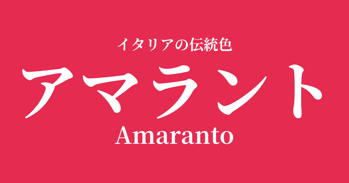
| Italian original name | Butmaranto |
|---|---|
| Japanese notation | Amarant |
| HEX | #E52B50 |
| RGB | 229, 43, 80 |
What is Amaranto? Origin and Etymology
Amarant is a color name derived from the flower of the amaranth, a plant in the Amaranthaceae family, which is known for its striking reddish-purple color. Its etymology traces back to the ancient Greek word "amarantos," which is a combination of "a" (negation) and "maraino" (to wither), meaning "not wilting" or "not dying."
Because amaranth flowers retain their beautiful color and shape for a long time even when dried, they were considered a symbol of "immortality," "eternity," and "permanence" in the ancient Greek and Roman world. This mystical background gives the color name itself a deep narrative.
Historical background of Amarant
In ancient Rome, amaranth was celebrated in poetry as a symbol of eternal love and was cherished as an offering to the gods and placed at tombs. This suggests that from this era onward, the color of amaranth held special significance beyond mere color.
From the Renaissance to the Baroque period, deep, passionate reddish-purple colors like amarant were symbols of wealth and power. Expensive dyes such as cochineal were used in the crimson robes worn by cardinals and the luxurious velvet garments of royalty and nobility, and it is said that the hue of amarant was also highly valued as a color that expressed such dignity and splendor. In particular, the depth of emotion inherent in this color was effectively used in Baroque paintings, which are characterized by dramatic contrasts of light and shadow.
Amaranto in Italian Culture and Art
In Italian art, amaranth has been depicted as a color representing passion, sacrifice, and sacred love. The deep red of the figures' costumes and backgrounds in the works of Renaissance master Titian and Baroque master Caravaggio strongly appeals to the viewer's emotions and adds dramatic depth to the narrative.
Furthermore, this color held an important position in the textile culture that flourished in Venice and Florence. Fabrics dyed in amaranth from the finest silk and velvet were highly prized in courts throughout Europe, showcasing Italian aesthetics and the high level of craftsmanship to the world.
Even in contemporary Italian fashion, amaranth is a special color. Reminiscent of Valentino's signature red, this color enhances the wearer's charm and expresses sophisticated passion when used in dresses, accessories, and lip colors.
Color scheme preview
This is to check the readability of the text when this color is used as the background.
Amaranth color scheme proposal
Giallo Napoli (#FADA5E)
The combination of passionate amaranthos and bright, warm giallo Napoli creates a festive and vibrant impression. It's a classic and lively color scheme reminiscent of Renaissance paintings.
Verde Marina (#3C8A90)
The deep reddish-purple and the calming blue-green are almost complementary colors that enhance each other. This combination is perfect for creating a dramatic yet sophisticated, intelligent, and modern space.
Grigio Perla (#E0DED8)
The strong presence of amaranth is gently balanced by a pearly light gray, creating an elegant impression. The result is a sophisticated and chic urban color scheme that is minimalist yet distinctive.
Practical Scenes
In interior design, incorporating amaranth into accent walls, sofas, cushions, and other fabrics brings dramatic depth and a sense of luxury to a space. It pairs particularly well with metallic materials such as gold and brass, creating a classic yet modern atmosphere.
In fashion, amaranth dresses and coats are perfect for special occasions, exuding confidence and elegance. For everyday wear, simply incorporating it as an accent in a scarf, bag, or lip color will elevate your entire outfit and create a sophisticated look.
In web and graphic design, using this color for call-to-action buttons or important headings can capture the user's attention. When used as a brand image color, it helps convey passion, sophistication, and trustworthiness.