
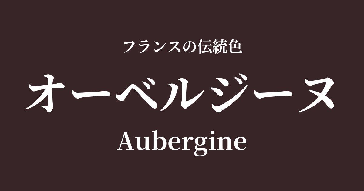
| French | Aubergine |
|---|---|
| Katakana | Aubergine |
| HEX | #372528 |
| RGB | 55, 37, 40 |
What is Aubergine? Origin and Etymology
Aubergine is a French word meaning "eggplant." As the name suggests, the color comes from the deep, almost black, glossy reddish-purple color seen on the skin of a ripe eggplant.
Eggplants are originally from India and were brought to Europe via the Arab world. It wasn't until around the 18th century that they became widely popular as a food ingredient in France. As they became deeply rooted in the food culture, their distinctive color also came to be recognized as "aubergine," and the name became established as a color name. It's not just a simple purple; the greatest appeal of this color lies in its unique depth, which evokes a sense of vitality and maturity.
Historical background of Aubergine
Purple has been considered a noble color since ancient times, but it was from the late 19th to the early 20th century that dark, subdued purples like aubergine particularly gained attention in France.
In the era following the Industrial Revolution, when new chemical dyes were constantly being developed and a wide range of colors became possible, people began to seek more delicate and nuanced colors. Aubergine, with its mystical and sophisticated atmosphere, became extremely popular in the world of fashion and interior design during the Art Nouveau and Art Deco periods.
While not flashy, this color, which conveys intelligence, elegance, and a touch of mystery, is said to have strongly stimulated the sensibilities of artists and intellectuals of the time. It was one of the essential colors for cutting-edge expressions of the era, such as luxurious velvet dresses and intricately designed wallpapers.
Aubergine in the world of art and fashion
The mystical atmosphere of aubergine has inspired many artists. Symbolist painters, in particular, who sought to depict not only the visible world but also the inner world and the realm of dreams, favored this color. In the fantastical scenes found in the works of Gustave Moreau and Odilon Redon, deep purples like aubergine create an effect that blurs the boundary between dreams and reality.
In the world of fashion, early 20th-century designer Paul Poiret used this color in innovative dresses incorporating Oriental influences, bringing out a new kind of charm in women. In textiles, it pairs exceptionally well with lustrous and substantial fabrics such as velvet, silk, and damask, and is still used today in high-end curtains and furniture upholstery as a color that maximizes the beauty of these materials.
Color scheme preview
This is to check the readability of the text when this color is used as the background.
Aubergine's color scheme proposal
Rose Dragee (#F2A0A1)
The richness of Aubergine, combined with the sweet and gentle pink of Rose Dragee, creates a classic yet modern femininity. The beautiful contrast gives it a sophisticated impression.
Champagne (#F7E7CE)
The deep, rich color of Aubergine is gently complemented by the bright, elegant cream hue of Champagne. This calm, sophisticated color combination is perfect for adults and is also recommended for interior design.
Vert Veronese (#578562)
This combination, reminiscent of plant leaves and fruits, is natural and intellectual. The complementary colors of purple and green enhance each other, creating an artistic and calm impression that conveys depth and vitality.
Practical Scenes
In interior design, aubergine adds a touch of elegance to any space. Simply using this color on one wall in the living room, or incorporating it into velvet sofas and cushions, instantly creates a luxurious feel. It also pairs well with brass and gold metals, allowing you to create a modern and opulent space.
In fashion, incorporating this color into autumn and winter coats, knitwear, and dresses creates an elegant and sophisticated impression. Rather than using this color head-to-toe, using it as an accent color in bags or shoes with basic colors like beige, gray, or off-white will tighten up the outfit and create a refined style.
In web design, using dark gray as a background color can enhance the credibility of luxury brands and specialized content sites. However, because it is a dark color, it is important to choose white or light gray for text to ensure readability.