
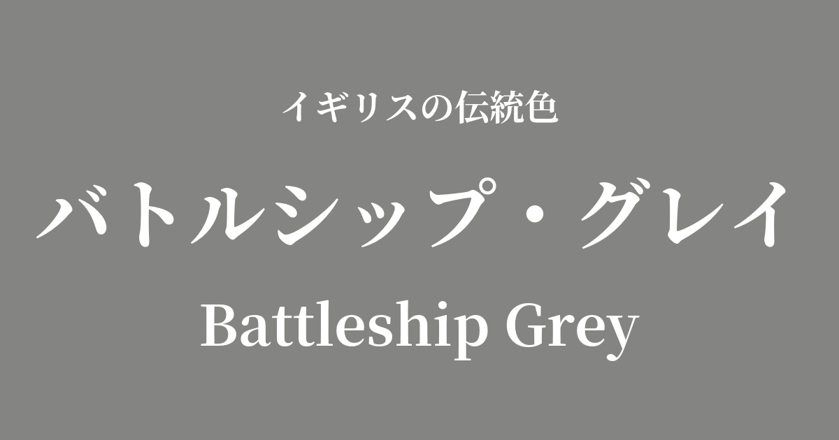
| Original English name | Battleship Grey |
|---|---|
| Japanese notation | Battleship Gray |
| HEX | #848482 |
| RGB | 132, 132, 130 |
What is Battleship Gray? Origin and Etymology
Battleship Grey, as the name suggests, is a strong and solid-looking gray color derived from "battleship."
This color was widely used in the early 20th century, particularly throughout the two World Wars, on warships of the British Navy and other countries around the world. Its purpose was camouflage, reducing visibility to the enemy on the vast ocean and delaying detection.
These neutral hues, which blend seamlessly with the colors of the sky, the sea, and the encroaching mist, were born from a relentless pursuit of functionality, completely devoid of any ornamentation.
Therefore, "Battleship Gray" is generally understood not as a strict definition referring to a single specific shade, but rather as a general term encompassing various shades of gray used on warships. The color reflects the ruggedness of steel itself and the harshness of the sea.
Historical background of Battleship Gray
In the early 20th century, Britain possessed the Royal Navy, the world's most powerful navy, which was said to "rule the seven seas." The fierce naval arms race with Germany produced a succession of massive and powerful warships, such as the Dreadnought-class battleships.
Battleship Gray was the color that truly symbolized the naval power of this "big ship, big gun" era. In contrast to the ornate sailing ship era, the steel hulls were painted in a purely practical gray, carrying the full weight of national prestige and technological prowess as they sailed out to the open seas.
Chosen in the extreme circumstances of war, this color evokes reliability, robustness, and an indomitable spirit. Along with the memory of war, Battleship Grey has become more than just a color name; it tells the story of an important moment in modern British history.
Battleship Grey in British Culture
Battleship Grey's military origins have a significant influence on modern fashion, particularly workwear and menswear. Durable, stain-resistant, and easy to pair with any color, this color is used in trench coats, field jackets, and high-quality wool trousers, giving a sophisticated and urban impression.
Furthermore, it is an indispensable color in the world of industrial design. Its texture, reminiscent of concrete and metal, is a perfect match for modern architecture and minimalist interiors, bringing a sense of calm and gravitas to the space.
Even in Britain's renowned automotive industry, this body color is popular for robust vehicles like Land Rover, further enhancing their tough image.
Color scheme preview
This is to check the readability of the text when this color is used as the background.
Battleship Grey color scheme proposal
Royal Blue (#002366)
This color scheme, reminiscent of the uniforms of British naval officers, exudes dignity and intelligence. The addition of deep blue to the ruggedness of gray creates an impression of reliability and refinement.
Old Gold (#CFB53B)
This combination evokes the metallic embellishments found on warships, such as insignia and buttons. The cool impression of gray is complemented by the warmth and luxurious feel of the gold's shine.
Signal Red (#D81920)
The addition of a vibrant red, a warning color, to achromatic gray creates a very modern and powerful impression. It is effective as an accent color in a minimalist space.
Practical Scenes
In interior design, Battleship Grey is ideal for creating industrial or modern-style spaces. Using this color on an entire wall gives the room a refined and calming atmosphere. When paired with stainless steel kitchens or concrete-look flooring, it creates a unified and sophisticated space.
Furthermore, by combining it with wooden furniture and warm fabrics, the coolness of the color can be softened, creating a comfortable and well-balanced space.
In fashion, battleship grey is an extremely versatile color. A battleship grey coat or jacket works well in a wide range of settings, from business to casual, conveying intelligence and trustworthiness. It also enhances the appearance of other colors, so pairing it with a brightly colored sweater or scarf creates a striking contrast in your outfit.
In web and graphic design, using this color as a background enhances content readability and creates a calm, trustworthy image. It is particularly suitable for corporate websites of technology companies and law firms.