
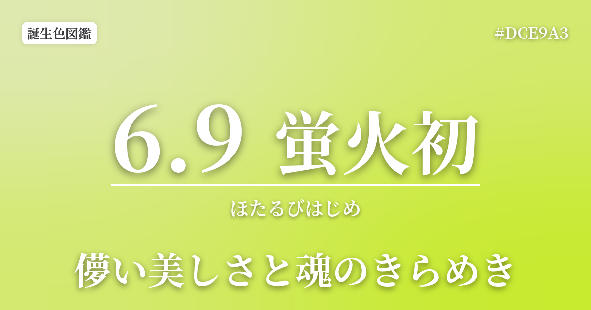
| birthday | June 9 |
|---|---|
| Color name | The first fireflies to light |
| HEX | #DCE9A3 |
| RGB | 220, 233, 163 |
| Color meanings | Ephemeral beauty and the sparkle of the soul |
- What is the birth color "Hotarubi Hatsu" for June 9th?
- The color's meaning is "fleeting beauty and the sparkle of the soul," and it also reflects personality.
- Connection to the seasons — First sighting of fireflies and the light of the waterside
- Color scheme preview
- Firefly's first color scheme proposal
- FAQ
- Related traditional colors
What is the birth color "Hotarubi Hatsu" for June 9th?
Hotarubi Hajime is a gentle, bright yellowish-green color that captures the faint light of fireflies appearing for the first time by the water's edge on a summer night. This color is a birth color uniquely selected by this website, inspired by Japan's rich sense of the seasons and its associated events.
This color captures the fleeting and mystical beauty of a single, flickering light of life in the darkness. The #DCE9A3 hue combines the vitality of young grass with the tranquility of moonlight, evoking a lyrical landscape that evokes the damp night air and the gentle murmur of a clear stream.
The color's meaning is "fleeting beauty and the sparkle of the soul," and it also reflects personality.
People who prefer this color tend to have delicate sensibilities and rich sensitivity. They may possess excellent insight, able to see not only the surface of things, but also their underlying essence and fleeting beauty.
While they may give off a calm and reserved impression, they often harbor a quiet passion and strong convictions within. They cherish their own worldview and find joy in quiet environments for contemplation or immersing themselves in creative activities.
Connection to the seasons — First sighting of fireflies and the light of the waterside
Early June is the season when fireflies begin to dance throughout Japan. "First sighting of fireflies" refers to the day when the light of fireflies is seen for the first time that year, and it has long been cherished as a symbol of the arrival of summer. Fireflies glow mainly for courtship purposes, with the males flying while glowing and the females responding with their own light, creating a drama of life.
Fireflies, which can only live near pristine bodies of water, are a symbol of a beautiful natural environment. Their faint, almost fading light has long been celebrated in Japanese poetry and stories, and has been likened to the human soul or fleeting love. The color of "Hirobi Hatsu" (first firefly light) reflects this Japanese aesthetic sense and view of nature.
Color scheme preview
This is to check the readability of the text when this color is used as the background.
Firefly's first color scheme proposal
Blue iron (#283C53)
When combined with the deep indigo color "Aitetsu," it evokes a quiet night scene of fireflies dancing. The gentle light of the fireflies stands out, creating a sophisticated impression that combines tranquility and mystery.
Celadon (#74B49D)
The gentle, pure green of the celadon porcelain harmonizes with the yellowish-green of fireflies, expressing the fresh, vibrant nature of a waterside scene. It's a refreshing color scheme that evokes a natural, comforting sense of peace.
Usagi Sakura (#FDEFF2)
Adding the subtly reddish "Pale Cherry Blossom" evokes nuances of the fleeting beauty of firefly light and hidden passion. It's a gentle, yet somewhat melancholic, lyrical, and beautiful combination.