
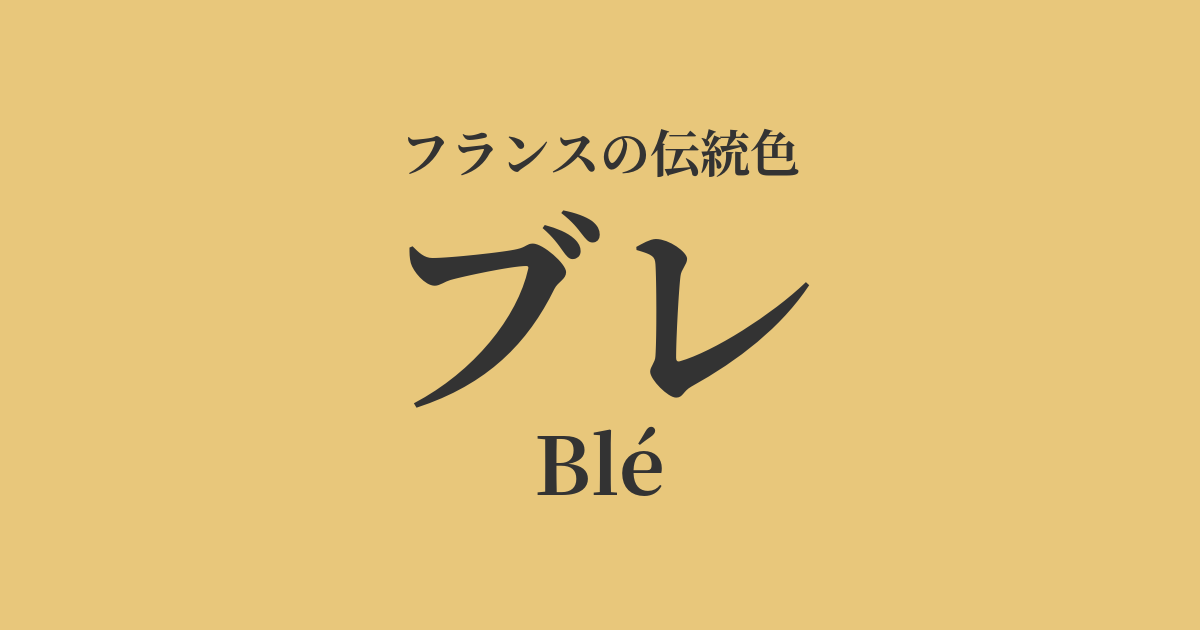
| French | Blé |
|---|---|
| Katakana | Blur |
| HEX | #E8C77B |
| RGB | 232, 199, 123 |
What is "Bure"? Origin and etymology
"Blé" is a French word meaning "wheat." As the name suggests, it is derived from the color of the golden wheat fields that spread across the vast French landscape, shining in the sunlight as harvest approaches.
Wheat, the source of life and the raw material for bread that forms the foundation of French food culture, has always been a very familiar and important part of people's lives. Therefore, the color "Boulé" is not simply yellow, but deeply rooted in the hearts of the French as a symbol of abundant harvest, fertility, and gratitude for daily sustenance. Its warm hue evokes the blessings of the sun and the richness of the earth, giving those who see it a sense of peace and happiness.
Historical background of blur
Wheat cultivation has been practiced in France since the time of ancient Gaul. In medieval Europe, the soft, white bread made from wheat was considered a privilege of the nobility and clergy, and a symbol of wealth and social status. In contrast to the dark color of rye bread eaten by commoners, the golden color of wheat represented abundance itself.
In the 18th century, the ideology of "physiocracy" emerged in France, which held that agriculture was the sole source of wealth, and the value of land and agriculture was re-evaluated. During this period, the color "Boulé" is said to have taken on even greater significance as a symbol of the nation's prosperity.
Furthermore, as seen in the French Revolution's slogan "Bread, Equality, Fraternity," bread (wheat) was an issue directly linked to the lives and politics of the people. "Blé" is a color deeply rooted in the earth, which has remained close to the lives of people throughout French history.
Break in the world of art and fashion
In the world of art, the color "blur" was beloved by many painters who depicted the French countryside. Particularly famous is Jean-François Millet's "The Gleaners," a painting of the Barbizon School. The landscape of the vast wheat fields after the harvest quietly tells a story of the dignity of labor, the harshness of nature, and the bounty of the earth.
Furthermore, Vincent van Gogh, who created his art in Arles in southern France, repeatedly painted wheat fields shining under the fiery sun. For him, wheat fields were an important motif that reflected the cycle of life and his own inner passion, and his body of work greatly expanded the possibilities of color expression known as "blur."
In the fields of fashion and textiles, "Ble" pairs exceptionally well with natural materials such as linen and cotton, and is often used in natural and warm styles. Especially in spring and summer collections, it has been loved across generations as a color that evokes the feeling of pleasant sunlight.
In the sun-drenched reapers and ears of wheat, I see something of eternity.
Color scheme preview
This is to check the readability of the text when this color is used as the background.
Color scheme proposal for Blur
Blue Roi (#002D62)
The French royal blue and golden wheat colors are a traditional and noble combination, also seen in the royal coat of arms. The strong contrast enhances each other's beauty, creating a dignified and elegant impression.
Vert Provence (#8A9B80)
By combining it with the gentle green reminiscent of the olive groves of southern France, it creates a natural and pleasant color scheme that evokes the French countryside. It gives a relaxed and calm impression.
Rouge Coquelicot (#C8272E)
The vibrant red of poppies blooming against golden wheat fields is an iconic combination that symbolizes the early summer landscape of France. It gives a bright and lively impression, full of vitality.
Practical Scenes
In interior design, "blur" brings warmth and brightness to a space. When used over large areas such as wallpaper, curtains, and rugs in living rooms and dining rooms, it fills the family gathering place with a comfortable and tranquil atmosphere. It pairs exceptionally well with natural wooden furniture and white-based interiors.
In fashion, incorporating linen into items like linen shirts, cotton dresses, and skirts creates a gentle, sophisticated, and natural style. Because it's an earth tone, it pairs well with basic colors like navy, brown, and khaki, adding warmth to your outfit.
In web and graphic design, using it as a background or accent color can give the entire site a friendly and trustworthy feel. It harmonizes particularly well with the brand image of organic foods, natural cosmetics, and lifestyle products.