
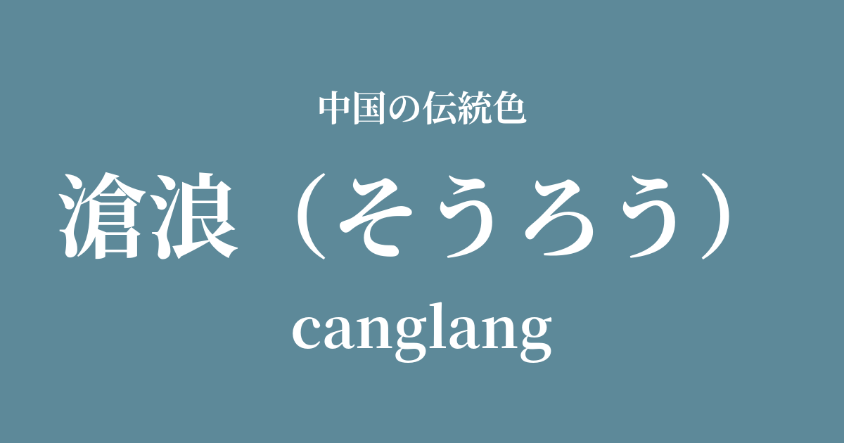
| Color name | Canglang |
|---|---|
| reading | Soro |
| pinyin | canglang |
| HEX | #5D8999 |
| RGB | 93, 137, 153 |
What is Canglang? Origin and etymology
Canglang refers to the deep, bluish color of water, or to blue-green waves. "Cang" means blue-green, and "lang" means waves, and as the name suggests, it evokes the image of a vast, calm body of water.
The most famous origin of this color comes from a passage in the "Fisherman" chapter of the "Songs of Chu," a collection of poems attributed to Qu Yuan, a poet of the Warring States period. The poem reads: "When the waters of the Canglang are clear, I can wash my tassel. When the waters of the Canglang are muddy, I can wash my feet."
This poem symbolizes the wisdom of a wise person who adapts their life to the circumstances: washing the strings of their crown (i.e., taking up official position) when the world is pure, and washing their feet (i.e., withdrawing from the secular world) when the world is corrupt. Since then, "Canglang" has become more than just a color name; it has acquired a cultural depth, encompassing a pure spirit and the philosophy of seclusion.
Historical background of Canglang
The Warring States period, when the word "Canglang" originated, was a turbulent era of warring states. Upright intellectuals like Qu Yuan struggled between ideals and reality, and entrusted their spirituality to poetry and prose. The colors of "Canglang" are deeply connected to the inner world of these literary figures and their yearning to return to nature.
In later periods, particularly during the Song Dynasty, this color acquired an even more special meaning among literati. For example, Su Shunqin, a poet of the Northern Song Dynasty, named the pavilion in the garden he built in Suzhou "Canglang Pavilion." This pavilion still exists today as part of the World Heritage Site "Classical Gardens of Suzhou," and is a fine example of how the yearning for a secluded life symbolized by "Canglang" was reflected in actual garden architecture.
Thus, "Canglang" is not merely a visual color, but has been passed down through generations as a spiritual pillar for intellectuals and artists, representing the depth of their thought.
Canglang in Chinese Art and Crafts
In Chinese art, Canglang has played a particularly important role in landscape painting. This calm blue-green color is used when depicting rivers in deep valleys, lakes shrouded in mist, or still waters on which hermits float their boats, giving the paintings a profound and tranquil atmosphere.
In the field of ceramics, we can find an aesthetic sensibility akin to "Canglang" in the colors of the celadon glaze fired at kilns such as the Longquan kiln during the Song dynasty. The transparency, like clear water, and the deep green color reminiscent of jade, condensed the natural beauty that people of that time idealized into a vessel.
In the realm of fashion culture, it is said that subdued colors like the Canglang (a type of wave-like color) were used in garments such as the "Dao bao" and "Lan shan," which were favored by literati and officials. These colors quietly reflect their aesthetic, which rejected extravagant ornamentation and valued inner dignity and intelligence.
滄波之水 Kiyoshiro, I was able to do it. The waters of the river are cloudy, and the water is cloudy.
Color scheme preview
This is to check the readability of the text when this color is used as the background.
Canglang's color scheme proposal
Moon White (#EAEFEF)
The combination of the pure white of Tsukishiro and the deep blue-green of Sounou evokes a tranquil and clear waterside scene. It gives an intelligent, refined, and calm impression.
赭石 (#A76443)
The warm, earthy color of the ochre softens the coldness of the waters of the Canglang River, evoking a rich natural landscape. The harmonious blend of earth tones creates a beautiful color scheme that is both stable and profound.
Dark blue (#E6D4C6)
The pale, soft pinkish-beige of lotus root adds an elegant touch of vibrancy to the tranquility of Canglang. It creates a refined and gentle yet somehow ephemeral and beautiful impression.
Practical Scenes
In interior design, this color is ideal for spaces where tranquility and concentration are required, such as study rooms, bedrooms, and meditation spaces. Incorporating it as an accent wall, using this color on one wall, creates depth and tranquility in the space. It also pairs exceptionally well with natural materials such as solid wood furniture, linen, and Japanese paper.
In fashion, this color conveys an intelligent and sophisticated impression. When incorporated into high-quality materials such as silk blouses or wool coats, its deep hue is further enhanced. It's not flashy, but it creates an outfit that exudes undeniable elegance.
In web and graphic design, it is effective as a key color for educational institutions and law firms that want to convey trustworthiness and expertise, or for brand sites with a quiet and contemplative worldview. When used in designs based on white or light gray, it creates a sophisticated impression.