
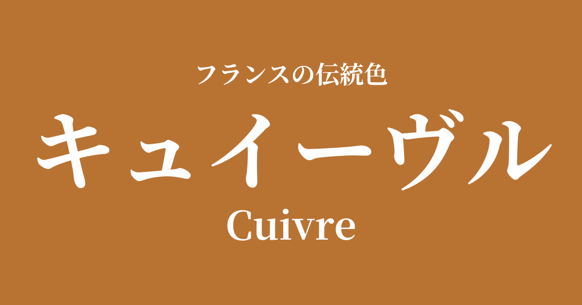
| French | Civire |
|---|---|
| Katakana | Cuivre |
| HEX | #b87333 |
| RGB | 184, 115, 51 |
What is a Cuivre? Origin and Etymology
Cuivre is a French word meaning "copper" or "metal." Its etymology traces back to the Latin word "cuprum," which originated from the island of Cyprus, a source of high-quality copper in ancient Roman times.
This color captures a range of expressions, from the reddish luster of newly polished copper to the deep, mellow brown that develops over time as it oxidizes. More than just a color, it's a profound color name that symbolizes the warmth, weight, and beauty of the texture that metal acquires over time.
The historical background of Cuivre
Copper is one of the oldest metals used by humankind, and its presence was indispensable in French history as well. It was used in tools and ornaments from the Gallic-Roman period, and in the Middle Ages, it adorned the magnificent doors and sacred objects of churches, becoming deeply rooted in people's lives.
Copper cookware is particularly symbolic of France's connection to French culture. Its excellent heat conductivity greatly contributed to the development of French cuisine, which requires delicate temperature control. Rows of gleaming copper cookware in kitchens can be seen as a testament to the richness of France's gastronomic culture.
In the 17th century, at the Palace of Versailles, built by Louis XIV, copper alloys were used in the gilded bronze (ormolu) decorations adorning the furniture, creating a magnificent and opulent space. Furthermore, during the Art Nouveau era, which flourished from the late 19th to the early 20th century, copper was re-evaluated as a material for expressing its organic and beautiful curves, as seen in the Paris Metro station entrances designed by Hector Guimard, thus increasing its artistic value.
Cuivre in the world of art and fashion
The warm, muted glow of cuivre has captivated many artists. In particular, in 17th-century Dutch and Flemish still-life paintings, copper pots and pitchers placed in the corners of kitchens are depicted with skillful use of light, conveying the gentle beauty found in everyday life.
In the world of fashion, cuivre is a color that combines luxury and sophistication, and is especially beloved in autumn and winter collections. When combined with materials such as leather, suede, and velvet, its warmth and rich texture are further enhanced. When used in lustrous silk or satin, this color shines like real metal, and the shadows cast by the drape create a dramatic effect.
In interior design, this color brings warmth and sophistication to a space. It's popular not only for use in hardware such as lighting fixtures and doorknobs, but also as an accent color for wallpaper and fabrics, harmonizing with a wide range of styles from classic to modern.
Color scheme preview
This is to check the readability of the text when this color is used as the background.
Cuivre's color scheme proposal
Blue Nuit (#0f2c56)
When combined with a deep blue reminiscent of the night sky, the warmth of the Cuivre is highlighted, and the two complement each other beautifully. It creates an intelligent, modern, and sophisticated adult atmosphere.
Vert Veronnaise (#509283)
This combination with a calming green reminiscent of the patina that appears on the surface of copper creates a natural, peaceful, and antique-inspired nostalgic impression.
Blanc de Voie (#f4f0e0)
The soft, ivory-like off-white softens the imposing presence of the Cuivre, creating a bright and elegant overall look. It's a color scheme that feels both classic and light.
Practical Scenes
In interior design, cuivre is an extremely effective accent color that adds warmth and a sense of luxury to a space. Simply incorporating this color into metalwork such as light fixtures, faucets, and furniture handles will tighten the overall look of the space and give it a sophisticated feel. Using it on one wall, or in fabrics such as cushions and curtains, can create a comfortable and calming atmosphere.
In fashion, cuivre particularly shines in autumn and winter outfits. Incorporating it into accessories such as leather jackets, boots, and bags adds depth and a seasonal feel to your styling. Furthermore, wearing it with silk or satin blouses or as accessories will add a touch of elegance and sophistication to your face.
In web and graphic design, it is suitable as the brand's image color to convey reliability, tradition, and craftsmanship. Rather than using it extensively as a background color, limiting its use to headings, buttons, and icons can effectively attract attention without compromising a sense of luxury.