
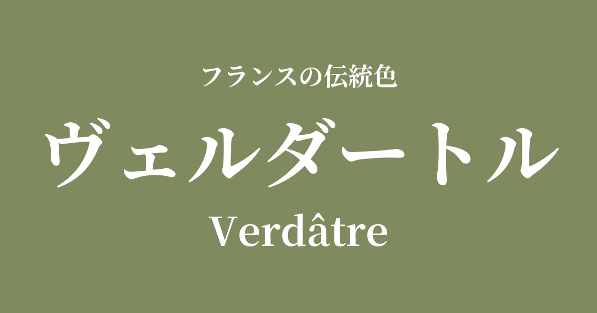
| French | Verdâtre |
|---|---|
| Katakana | Verdant |
| HEX | #7f8b5f |
| RGB | 127, 139, 95 |
What is Verdator? Origin and etymology
Verdâtre is a color name derived from the French adjective meaning "greenish" or "greenish." It refers to a nuanced shade that is not pure green, but rather has a slight yellowish or grayish tint.
The word "green" originates from the Latin word "viridis," meaning "green," and is not named after a specific plant or mineral. It's an interesting example of a color name derived directly from a word describing the "state" or "impression" of the color.
Its colors evoke images of moss-covered stones, dried leaves, and unripe olives found in nature, giving us a sense of calm and profound beauty.
The historical background of Verdantol
Due to its understated and practical hue, Verdantol was widely used in everyday clothing and military uniforms, especially from the 18th to the 19th centuries. In an era when extravagant colors were a symbol of the aristocracy, such subdued earth tones were colors that resonated with people's lives.
In particular, records show that during the Napoleonic Wars, this shade of green was used in some of the uniforms of French infantry regiments (such as the Hussars). This is thought to have been intended as a camouflage effect to hide from the enemy on the battlefield, and it is considered one of the roots of modern military colors.
In contrast to the opulent court culture, this color has quietly permeated history as a symbol of France's simple and honest side, as well as its rich rural landscape.
Verdant in the world of art and fashion
In the mid-19th century, the Barbizon School painters, who sought to depict natural landscapes as they were, skillfully used the complex shades of green found in Verdantre's work. The colors of the trees and the earth in the works of Jean-François Millet and Camille Corot express the depth of nature's green, which shifts in light and shadow.
In the world of fashion since the modern era, this color frequently appears as a key color in military styles and safari looks. Along with khaki and olive green, it is a representative earth tone, possessing a timeless appeal that is not influenced by trends, and is an indispensable color for creating a calm, mature casual style.
Color scheme preview
This is to check the readability of the text when this color is used as the background.
Verdator's color scheme proposal
Claim (#f3e9d4)
The calm, sophisticated tone of Verdantol, combined with the warmth of Crème, creates a natural and comfortable space. This combination is ideal for interiors where you want to convey a gentle and relaxed impression.
Rouge de Bordeaux (#60172c)
This dramatic combination features colors that are almost complementary, enhancing each other's beauty. The tranquility of Verdantore is complemented by the mature depth of Bordeaux, creating a classic, weighty, and intellectual impression.
Jaune Bouton d'Or (#f7d41d)
The calm tones of Verdantol are accented with a bright, vibrant yellow, creating a lively and energetic impression. This color scheme is recommended when you want to add a playful touch to fashion or design.
Practical Scenes
In the field of interior design, incorporating it on one wall in a living room or study creates a calming space that is easy on the eyes and enhances concentration. It pairs exceptionally well with wooden furniture and natural materials such as linen and cotton, making it useful for creating a natural modern or country style.
In fashion, this color is easy to incorporate with classic items such as trench coats, military jackets, and chinos. Pairing it with basic colors like white, beige, and navy creates a sophisticated, adult casual style.
In web design, using it as a background or accent color gives the entire site a trustworthy and stable impression. It is particularly compatible with themes that evoke nature and history, such as websites dealing with organic products, outdoor brands, or traditional crafts.