
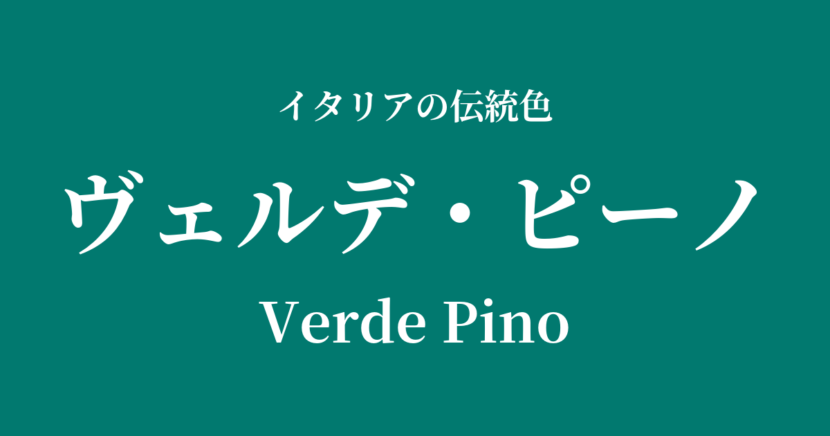
| Italian original name | Verde Pino |
|---|---|
| Japanese notation | Verde Pino |
| HEX | #01796F |
| RGB | 1, 121, 111 |
What is Verde Pino? Origin and Etymology
Verde Pino is a deep, calming green color that means "pine green" in Italian. "Verde" means green and "Pino" means pine, and as the name suggests, it evokes the color of the leaves of the Italian stone pine that colors the rich natural landscape of Italy, especially the hills along the Mediterranean coast.
This color is more than just a depiction of the landscape; it has also come to be considered a symbol of "eternity," "unchangingness," and "vitality," stemming from the evergreen pine tree that retains its leaves throughout the year. The strength of the pine tree, which continues to maintain its greenness even in harsh natural environments, is reflected in this deep hue.
Historical background of Verde Pino
In ancient Rome, green was considered the color of Venus and was favored in garden frescoes and other artwork as a symbol of fertility, beauty, and hope. Deep greens like verde pino likely added depth and mystery to the mythical forests and idealized landscapes depicted in these murals.
During the Renaissance, green pigment became one of the most important colors for artists. Venetian painters, in particular, skillfully manipulated light and shadow with the development of oil painting techniques, using deep greens like verde pino in the clothing of figures and in backgrounds to bring realism and grandeur to their works. This color was also depicted as a symbol of wealth and social status, and was well-suited to representing the textures of luxurious velvet and brocade.
Verde Pino in Italian Culture and Art
Renaissance paintings, particularly those of the Venetian school such as Titian and Veronese, effectively utilize deep greens reminiscent of verde pino. These greens are often depicted in the majestic garments of the Virgin Mary and saints, or as the color of curtains in the background of portraits, highlighting the whiteness of the figures' skin and other vibrant colors.
In architecture and interior design, this color has been used to create a dignified space. Green marble (such as Verde Antico) was used for floors and columns, and it was featured in tapestries and damask textiles adorning the walls of wealthy mansions. Its subdued tone brings tranquility and elegance to any space.
In contemporary Italian design, particularly in the world of fashion, Verde Pino is a popular color that conveys a classic yet modern impression. When this color is used in high-quality wool coats, cashmere knits, or luxury leather goods, it suggests the owner's intelligence and refined taste.
Color scheme preview
This is to check the readability of the text when this color is used as the background.
Verde Pino's color scheme proposal
Testa di Moro (#4B3621)
This natural and authentic color scheme is reminiscent of pine needles and trunks. The depth of each color creates a very calm, dignified, and classic impression.
Giallo Napoli (#FADA5E)
The addition of bright, warm yellow to deep green creates a vibrant contrast. This combination is perfect when you want to create a sophisticated and elegant look without being too dark.
Rosso Pompeii (#9B1C20)
The combination of red and green, which are close to complementary colors, vividly enhances each other's beauty. This color scheme creates a dramatic, passionate, and sophisticated impression.
Practical Scenes
In interior design, incorporating Verde Pino into accent walls, sofas, curtains, etc., brings a sense of calm and depth to the space. It is especially suitable for spaces where you want to relax, such as studies and living rooms. Combining it with gold or brass lighting and wooden furniture creates a sophisticated and classic atmosphere.
In fashion, choosing this color for coats, jackets, and trousers creates an intelligent and sophisticated impression. It pairs particularly well with materials like wool and velvet during the autumn and winter seasons, highlighting the depth of the color. Combining it with neutral colors such as beige, cream, and gray results in an elegant and refined look.
In web and graphic design, it is an effective key color for brands that want to convey reliability, tradition, and harmony with nature. Using it as a background color and placing white or off-white text on top creates a highly readable and sophisticated look.