
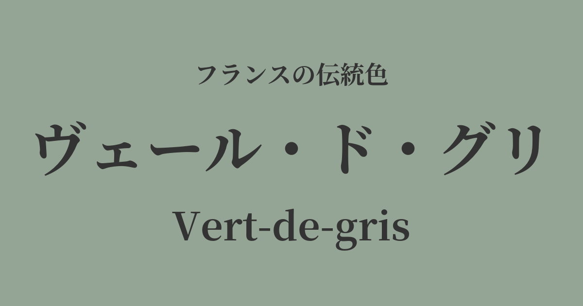
| French | Vert-de-gris |
|---|---|
| Katakana | Vert de Gris |
| HEX | #95a595 |
| RGB | 149, 165, 149 |
What is Vert de Gris? Origin and Etymology
Vert-de-gris, which literally translates to "gray-green" in French, is a muted, subdued green color. This color refers to the hue of "verdigris," which naturally forms on the surface of copper, brass, and bronze.
Its etymology is said to trace back to the Latin "viridis aeris," meaning "copper green." This evolved into "vert de Grece" (Greek green) in Old French, and eventually settled into the current name "Vert-de-gris." Another theory suggests that the name originates from the fact that the pigment's manufacturing method was introduced from ancient Greece.
Vert de Gris, as a pigment, was sometimes produced artificially. The primary method involved exposing copper plates to vapors from vinegar or wine lees to corrode them and extract green crystals (basic copper acetate). This method has been known for a long time and has been used throughout history as an important green pigment in painting.
Historical background of Vert de Gris
Vert de Gris has a long history, with its existence as a pigment dating back to ancient Roman times. In medieval Europe, it was highly valued, along with gold and lapis lazuli blue, as an essential color for the illustrations (miniatures) that adorned beautiful manuscripts.
During the Renaissance, early Flemish painters, including Jan van Eyck, skillfully used this color to give depth and realism to the folds of clothing and landscapes. However, this pigment was chemically unstable and had the drawback of easily changing to black or brown due to the effects of light and air. Therefore, painters devised various methods to preserve its beautiful green color, such as dissolving it in oil or protecting the surface with varnish.
During the Rococo period of the 18th century, soft, muted colors like verre de gris became immensely popular among the ladies of the court. These grayish-green tones were effectively used in the interior of the Petit Trianon, a place beloved by Marie Antoinette, creating a natural, refined, and elegant space.
Furthermore, if you look around the streets of France, you will notice that the copper roofs and bronze statues of historical buildings are covered in a beautiful verdigris patina that has developed over time. The roof of the Opéra Garnier in Paris and the color of the Statue of Liberty, a gift from France to America, are both this verdigris, and they speak to the weight and dignity of history.
Vert de Gris in the world of art and fashion
In the world of art, verre de gris held meaning beyond mere pigment. Particularly from the Middle Ages to the Renaissance, its mystical hue was sometimes depicted in religious paintings as a symbol of supernatural light or worldly wealth. However, due to its unreliability, it was also called an "unreliable color" and is said to have been used with negative connotations such as jealousy and deceit.
In the 19th century, with the invention of more stable new chemical pigments (such as viridian), the use of verre de gris in painting gradually declined. However, its unique nuanced hue continues to inspire contemporary artists and designers.
In the fields of fashion and textiles, Vert de Gris is a symbol of sophistication and composure. Especially in French chic styles, this color conveys an elegant and intellectual impression. Its appeal is further enhanced when combined with high-quality natural materials such as silk blouses, cashmere knits, and linen dresses. This shade is also used in Toile de Jouy, a traditional French printed fabric, giving a gentle atmosphere to its pastoral motifs.
Color scheme preview
This is to check the readability of the text when this color is used as the background.
Vert de Gris color scheme proposal
Rose Poidrine (#F2A0A1)
The grayish green and powdery pink evoke an elegant and romantic impression reminiscent of 18th-century Rococo. It's a sophisticated color scheme that exudes a refined, grown-up elegance without being overly sweet.
Ecru (#FBF8E9)
Pairing it with ecru, an off-white color, creates a very natural and organic atmosphere. This calming combination of earth tones is perfect for interior design and natural-style fashion.
Gris de Lignant (#949494)
Combining it with charcoal gray, another grayish tone, creates a sophisticated and urban impression. This color scheme is recommended for minimalist and modern spaces, as well as chic styling.
Practical Scenes
In interior design, verre de gris brings a sense of calm and tranquility to a space. Incorporating it into a large area, such as a wall, curtains, or sofa, creates a gentle and contemplative atmosphere. It pairs particularly well with French chic, shabby chic, and classical styles, and adding gold or brass lighting and frames adds a touch of elegant sophistication.
In fashion, Vert de Gris is a color that gives an intelligent and sophisticated impression. When incorporated into trench coats, jackets, or wool sweaters, it creates a nuanced look without being flashy. It also pairs exceptionally well with basic colors such as beige, brown, and navy, adding depth to your outfits.
In web and graphic design, this color is suitable for conveying trustworthiness, tradition, and sustainability. When used as a background color, it enhances content and gives users a calming impression. It's particularly effective for art, lifestyle, and environmental brand websites.