
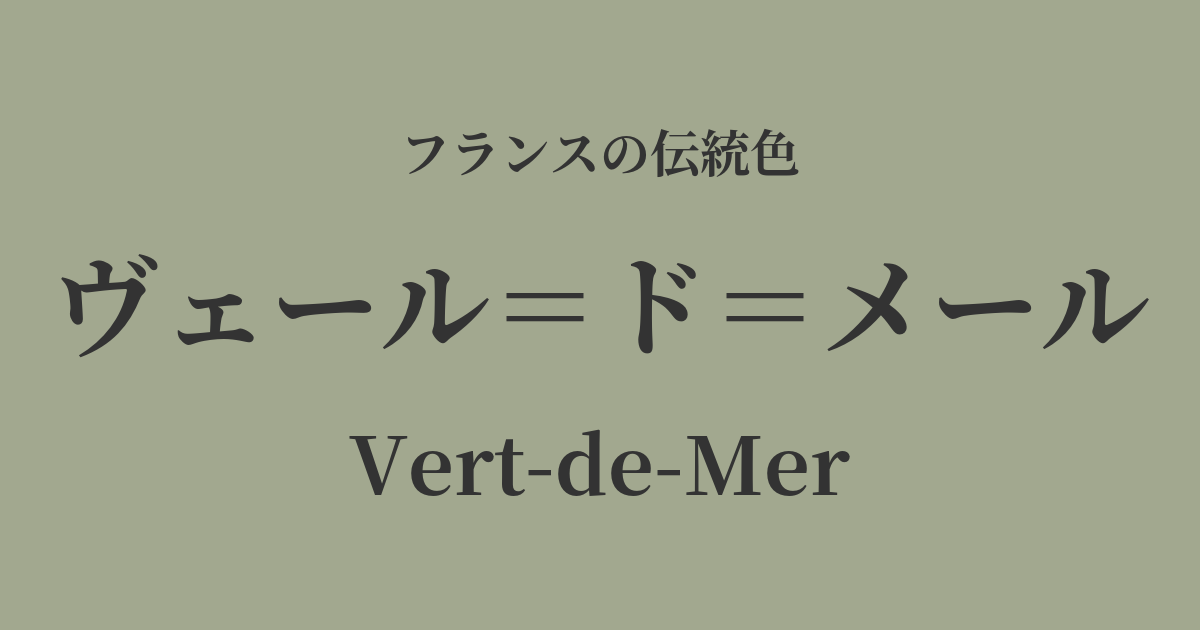
| French | Vert-de-Mer |
|---|---|
| Katakana | Vert-de-Mer |
| HEX | #a2a88f |
| RGB | 162, 168, 143 |
What is Vert-de-Mer? Origin and Etymology
Vert-de-Mer is a color with a very poetic name, which literally translates to "sea green" in French.
As the name suggests, this color is inspired by the calm, deep hues of the Mediterranean and Atlantic seas surrounding France. Rather than the vibrant blue of a clear day, it represents the complex and nuanced greens found under slightly cloudy skies, or in rich seawater containing plankton and minerals.
It's not just a simple green; the inclusion of gray and bluish tones evokes a sense of calm, sophistication, and the grandeur of nature. It's a color that reflects the deep insight into nature cultivated by the French people's refined sense of color.
Historical background of Vert-de-Mer
Vert de Mer gained particular aesthetic value during the "Belle Époque" (the beautiful era) from the late 19th to the early 20th century, and the period when Art Nouveau flourished.
During this period, as a reaction against the urbanization following the Industrial Revolution, there was a growing interest in the organic forms and colors of the natural world. Natural motifs such as plants, insects, and the sea were incorporated into all kinds of design, including architecture, crafts, and poster art. Vert de mer, in particular, is one of the colors that symbolizes the spirit of this era, and can be seen in the glasswork of Émile Gallé and the jewelry of René Lalique.
Furthermore, the development of seaside resorts, including the French Riviera, as social hubs for the upper class is also thought to have influenced the popularity of this color. This color, reminiscent of the sea of one's hometown, was likely favored in the interiors of seaside villas and in fashion.
Vert de Mer in the world of art and fashion
In the world of art, we can find colors reminiscent of the Vert de Mer in the depictions of light and water, particularly those of Impressionist painters. Claude Monet's paintings of the cliffs of Normandy and the coastline of Étretat beautifully capture the ever-changing colors of the sea depending on the light, and within them are countless gradations of deep green.
In fashion, this color has been loved across generations for its calm and intelligent feel. When expressed in lustrous fabrics like silk or velvet, the interplay of light and shadow creates a particularly elegant impression. Even today, it remains a sophisticated color representative of French chic, and many fashion houses incorporate it into their collections.
In textile culture, this color is sometimes used as the background color for "Toile de Jouy," a traditional French fabric. This gentle green softly enhances the monochrome depictions of pastoral landscapes and mythological stories, creating an elegant and classical atmosphere.
Color scheme preview
This is to check the readability of the text when this color is used as the background.
Vert-de-Mer's color scheme proposal
Ecru (#F3EAD3)
The calming green of Vert-de-Mer combined with the off-white ecru creates a natural and organic atmosphere. This combination is perfect for creating a natural and relaxed space and fashion style.
Rose Pompadour (#ED7A9E)
The contrast between the grayish green and the vibrant, slightly bluish pink creates a beautiful color scheme. It evokes Art Deco, giving off an elegant and distinctive impression that is both sophisticated and sweet.
Gris de Lignan (#DCD3C4)
By combining it with a muted gray, like flaxen, it creates a calm and intellectual impression that is the epitome of French chic. Because the color tones are similar, it has a cohesive and very elegant feel.
Practical Scenes
In interior design, verre de mer brings tranquility and serenity to a space. Simply incorporating it on one wall in a living room, study, or bedroom creates a calm and intellectual atmosphere. It pairs exceptionally well with natural wooden furniture such as oak, as well as linen and cotton fabrics.
In fashion, its elegance stands out. Vert de Mer's dresses and skirts give a sophisticated impression on their own and are versatile enough for both the office and casual occasions. Adding gold accessories adds glamour, while silver creates a cool and modern feel.
In web and graphic design, it is effective when you want to convey a sense of trust or harmony with nature. Using it as a background color for lifestyle brands, environmental websites, and museums can enhance the quality of the content and give users a calm impression.