
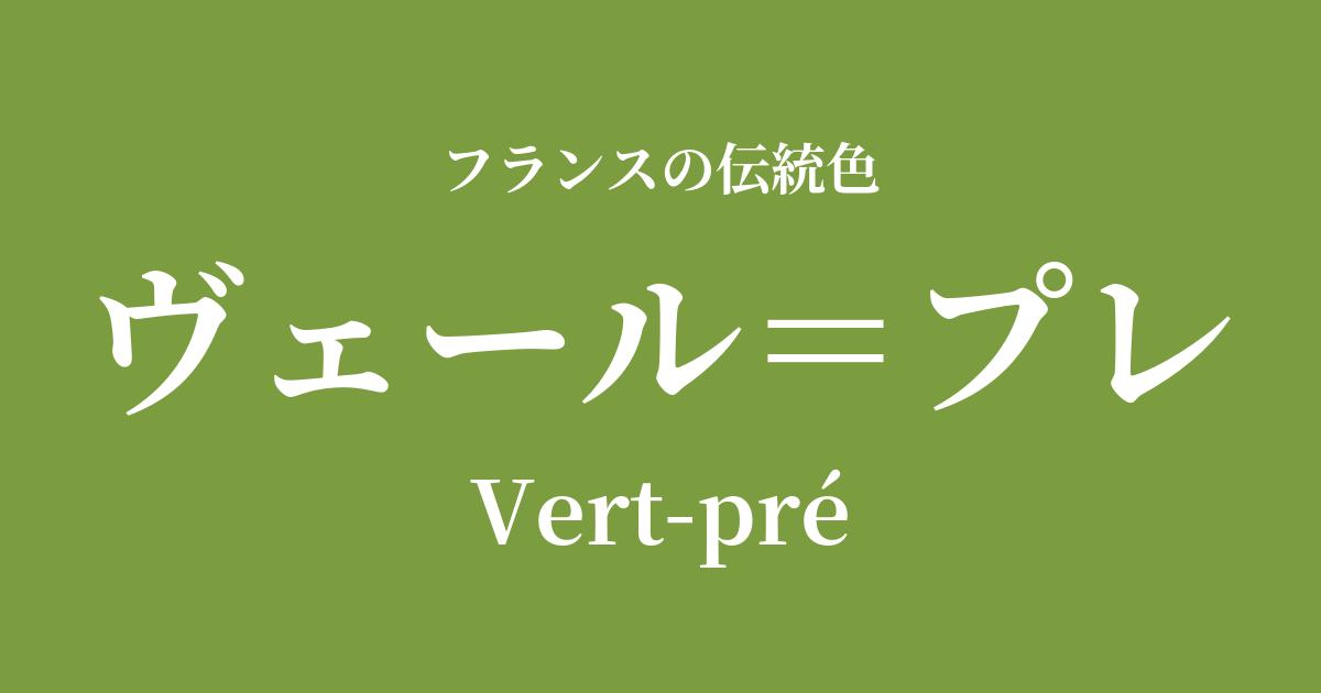
| French | Vert-pré |
|---|---|
| Katakana | Vert-Pré |
| HEX | #7c9d3f |
| RGB | 124, 157, 63 |
What is Vert-Pré? Origin and Etymology
Vert-pré is a color name that, as its name suggests, represents "the green of a meadow," combining the French words "Vert," meaning "green," and "pré," meaning "pasture" or "grassland."
This vibrant green color perfectly captures the lively colors of the grasses that spread across the French countryside from spring to early summer, brimming with life. Just looking at it evokes the scent of grass swaying in the breeze and the gentle sunlight, a color that connects you deeply with nature.
This color doesn't originate from any specific pigment or dye, but rather from the everyday landscapes that the French people have cherished. It has long been a beloved color symbolizing abundance, hope, and peace of mind.
Historical background of Vert-Pré
Vert-Pré is a color rooted in the lives of ordinary French people and the sensibilities of artists, rather than being a color favored by specific royalty or nobility.
During the Rococo period of the 18th century, a longing for the countryside (pastoral taste) became fashionable, exemplified by the "Petit Hameau" gardens that Marie Antoinette had built for the Palace of Versailles. The nobility escaped the restrictive life of court and enjoyed imitating a natural and simple lifestyle. Against this backdrop, natural greens like Vert-Pré were incorporated into and loved in the fashion and interior design of the time.
Furthermore, in the 19th century, as a reaction to the urbanization brought about by the Industrial Revolution, an artistic movement emerged that sought to depict nature as it was. In particular, the painters of the "Barbizon School," who gathered around the Fontainebleau Forest, painted many scenes of the French countryside. Their canvases richly express the colors of meadows shimmering in the light, or verre pré.
Veil-pre in the world of art and fashion
The Vert-Pré hue is inextricably linked to the history of French art, particularly landscape painting. Barbizon School painters such as Jean-Baptiste Camille Corot and Jean-François Millet used this vibrant green to poetically depict the tranquil daily life of the French countryside and the changing light and atmosphere.
Later, Impressionist painters, who pursued the expression of light, were also captivated by this color. Claude Monet and Camille Pissarro, through porcelain painting (plenary), sought to capture the ever-changing colors of plants and trees bathed in sunlight. On their palettes, verre-prée shone even more vividly, enveloped in particles of light.
In the world of fashion and textiles, this color is a symbol of naturalistic design. This gentle green frequently appears in the pastoral motifs depicted in Toile de Jouy, a traditional French printed fabric, and continues to bring tranquility to people's hearts.
Color scheme preview
This is to check the readability of the text when this color is used as the background.
Vert-Pre's color scheme proposal
Blanc Cassé (#EAE2D6)
By combining it with a warm, off-white color, it creates a very natural and organic atmosphere. This color scheme is perfect for creating a calm and comfortable space where you can truly relax.
Jaune Bouton d'Or (#FDC14E)
The vibrant yellow, reminiscent of buttercups blooming in a meadow, further enhances the vitality of Vert-Pré. This combination creates a bright, hopeful, cheerful, and joyful impression, as if announcing the arrival of spring.
Rose Pompadour (#ED82A2)
The combination of green and pink, often seen in nature, beautifully complements each other. It's an elegant yet lovely color scheme, reminiscent of delicate flowers blooming in a meadow.
Practical Scenes
In interior design, verre-pre brings tranquility and a natural feel to a space. Incorporating it into an accent wall in a living room or study, or adding it through fabrics like cushions, curtains, or rugs, can create a relaxing effect, making you feel as if you're taking a walk in a forest. It pairs particularly well with natural wooden furniture such as oak and pine.
In fashion, incorporating natural materials like cotton and linen into shirts and dresses creates a fresh and unpretentious appeal. Pairing them with earth tones such as white, beige, and brown completes a sophisticated adult casual style.
For websites and graphic design, this approach is ideal for content themed around organic products, gardening, environmental issues, or slow living. It conveys a sense of security and trust to users, and communicates a pleasant brand image.