
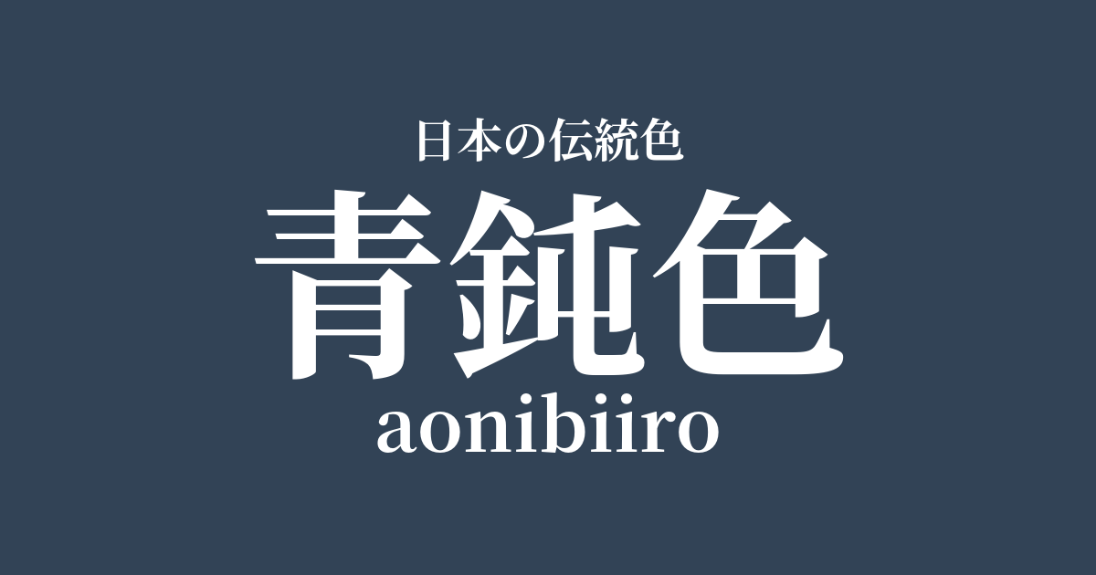
| Japanese color name | Bluish-blue |
|---|---|
| reading | aonibiiro |
| HEX | #324356 |
| RGB | 50, 67, 86 |
What is a dull blue color? Origin and etymology
Aonibi-iro is a deep, dark bluish-green color, a variation of nibi-iro (dull gray) with a bluish tint. "Nibi-iro" is a general term for dark gray used as the color of mourning clothes during the Heian period, and aonibi is one type of nibi-iro. Its hue is said to have been created by dyeing a cloth under-dyed with indigo and then further dyeing it with plant dyes such as tsurubami. Tsurubami is a dye obtained from the fruit peels and bark of beech family plants such as acorns, and by using iron as a mordant, it dyes to a deep, subdued color.
This complex process creates the deep, rich hue characteristic of this bluish-gray color.
The character "don" (無) means dull light or poor cutting edge, and thus came to be used in connection with inauspicious occasions as a color that has lost its luster, that is, a color representing sadness. Among these, the bluish-gray color, in particular, was recognized as a color that symbolizes quiet and deep sorrow due to its bluish hue. While it has a strong image as a color of mourning, its subdued hue also conveys a sense of elegance and dignity, and it has a history of being used by people of high status.
A historical background of dull blue
A dull blue color was primarily used for mourning attire during the Heian period. The Engishiki, a compilation of laws and regulations from that time, records that this dull blue color was designated as the color of mourning attire when a close relative of the emperor or retired emperor died. It is said that the shade of the color was strictly differentiated depending on the length of the mourning period and the relationship with the deceased. It was customary to gradually change to lighter-colored clothing as the mourning period progressed.
Although the dull blue color was considered an ominous color, its profound hue was not merely an expression of sadness. When worn by people of high status, it actually functioned as a color that enhanced their dignity and inner beauty. In the aesthetic sensibilities of the Heian aristocracy, the dull blue color was positioned as a complex and important color possessing two aspects: sorrow and elegance.
Related literature, waka poetry, and seasonal words
The color dull blue also appears as a symbolic color in "The Tale of Genji," considered the greatest masterpiece of Heian literature. For example, in the chapter "Kiritsubo," the protagonist, Hikaru Genji, is depicted wearing dull blue mourning clothes upon the death of his father, Emperor Kiritsubo. His appearance is described as "a dull blue fabric that is not particularly flashy, yet very elegant," and the color is portrayed as having the effect of further highlighting Hikaru Genji's beauty, even though it is mourning attire.
Furthermore, in the "Suma" chapter, there is a scene where Hikaru Genji, who has been banished from the capital, receives news of the death of Fujitsubo no Miya, the woman he once loved, and changes into a dark blue mourning robe, immersed in deep sorrow. In this way, dark blue is effectively used in "The Tale of Genji" as an important color expression to convey the characters' sadness and sense of loss to the reader. Through this literary work, we can catch a glimpse of the cultural significance of this color.
Color scheme preview
This is to check the readability of the text when this color is used as the background.
A proposed color scheme in a muted blue.
Silver mouse (#AFAFAF)
By combining it with a light gray, the heaviness of the bluish-gray is softened, giving it a refined impression. This color scheme evokes the tranquil scenery of winter and is suitable for creating a modern and calm atmosphere.
Kutsuha color (#917347)
The coolness of the muted blue and the warmth of the withered leaf color complement each other, creating a color scheme that is almost complementary. It evokes the deepening of autumn and the quiet scenery of nature. It is an elegant combination that is calm yet somehow warm.
White training (#F3F3F3)
The combination with pure white, or "shironeri," best highlights the deep, muted blue hue. The clear contrast creates a dignified and refined impression. It is effective in formal designs and situations where cleanliness is important.
Practical Scenes
In the world of kimono, a muted blue was originally a color associated with mourning and is therefore generally avoided in modern celebratory occasions. However, its subdued hue makes it a popular choice for those who appreciate a sophisticated style. In particular, incorporating it into men's kimonos, obi sashes, and accessories can create an understated yet elegant look.
In interior design, using it on large areas such as wallpaper, curtains, and sofas brings a sense of gravitas and tranquility to the space. It is suitable for rooms where a calm atmosphere is desired, such as studies and bedrooms. Furthermore, adding it as an accent with small items such as cushions and rugs can tighten the overall look of the space and create a sophisticated impression.
In web and graphic design, using it as a background color enhances the visibility of text and images on top, conveying a sense of reliability and expertise. It is also effective as a key color for corporate websites and brands aiming to project a sense of luxury, giving users a calm and sophisticated impression.