
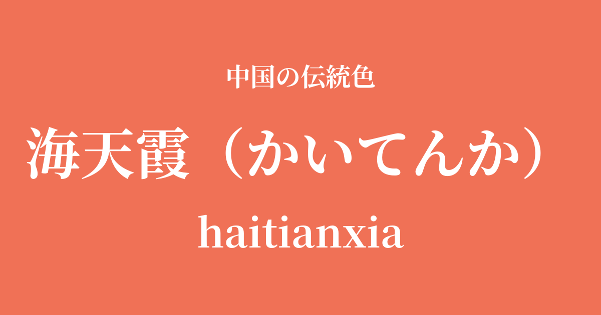
| Color name | Kaiten Kasumi |
|---|---|
| reading | Rotating |
| pinyin | haitianxia |
| HEX | #F07156 |
| RGB | 240, 113, 86 |
What is Kaitenka? Origin and etymology
Kaitenka, as its name suggests, represents the color of the "haze" that spreads between the "sea" and the "sky." It is a very poetic color name that captures the scene at sunrise and sunset when sunlight is reflected and scattered by water vapor and dust in the atmosphere, dyeing the sky a fiery orange-red.
The colors of that majestic yet fleeting moment when the horizon slowly changes color, and the sky and sea merge to create a beautiful gradient. It's a name that seems to capture a scene straight out of a magnificent landscape painting woven by nature.
Historical background of Hai Tian Xia
There are not many records indicating that the color name "Haitianxia" was officially established by any particular dynasty, but the imagery this color evokes has been cherished by Chinese poets and painters since ancient times.
In particular, during the Tang and Song dynasties, when literature and art flourished, many poems were written celebrating the beauty of nature. Descriptions of sunrises and sunsets were important motifs for enhancing poetic sentiment, and it is thought that the image of "sea and sky with mist" developed within this cultural context.
In the world of dyeing, these vibrant red hues were created using natural dyes such as madder and safflower. Rather than being associated with the lavish ceremonies of the royal court, these colors have become deeply rooted in people's hearts as reflections of literary sensibilities and a longing for nature.
Hai Tian Xia in Chinese Art and Crafts
The color of "sea, sky, and mist" can be seen in various forms of Chinese art. In landscape painting, this color was effectively used when depicting sunrises and sunsets. When warm colors like "sea, sky, and mist" are subtly added to the silhouettes of mountains depicted with varying shades of ink, the painting gains a sense of time and emotional depth.
In the world of ceramics, there are glazes that evoke this color. For example, the purple-red glaze found in Jun ware from the Song dynasty and the sacrificial red glaze perfected during the Ming and Qing dynasties express a complex and deep red color reminiscent of the hazy sea and sky. In ceramics, an art form associated with fire, the color of a burning sky may have been a perfect theme.
In clothing culture, this color was often used, particularly in women's clothing such as Hanfu and ceremonial attire. The vibrant orange-red, which evokes vitality and passion, was favored as a color suitable for special occasions such as celebrations and festivals.
Rakka, Koryu Saihi, Shusui Kyocho Ten Isshiki.
Color scheme preview
This is to check the readability of the text when this color is used as the background.
Color scheme proposal for Kaitenka
Red (#495859)
The vibrant sea and sky mist are enhanced by the deep, calming shade of dark brown. A contrast is created, like the quiet sky before sunrise and the light of the rising sun, giving a refined and intellectual impression.
Tsukihaku (#EAF4FC)
The warmth of the sea and sky, and the coolness of the moon, complement each other, creating a pure and elegant atmosphere. The delicate and beautiful color scheme is reminiscent of the gradation of the dawn sky.
Matsuka (#BCEE68)
When combined with pine blossoms that shine like young leaves bathed in sunlight, it creates a vibrant and lively impression full of life. It's a bright and positive color scheme that evokes the energy of nature.
Practical Scenes
In interior design, using Hai Tian Xia as an accent color brings warmth and energy to a space. Incorporating it into cushions, curtains, or art panels will give the entire room a bright and cheerful atmosphere. It pairs particularly well with natural wood and neutral colors such as white and gray.
In fashion, choosing this color for key pieces like dresses and skirts creates a confident impression. It's also lovely to add it as an accent color with accessories like scarves, bags, and jewelry. It brightens the face and adds vibrancy to the overall look.
In web and graphic design, it's effective when used for buttons, banners, and headlines that you want to attract attention. It has the power to draw the user's eye and encourage action. It's also suitable as the brand color for brands and services that you want to convey warmth and passion.