
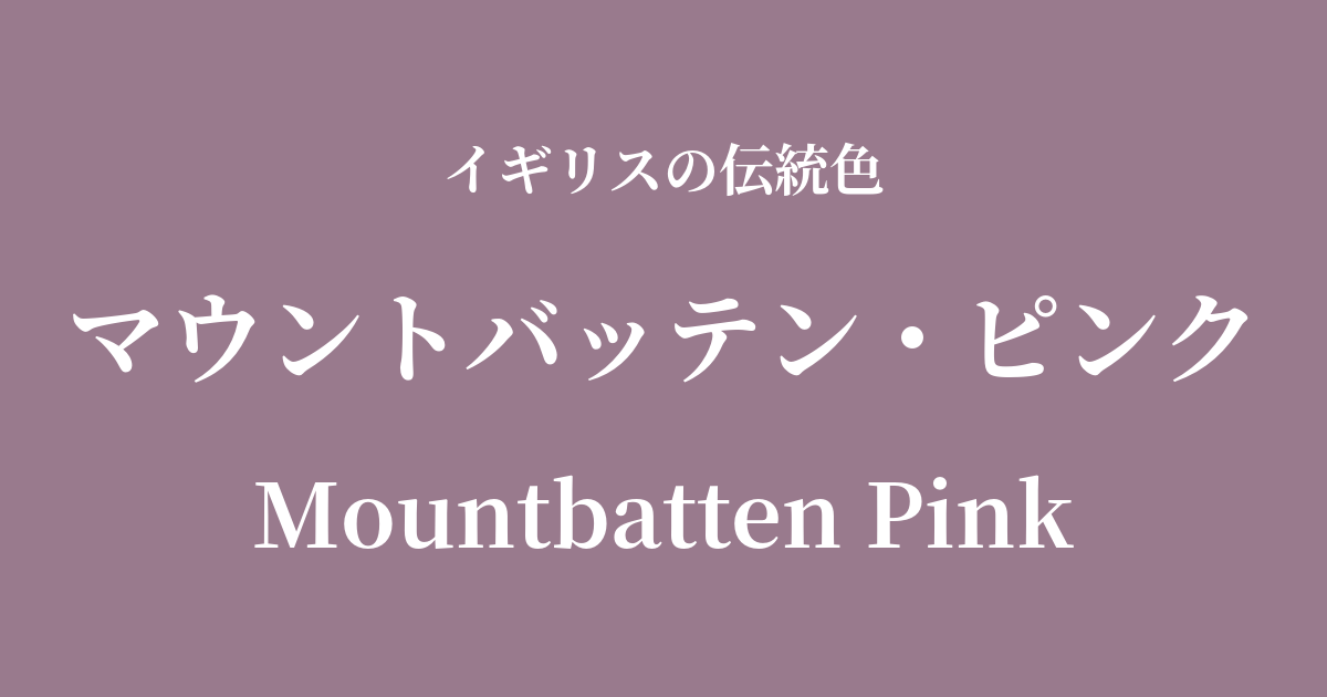
| Original English name | Mountbatten Pink |
|---|---|
| Japanese notation | Mountbatten Pink |
| HEX | #997A8D |
| RGB | 153, 122, 141 |
What is Mountbatten Pink? Origin and etymology
Mountbatten Pink, as its name suggests, is a color derived from Sir Louis Mountbatten, a British royal and naval admiral. This was not merely a decorative color, but a "camouflage color" created for practical purposes under the extreme conditions of World War II.
The purpose was to conceal the ships from the enemy's sight. In particular, it was designed to make the ship's silhouette blend into the horizon and sky during the brief period of dawn and dusk when the sky is tinged with pink and purple, thereby reducing its visibility.
Although it's called "pink," the actual color is closer to lavender or mauve—a muted, grayish-purple pink. This exquisite shade was expected to provide an amazing camouflage effect under certain lighting conditions.
Historical background of Mountbatten Pink
The origin of this color lies in the fierce Battle of the Atlantic during World War II. At that time, British convoys were constantly threatened by German U-boats, and every means of protecting the ships was being sought.
Around 1940, Lord Mountbatten noticed an intriguing phenomenon while inspecting a convoy. One passenger ship of the Laval Union Line was sailing with a grimy, pinkish-gray paint job, making it remarkably difficult to see in the twilight. This accidental discovery led to the development of a new camouflage pattern.
Under the leadership of Lord Mountbatten, this pinkish-gray-based paint was developed and experimentally applied to some ships. However, its effectiveness was limited to very specific times of day, such as dawn and dusk, and it had the drawback of being conspicuous in bright daylight. As a result, the more versatile standard gray camouflage became dominant, and Mountbatten Pink was never adopted on a large scale. Nevertheless, it remains a historically interesting color that tells the story of wartime ingenuity and trial and error.
Mountbatten Pink in British Culture
Mountbatten Pink, due to its military origins, is not a color that has been widely used directly in the fields of fashion or art. However, its unique shade and historical background continue to inspire contemporary designers and creators.
In the world of military fashion, pink is sometimes seen as a distinctive and sophisticated color that stands out from standard colors like khaki and olive drab. The unexpected addition of pink to the rugged image of camouflage creates depth and a narrative in the design.
Furthermore, in the field of interior design, its grayish, subdued tone is being re-evaluated as an accent color that creates a calm and intellectual space. As a gender-neutral pink, it is being incorporated into wallpaper, fabrics, and furniture, creating a classic yet modern atmosphere.
Color scheme preview
This is to check the readability of the text when this color is used as the background.
Mountbatten Pink color scheme proposal
Royal Blue (#002366)
This color combination both have roots in the British Navy. The soft impression of pink is tightened by the deep, intelligent navy, creating a sophisticated color scheme that conveys elegance and trustworthiness.
Cambridge Grey (#A3A3A3)
Mountbatten Pink harmonizes beautifully with its grayish tones, creating a calm and sophisticated impression. This color scheme is suitable for minimalist, urban spaces and chic fashion coordinates.
British Racing Green (#004225)
The muted pink and deep green are almost complementary colors that enhance each other. It's a classic and dignified combination that also evokes a sense of natural warmth, making it a truly refined pairing.
Practical Scenes
In the world of fashion, Mountbatten Pink is a unique yet easy-to-wear color. When incorporated into shirts or knitwear, it pairs well with navy jackets and gray trousers, creating an intelligent and sophisticated style. Using it as an accent color in accessories such as scarves and ties is also effective for subtly expressing individuality.
In interior design, this color is effective as an accent color that brings calmness and depth to a space. Using this color on one wall in the living room or as an accent wall in a study creates a thoughtful and tranquil atmosphere. Incorporating it into fabrics such as cushions and curtains can add a soft touch of color to the space.
In web and graphic design, its historical background can be leveraged to make it a key color for brands that want to convey trustworthiness and tradition. The contrast with white or charcoal gray text is also beautiful, creating a memorable design while maintaining readability.