
| Color name | Western red |
|---|---|
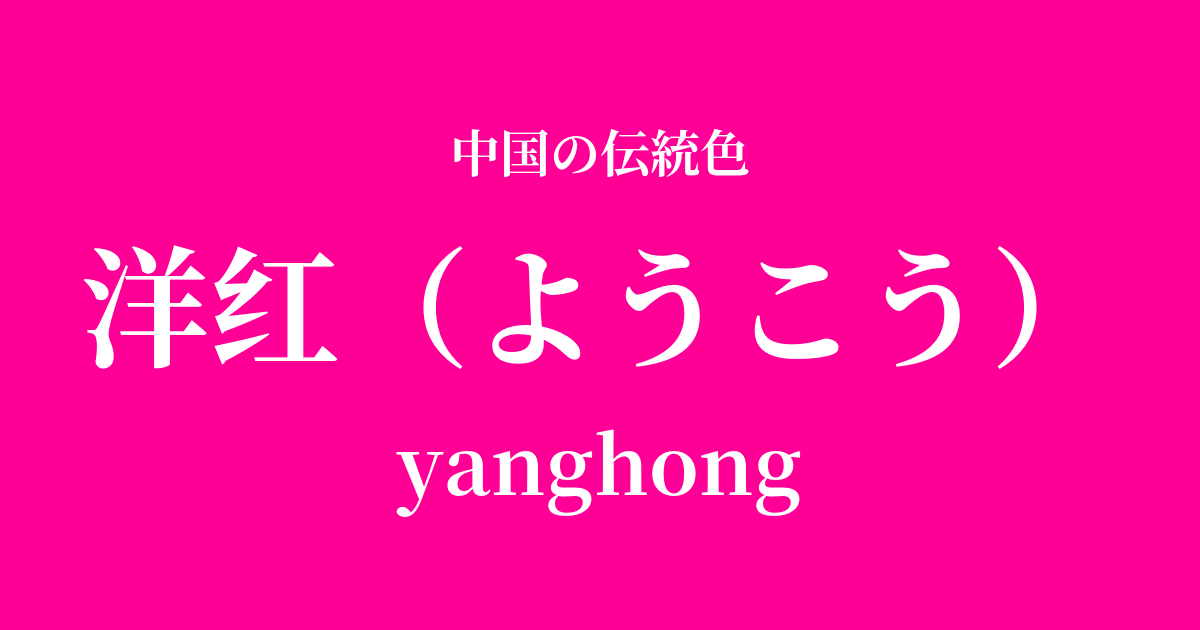
| reading | Yohko |
| pinyin | yanghong |
| HEX | #FF0097 |
| RGB | 255, 0, 151 |
What is "Yanghong"? Origin and etymology
"Yōkō" (洋红), as the name suggests, refers to a vibrant magenta color, meaning "red that came from the West."
This color originated in the 19th century when synthetic dyes, such as aniline dyes invented in Europe, were introduced to China. It is characterized by an exceptional brightness and vividness that could not be achieved with natural dyes such as safflower and madder, which had been used in China until then.
The word "Western" was often used to describe new cultural items introduced from overseas during the late Qing Dynasty and the Republic of China period. Examples include "Western lamps" and "Western clothing," indicating that this color was considered modern and innovative by the people of that time.
Historical background of the red
The term "yanghong" (Chinese red dye) first appeared in Chinese history during the late 19th century, in the late Qing dynasty. Following the Opium Wars, trade with the West intensified, and large quantities of inexpensive, brightly colored chemical dyes were imported along with various industrial products.
This new color quickly gained popularity among court ladies and the wealthy in urban areas. Unlike the solemnity of traditional red, this light and vibrant red was embraced especially by younger generations as a color symbolizing a new era.
The popularity of Western-style clothing can be said to strongly reflect the atmosphere of the time, when Chinese society was being heavily influenced by Western culture and traditional values were beginning to waver.
Western Red in Chinese Art and Crafts
In clothing culture, Western red was boldly used in qipao and fuan (jackets) made from the late Qing Dynasty to the Republic of China era. When combined with traditional auspicious embroidery patterns, it created a unique and magnificent style that fused Eastern and Western aesthetics.
Furthermore, although rarely used in traditional ink paintings, these vibrant colors were effectively used to attract attention in "nianhua," folk prints celebrating the New Year, and in modern advertising posters called "yuefenpai," which developed mainly in Shanghai. These modern colors were perfectly suited to depicting women of the new era.
Color scheme preview
This is to check the readability of the text when this color is used as the background.
A color scheme proposal for crimson.
Tsukihaku (#EAF4FC)
The vibrant red of the rosé is enhanced by the pale, pure color of the moon white, creating a modern and sophisticated impression. The beautiful contrast between the two colors makes each other stand out.
Mayuzumi (#495859)
The vibrant red stands out even more when paired with a deep, calming dark brown. This color scheme is chic, sophisticated, and exudes adult elegance.
Fujio (#FFB61E)
Combining it with the vibrant yellow of lavender creates an energetic and festive atmosphere. It's recommended for bold, playful designs that are sure to attract attention.
Practical Scenes
In the world of fashion, incorporating red as an accent color in dresses, skirts, or scarves instantly brightens up the entire outfit. It's especially perfect for special occasions like parties. Using it as a pop of color in accessories like bags and shoes is also effective.
In interior design, it's recommended to use them in small areas, such as cushion covers or art panels. Adding them to a simple space based on white or gray will create a modern and vibrant accent.
In web and graphic design, it's highly effective when used for buttons and banners you want to attract attention. It's also suitable as a key color for brands that want to express youthfulness, creativity, and passion, but because of its high saturation, it's important to use it with balance in mind.