
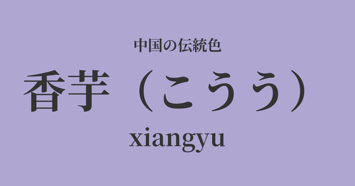
| Color name | Sweet potato |
|---|---|
| reading | Kou |
| pinyin | xiangyu |
| HEX | #AFA7D2 |
| RGB | 175, 167, 210 |
What is a fragrant potato? Origin and etymology
"Kouu" (香芋) is a color derived from the word for "fragrant potato," or taro. This color faithfully represents the pale, gentle purple color seen in the cross-section of steamed or sliced taro.
Taro has been cultivated in China, especially in the southern region, since ancient times and has become deeply ingrained in people's diets as a staple food and confectionery. The color "Xiangyi," derived from the color of this everyday ingredient, can be described as a simple yet elegant and warm color that is close to everyday life.
The fact that the kanji character for "fragrance" is included in the name is also distinctive, evoking not only the color itself, but also the subtle sweet scent and fluffy texture of taro. It is an emotionally rich color name that appeals not only to sight, but also to taste and smell.
Historical background of sweet potatoes
The color name "Kaorimo" (fragrant taro) is thought to have been cultivated within the everyday life and culture of ordinary people, rather than being recorded as an official color of the royal court. Although it is not a color that symbolizes a particular dynasty, its gentle and understated hue has been loved by many people throughout history.
Particularly during the Ming and Qing dynasties, as society matured and culture flourished, people's sense of color became more refined and diverse. Paintings from this period, as well as literary works such as the novel "Dream of the Red Chamber," feature various shades of purple in the clothing of the characters. It is said that a subdued purple, like "fragrant taro," was favored to represent the elegant attire of young women and intellectuals.
It was a color that resonated with the aesthetic sensibilities of literati who valued gentle and intellectual beauty, setting it apart from the extravagant court culture. Its soft hues may have also been seen as embodying the Confucian virtues of "gentleness" and "humility."
Aromatic taro in Chinese art and crafts
In clothing culture, "fragrant taro" was a favorite color for women's clothing. When silk or cotton is dyed this color, it creates an elegant and soft texture that subtly changes its appearance depending on the light. In the Hanfu of the Ming and Qing dynasties, especially in the everyday garments of the fuan (jacket) and kun (skirt), this color was used to portray the wearer's modest yet refined personality.
In the world of ceramics, the fencai and enamelware that developed during the Qing Dynasty feature a pale purple glaze reminiscent of "fragrant taro." This color was used as a background color to enhance the delicate floral, bird, and human figures depicted on the surface of the vessels, or as part of the patterns themselves, thereby elevating the overall elegant atmosphere of the piece.
Furthermore, this color plays an important role in intricate paintings such as Kohitsuga. When expressing the shadows of the folds in a figure's clothing or the gradations of petals in flowers like peonies and tree peonies, intermediate colors like "fragrant taro" are used, creating a realistic yet poetic depth.
Color scheme preview
This is to check the readability of the text when this color is used as the background.
Color scheme proposal for sweet potato
Mica (#DCDCDC)
The soft purple of the sweet potato and the quiet, light gray of the mica harmonize beautifully, creating a very elegant and sophisticated impression. This understated yet intelligent color scheme is suitable for interiors and formal designs.
Bean green (#A4D893)
By combining it with a bean-green color reminiscent of taro leaves and stems, a natural and vibrant color scheme is created. The gentleness of the taro is complemented by the youthful green, creating a bright and gentle atmosphere like spring.
Blue color (#EDD1D5)
The purple of sweet potato and the pale pink of lotus root are both gentle, plant-derived colors. When combined, they create a sweet, feminine, and dreamy, romantic impression. This color scheme is particularly striking in the fields of cosmetics and fashion.
Practical Scenes
In the world of fashion, incorporating "fragrant yam" into items such as dresses, blouses, and knitwear creates an elegant, feminine, and soft impression. Its understated, muted color makes it suitable for office casual wear. Using it as an accent color in accessories like scarves, bags, and jewelry also adds a sophisticated touch.
In interior design, using this color for wallpaper, curtains, and cushions in bedrooms and living rooms can create a relaxing and tranquil space. It pairs exceptionally well with neutral colors such as white, ivory, and light gray, as well as natural wood-grain furniture, creating a comfortable and sophisticated atmosphere.
In web and graphic design, it's a great fit for wellness, beauty, and lifestyle brand images. Using it as a background or accent color can give users a sense of security and elegance, effectively conveying the worldview of the content.