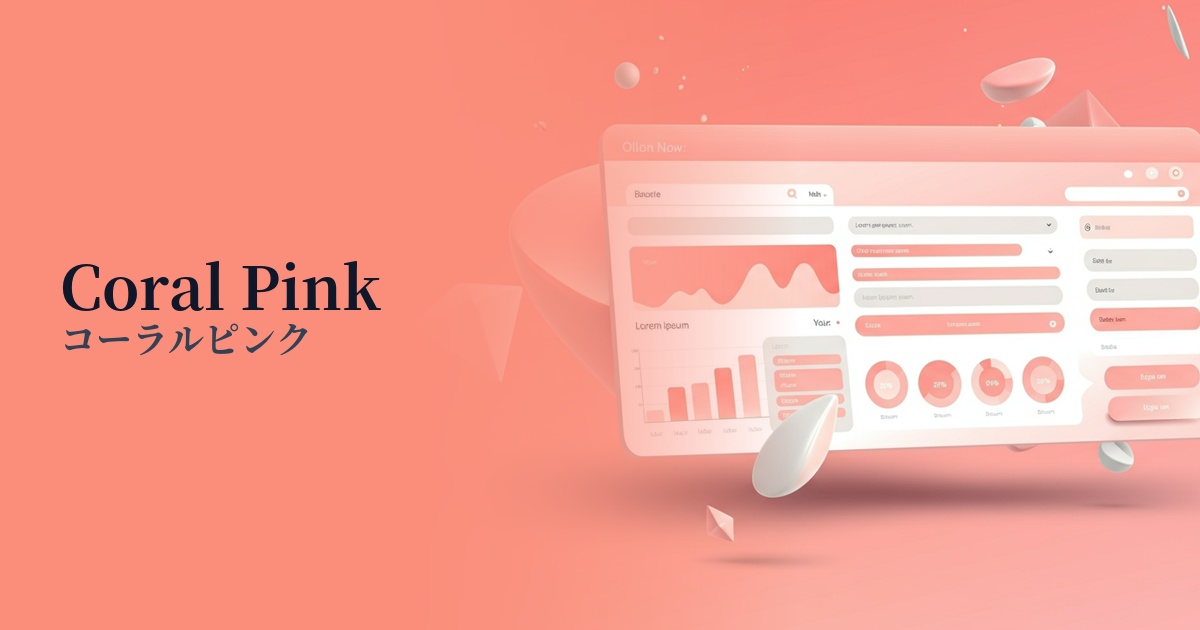
| English name | Coral Pink |
|---|---|
| Katakana | Coral Pink |
| HEX | #F8D6D5 |
| RGB | 248, 214, 213 |
| Design Theme | Pastel & Macaron Colors |
Why is it a trend? (Background and reasons)
In recent years, web design has seen a reaction against minimalism, with a growing demand for more human-centered and warm expressions. Soft pastel colors like coral pink are gaining attention as colors that bring emotional richness and approachability to digital interfaces.
In particular, in the lifestyle, wellness, and beauty sectors, an organic and healthy image is highly valued. Coral pink, reminiscent of coral reefs, evokes a sense of natural gentleness and vitality, making it a perfect fit for this brand's worldview. With its visually pleasing nature and appeal to social media, this color has been well-received by many users.
Furthermore, Gen Z and Millennials, in particular, tend to prefer a positive and optimistic mood. The sense of happiness and cheerful atmosphere that coral pink evokes makes it an effective choice for providing users with a sense of security and a positive experience.
The psychological effects of design and UX
Coral pink is a color that combines the gentleness and affection of pink with the vibrancy and energy of orange. This gives users a positive impression of "warmth," "friendliness," and "happiness."
In UI/UX design, this color can be expected to lower psychological barriers for users. For example, even on a site you're visiting for the first time, the use of this color can reduce apprehension and make it easier to approach the content with an open mind.
Furthermore, its soft, healthy-looking complexion helps to create a sense of security and trust. However, if the saturation is too high, it tends to give a childish impression, so choosing a light tone like #F8D6D5 can create a sophisticated and gentle atmosphere.
Visibility testing (UI component example)
Practical usage (best practices)
When used as an accent color for interactive elements such as CTA buttons and links, it gently and effectively encourages user action. Its presence stands out especially in clean designs based on white or light gray.
Using it boldly as the main background color creates a soft, enveloping atmosphere throughout the entire site. In this case, it's important to choose a color that maintains sufficient contrast, such as dark gray or navy, for the text to ensure readability.
It's also effective to apply it to specific UI components such as the background of product cards, user review sections, and tags. It visually groups information and creates rhythm and warmth throughout the entire interface.
By incorporating these colors into the color schemes of illustrations and icons, you can give your designs a sense of life and emotional depth. They play a role in adding a tangible, human touch to digital expressions that can often feel impersonal.
Recommended color scheme suggestions
Steel Blue (#4682B4)
The warmth of coral pink and the intellectual, calm atmosphere of steel blue harmonize beautifully, creating a modern and sophisticated impression. It's recommended for SaaS UIs that aim to balance trustworthiness and approachability, as well as for cutting-edge corporate websites.
Sage Green (#9DC183)
This organic and soothing color scheme evokes the coral and plant leaves found in nature. It brings a sense of peace and health to wellness-related services, natural cosmetics, and sustainable brand websites.
Cream (#FFFDD0)
The soft cream color enhances the gentleness of the coral pink, creating a very refined and elegant atmosphere. It is ideal for bridal-related websites, high-end beauty salons, and sophisticated fashion brand websites.