| English name | Macaron Yellow |
|---|---|
| Katakana | Macaron Yellow |
| HEX | #FFF4BE |
| RGB | 255, 244, 190 |
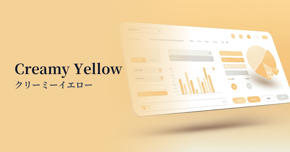
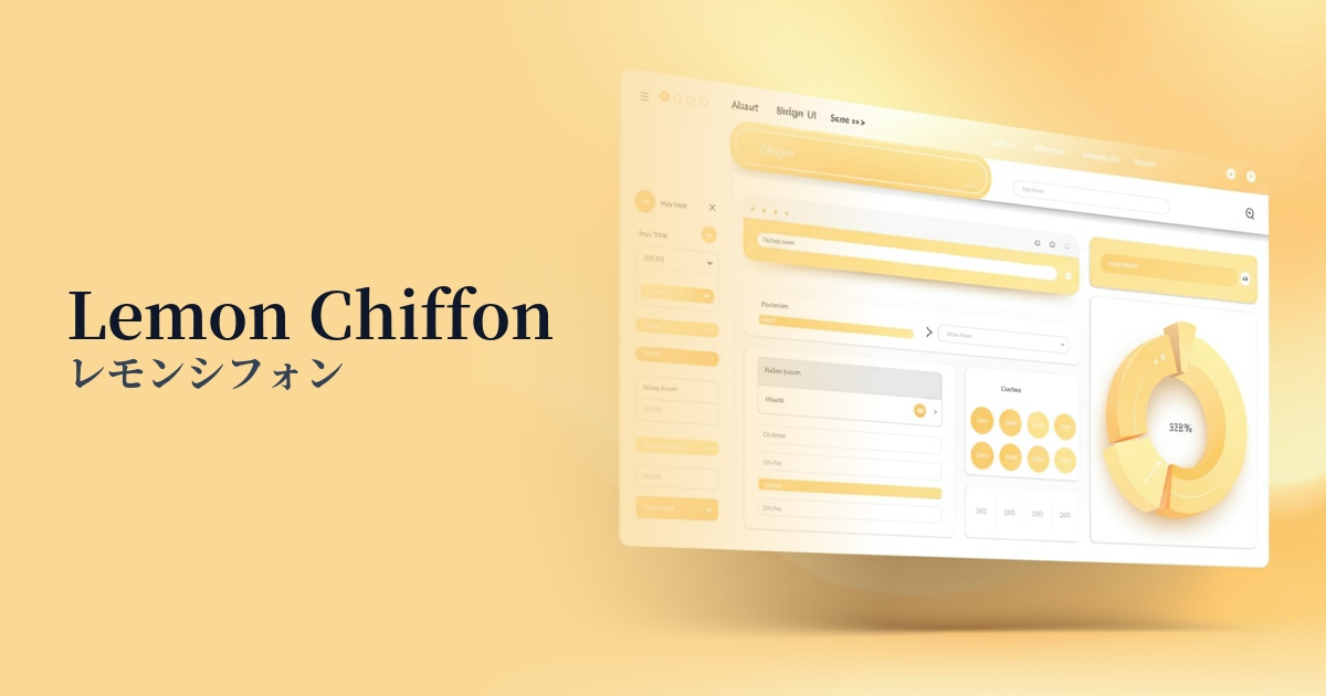
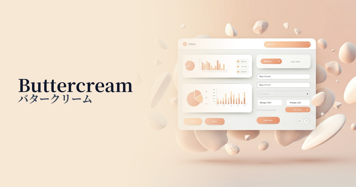
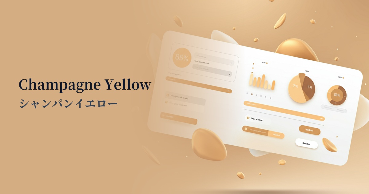
| Design Theme | Pastel & Macaron Colors |
Why is it a trend? (Background and reasons)
In recent years, web design has seen a shift away from intensely vivid colors towards more soothing and pleasing color palettes. With growing interest in digital wellness and mindfulness, designs that provide users with mental peace and comfort have become increasingly important. Macaron yellow is one of the best colors to express this sense of comfort.
As its name suggests, this color is characterized by its sweet and light hue, reminiscent of the French pastry macaron. It brings the warmth of human touch and positive emotions to the often cold and impersonal digital space. Not overly optimistic, yet conveying a quiet sense of happiness, this color resonates with the mood of "small happiness" that modern users seek.
Another reason for the trend is the versatility of macaron yellow. It's popular not only in areas where friendliness is important, such as lifestyle, food, and baby products, but also increasingly adopted by cutting-edge technology companies to project a "human-centered" image. It's a truly modern yellow, combining the vibrant energy of traditional yellow with a refined softness.
The psychological effects of design and UX
Macaron yellow psychologically evokes positive emotions such as happiness, joy, and optimism. However, it's not as stimulating as a bright yellow, so it leaves users feeling calm and positive without overwhelming them.
From a UI/UX perspective, this color brings a sense of familiarity and reassurance to the interface. It can alleviate the apprehension of first-time users and create a positive first impression of the service or brand. In particular, using it on SaaS onboarding screens, which often require complex operations, can reduce the psychological burden on users.
It is also a color that symbolizes creativity and new ideas. By using it on creative portfolio websites or landing pages for services that propose new concepts, you can build a brand image that combines innovation and approachability.
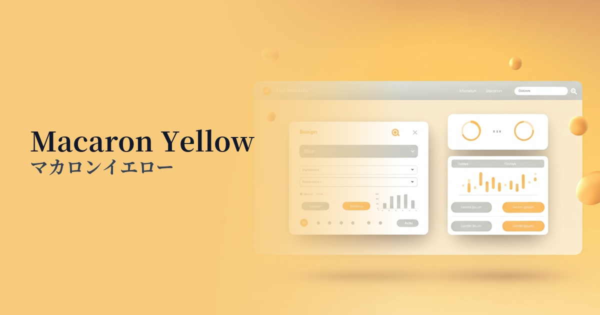
Visibility testing (UI component example)
Practical usage (best practices)
Using it as a background color for a wide area can create a bright and warm atmosphere throughout the entire site. Using it as an alternative to white or light gray results in a more distinctive and memorable design. However, it's crucial to pay close attention to the contrast ratio with text to ensure readability.
Using macaron yellow as an accent color for CTA buttons, icons, and links gently attracts the user's attention. In particular, using a stronger color for the main CTA and macaron yellow for secondary CTAs and auxiliary actions effectively organizes the information hierarchy.
By combining it with other pastel colors, you can make multi-item dashboards and price plan comparison charts visually clear and engaging. While differentiating each element by color, the overall design remains harmonious.
It's also effective to use it partially as a background for product images on e-commerce sites or as an overlay for portraits. It can give the impression that warm light is shining on the product or person, enhancing their appeal.
Recommended color scheme suggestions
Slate Blue (#6A5ACD)
The warmth of macaron yellow and the intellectual, calm atmosphere of slate blue harmonize beautifully. This combination is ideal when you want to convey both trustworthiness and approachability, and is recommended for modern SaaS UIs and slightly more formal corporate websites.
Sage Green (#9DC183)
This organic and soothing color scheme evokes nature and health. The brightness of macaron yellow enlivens the calmness of sage green. It's perfect for wellness-related services, natural-oriented e-commerce sites, and environmental media.
Rosy Brown (#BC8F8F)
This combination gives off a sweet, somewhat nostalgic, and gentle impression. Although it's a combination of warm colors, the calm tone of Rosy Brown pulls the whole look together, creating a sophisticated atmosphere. It's perfect for cosmetic brands, sweets, and lifestyle media.