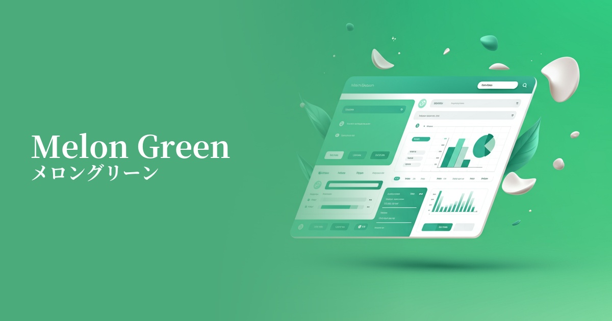
| English name | Melon Green |
|---|---|
| Katakana | Melon Green |
| HEX | #D9F0D3 |
| RGB | 217, 240, 211 |
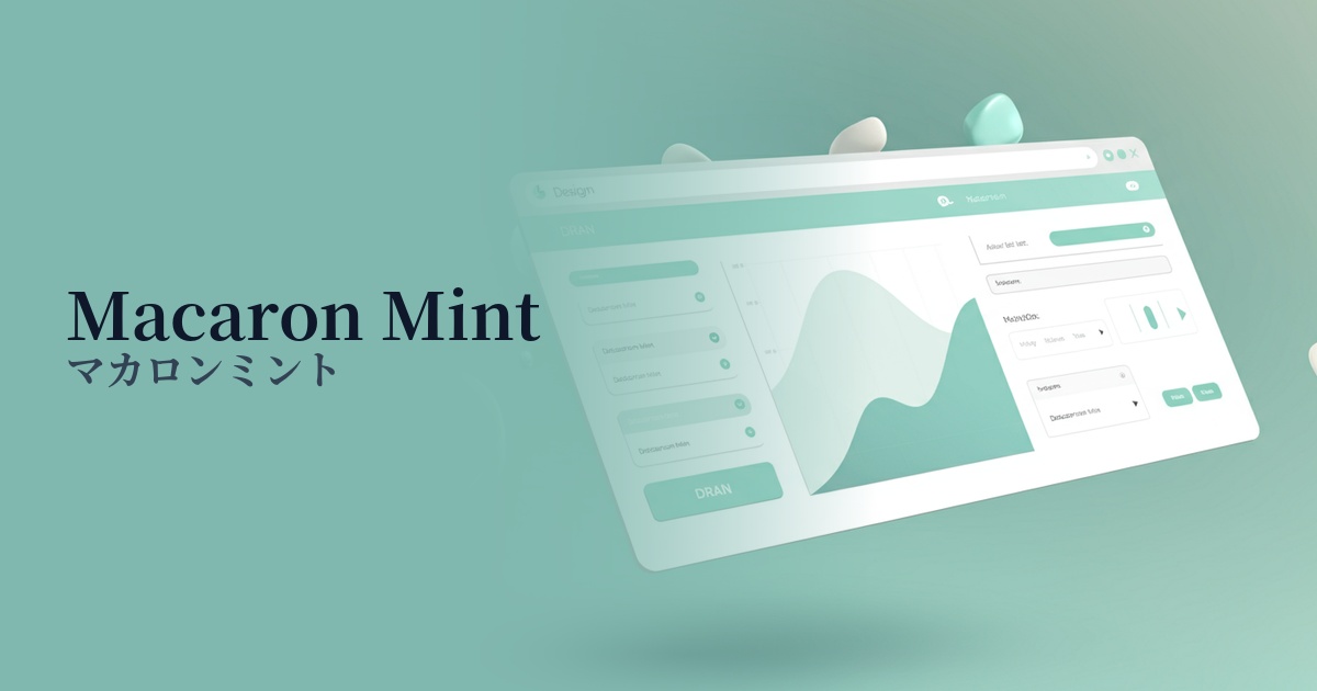
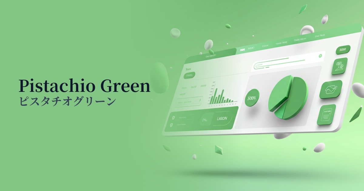
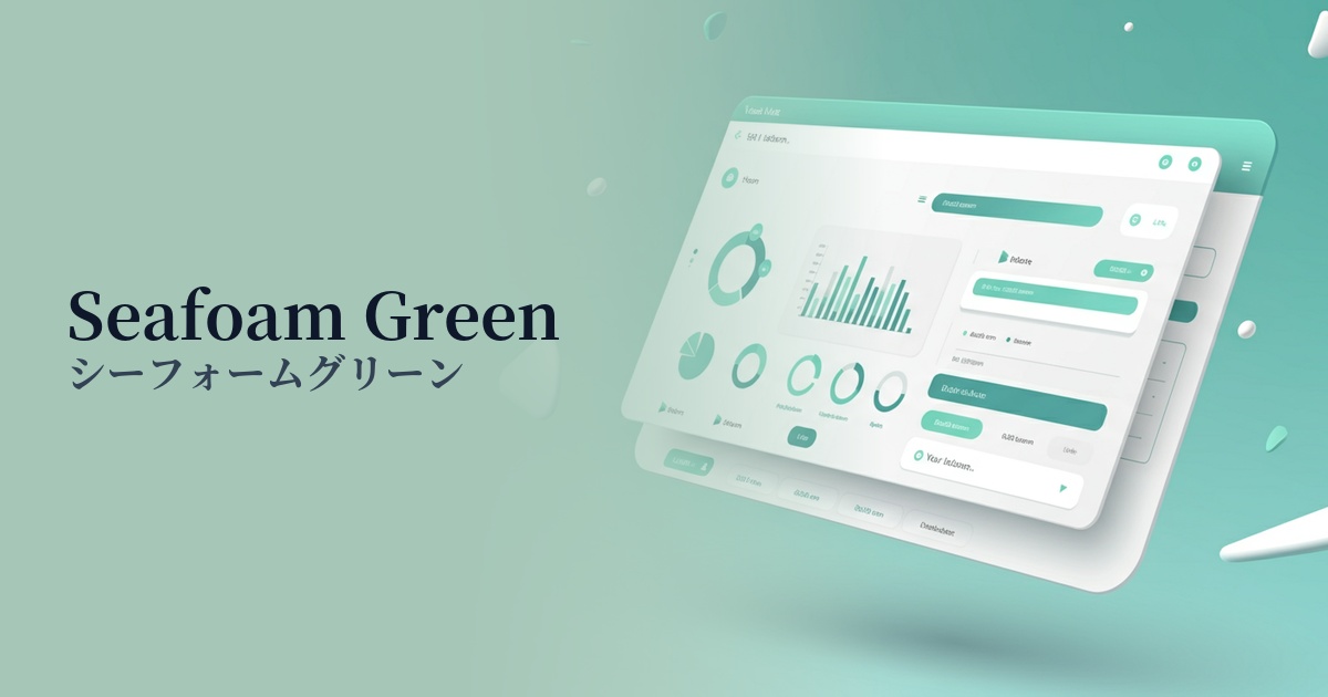
| Design Theme | Pastel & Macaron Colors |
Why is it a trend? (Background and reasons)
In recent design trends, there has been a significant increase in interest in nature, health, and sustainability. Melon green combines the freshness reminiscent of ripe melon flesh with the vitality of young plant leaves, making it the perfect color to visually represent these values.
Furthermore, with an increasing number of users experiencing digital fatigue, there is a growing demand for pastel colors that are easy on the eyes and calming. Melon green, in particular, gives a bright and positive impression, and is therefore being actively adopted in UI designs that provide users with a sense of security and comfort.
The psychological effects of design and UX
Melon green gives a fresh and refreshing impression. Because it evokes images of nature and health, using it on websites for organic products, wellness services, and food products can effectively convey the clean image of the product.
Bright and gentle color schemes evoke a sense of security and familiarity in users. In UI/UX design, they can help alleviate tension and promote positive feelings. In particular, using them on new user registration screens and onboarding processes will lower psychological barriers.
It also symbolizes positive energy such as youthfulness and growth. When used on the website of a startup company or on the landing page of a service that proposes new value, it is easy to create a sense of anticipation for the future and innovation.
Visibility testing (UI component example)
Practical usage (best practices)
When used as a background color for a wide area, it brings a bright and open feel to the entire page. Its soft color doesn't interfere with content readability, making it ideal for blog posts and portfolio websites.
It's also effective for use as a CTA (Call To Action) button on landing pages (LPs) and e-commerce sites. It harmonizes with other elements while naturally attracting the user's attention and encouraging clicks. Visibility is particularly enhanced when combined with white or cream-colored backgrounds.
It's also recommended to use it selectively as an accent color, such as on icons, headings for specific sections, or parts of graphs. In a minimalist design, it subtly highlights important information and guides the user's eye.
In SaaS dashboards and management screens, it can be used for status indicators (e.g., success, completion) and tag colors. While maintaining the common association of "success = green," it can give a more modern and sophisticated impression.
Recommended color scheme suggestions
Sandy Brown (#F4A460)
By combining it with sandy brown, reminiscent of beaches and wood, you can create a very organic and calming atmosphere. It's perfect for websites of natural cosmetics and lifestyle brands, giving users a sense of security and warmth.
Slate Gray (#708090)
By using slate gray as an accent color, which gives an intelligent and calm impression, a modern feel is added to the gentleness of melon green. This color scheme is recommended for SaaS UIs where reliability is essential, and for minimalist corporate websites.
Coral (#FF7F50)
Adding vibrant coral as an accent creates a fresh and playful design. This combination is effective in situations where you want to convey fun and excitement, such as on websites announcing services or events for children.