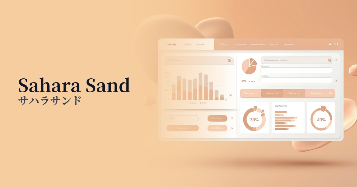
| English name | Sahara Sand |
|---|---|
| Katakana | Sahara Sand |
| HEX | #EDE5D9 |
| RGB | 237, 229, 217 |
| Design Theme | Neutral & Minimal Background Colors |
Why is it a trend? (Background and reasons)
In recent years, minimalism and organic approaches have become mainstream in web design. Sahara Sand is a color that embodies this trend, bringing the tranquility and comfort of nature to the digital space. It is gaining popularity as a color that perfectly meets the modern need to avoid excessive ornamentation and convey essential values.
The "quiet luxury" trend in the fashion and interior design industries is also influencing web design. Sahara Sand is ideal for expressing a brand's worldview through texture and quality rather than flashiness. This sophisticated yet understated color exudes timeless appeal and quietly conveys high quality to the user.
As users spend more time interacting with digital devices, there is growing interest in "eye-friendly designs" that reduce strain on the eyes. Sahara Sand, which softens the glare of a pure white background and reduces eye strain even during prolonged viewing, is an excellent choice from a UX perspective. It provides users with a sense of security and creates an environment where they can easily concentrate on the content.
The psychological effects of design and UX
Sahara Sand evokes images of vast deserts, dry land, and natural linen materials, bringing positive psychological effects such as "warmth," "security," and "calmness" to the user. This naturally derived color softens the coldness inherent in digital spaces, creating a friendly atmosphere.
In UI/UX design, this color functions as an excellent background color. It doesn't distract from the content and naturally enhances the main elements such as text, photos, and products. Its minimalist and sophisticated impression avoids information overload, guiding users to focus on the most important information.
Sahara Sand, a type of earth tone, also conveys impressions of "reliability" and "integrity." Because it expresses a grounded sense of stability, it is a highly versatile color that can be used in a wide range of situations, such as when building a company's brand image or for service websites where user trust is essential.
Visibility testing (UI component example)
Practical usage (best practices)
The most effective way to use it is as the background color for the entire website. It brings a consistent and calm atmosphere to the entire page, and is especially well-suited for lifestyle brands, interior design, and sustainability-themed sites. Combining it with a layout that makes good use of white space will give it an even more sophisticated look.
It's also recommended to use it partially as a background color for card-type UIs or information sections. Combining it with other neutral colors (such as light gray or off-white) gently creates a visual hierarchy and helps organize and present information. This helps users intuitively recognize the grouping of content.
Sahara Sand provides the perfect canvas for highlighting vibrant accent colors. For example, using colors like terracotta, dark green, and navy blue for buttons, links, and important headings effectively makes those elements stand out. This allows you to maintain a calm overall tone for the site while precisely guiding user actions.
It is also very effective as a background for product pages on e-commerce sites. It provides a warm shopping experience without interfering with the product's colors or details. In particular, it brings out the maximum appeal of products when combined with organic products, handmade items, and apparel with a natural feel.
Recommended color scheme suggestions
Slate Gray (#708090)
The warmth of Sahara Sand is complemented by the intelligent and calming impression of Slate Gray. This combination creates a modern and sophisticated atmosphere, making it ideal for corporate websites and portfolio sites where trustworthiness is essential.
Terracotta (#E2725B)
Adding terracotta, another earth tone, as an accent creates an exotic, warm, and energetic impression. This is an attractive color scheme that will capture the hearts of users on lifestyle brands and travel websites.
Moss Green (#8A9A5B)
This natural and organic combination evokes the sand of a desert and the green of plants. It provides users with a sense of security and tranquility, making it a perfect color scheme for themes such as wellness, sustainability, and natural cosmetics.