| English name | Powder Pink |
|---|---|
| Katakana | Powder Pink |
| HEX | #FFE9F1 |
| RGB | 255, 233, 241 |
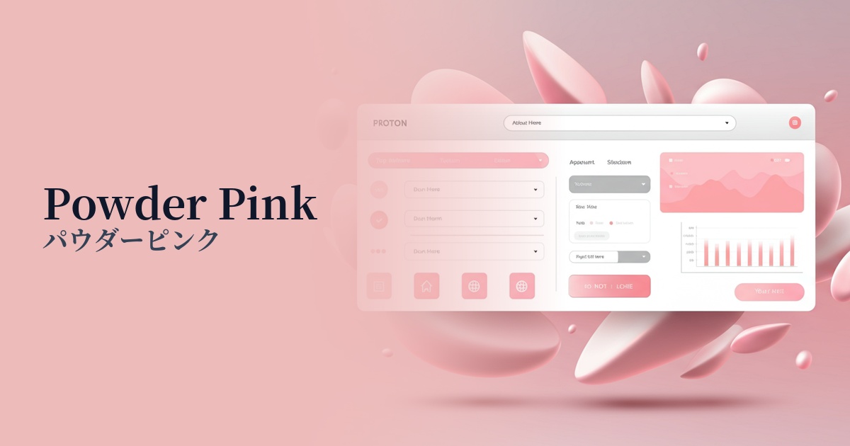
| Design Theme | Neutral & Minimal Background Colors |
Why is it a trend? (Background and reasons)
In recent years, clean and minimalist designs have become mainstream in web design. Within this trend, neutral colors that add warmth and softness to a space, rather than just white or gray, are gaining attention. Powder pink, in particular, is chosen by many designers because it maintains a minimalist impression while bringing a gentle and sophisticated atmosphere to the entire site.
Pink was once associated with femininity, but that image has faded, and it has become a color widely accepted regardless of gender. This shift aligns with inclusive design principles that ensure everyone can use the service comfortably, making it easier to adopt in services targeting diverse user bases.
With growing interest in digital wellness, there is a demand for designs that reduce visual stress caused by prolonged screen use. Low-saturation, pale colors like powder pink are less irritating to the eyes and contribute to providing users with a calm and comfortable browsing experience.
The psychological effects of design and UX
Powder pink, with its soft and delicate hue, has a psychological effect of giving users a sense of security and familiarity. Especially in the wellness, beauty, and baby-related fields, it can intuitively convey the "gentleness" and "safety" of products and services.
A very pale pink, almost white, doesn't give off an overly sweet impression; rather, it creates a sophisticated and elegant atmosphere. This characteristic is utilized in luxury brand e-commerce sites and creators' minimalist portfolio websites to express a clean yet distinctive worldview.
This color evokes positive emotions such as happiness and calmness. Incorporating powder pink into the UI can unconsciously make users feel comfortable, potentially leading to increased engagement and longer visits to the service.
When used as a background color, it reduces the overall feeling of clutter on the page and makes the content appear lighter. When combined with sufficient white space, it allows for smoother eye movement and gives the impression of neatly organized information.
Visibility testing (UI component example)
Practical usage (best practices)
Using powder pink as the background color for the entire site easily creates a unified and soft aesthetic. It's ideal for expressing your brand's personality without interfering with content readability.
When the main background is white, incorporating powder pink into the background of card UI or specific information sections creates a visual hierarchy. This makes it easier for users to intuitively understand the structure of the information.
Powder pink is an excellent "supporting color" when combined with dark gray, navy, or vibrant accent colors. Using powder pink as a background makes the main color and CTA button stand out more, attracting the user's attention.
When used in subtle micro-interactions such as hover effects for buttons and links, or when opening and closing accordion menus, it can provide users with elegant and pleasant feedback.
This color is effective as a background color for product photos on e-commerce sites that sell cosmetics, fashion, sweets, and miscellaneous goods. It adds a gentle and attractive atmosphere without detracting from the appeal of the products.
Recommended color scheme suggestions
Slate Gray (#708090)
The softness of powder pink, combined with the intelligent and calm impression of slate gray, creates a modern and sophisticated atmosphere. This color scheme is recommended for service websites where trustworthiness is essential, or for minimalist portfolios.
Sage Green (#9DC183)
The combination with sage green, reminiscent of nature, creates an organic and comforting impression. It is ideal for wellness-related services and brand websites that deal with natural materials, providing users with a sense of security.
Gold (#FFD700)
Adding gold accents further enhances the elegance of powder pink, adding a touch of luxury and glamour. This combination is particularly effective for luxury brand websites and special event announcement pages.